- 16 November 2022
- 6101 defa okundu.
Ficus Office
The architecture studio ARQUID transforms an old industrial warehouse in Madrid into its new offices
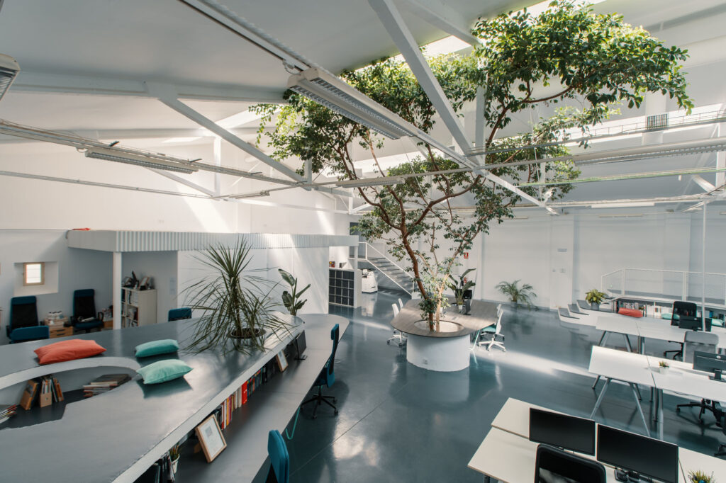
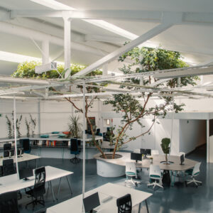
The project, ‘FICUS OFFICE’, inherits the name of the central tree that frames the design; heart of the studio and space. A place where the tranquility of nature wins the battle against the frenetic energy of the city.
The design of the office is focused on improving the health, creativity and efficiency of workers, following the global trend of the ‘third space’; an environment that combines the comfort of home with the functionality of work spaces.
In the basement of a residential building in Madrid, an old industrial warehouse was hidden, fully integrated with the city and with an abandoned appearance. Inside, a large ficus 4 meters high that had been preserved over the years. In search of their new headquarters, Begoña Soto and Juan Sánchez, partners of the ARQUID architecture studio, discovered this space and began a process of metamorphosis to create their new offices in it.
The studio calls its headquarters ‘FICUS OFFICE’ and it is not so much an office as it is a meeting place designed by its own team. The ficus, which gives the project its name, has become the heart of the space, fully integrating itself into ARQUID’s daily life. The headquarters are the soul of the studio made into a project; a tribute to its personality and a space to promote and enhance the ideas that make its designs possible.
The metamorphosis of an industrial warehouse into an office
‘FICUS OFFICE’ is the result of believing in the potential of legacy architecture. The intervention focuses on preserving the identity of the warehouse and adapting it to new uses; a metamorphosis in which ARQUID fuses the elements of industrial aesthetics, with its conception of a space adapted to its work needs and methodology.
At the beginning of the project, the warehouse is completely cleaned and only its main structure is maintained so as not to lose the essence of the original space. A nudity that allows ARQUID to visualize the final and real height of the site and draw an idea that allows them to access and take advantage of every corner in the width and height of the space.
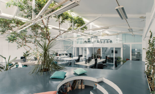
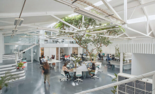
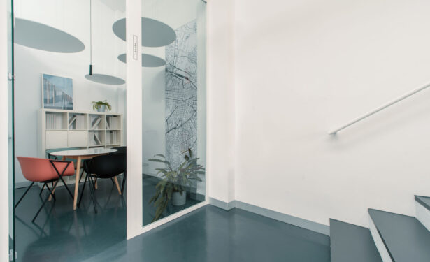
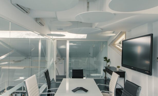
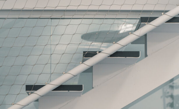
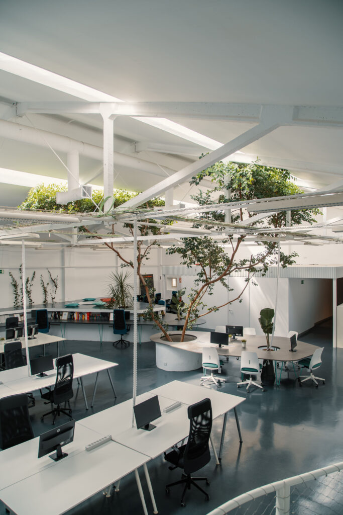
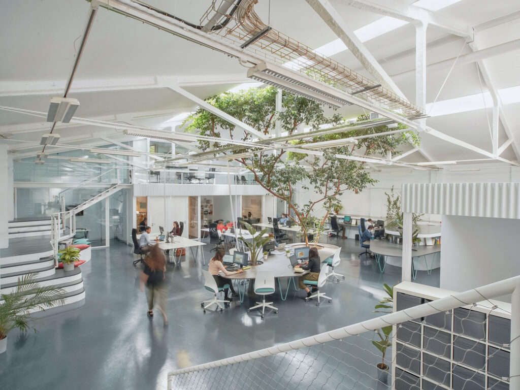
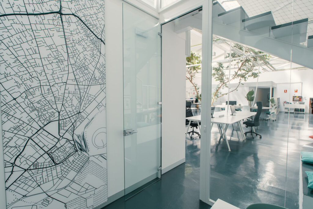
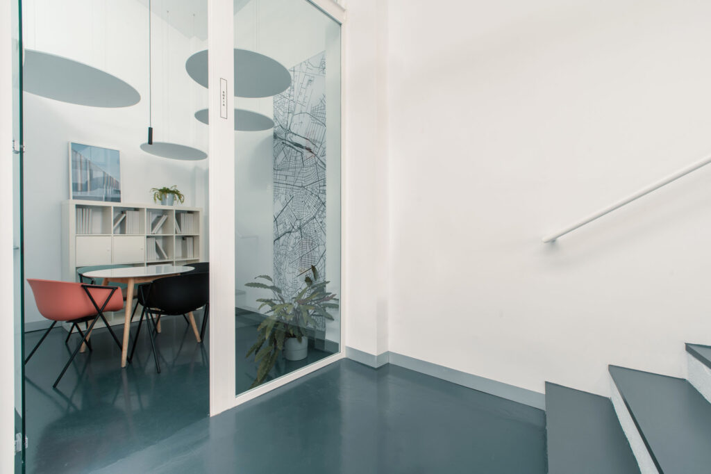
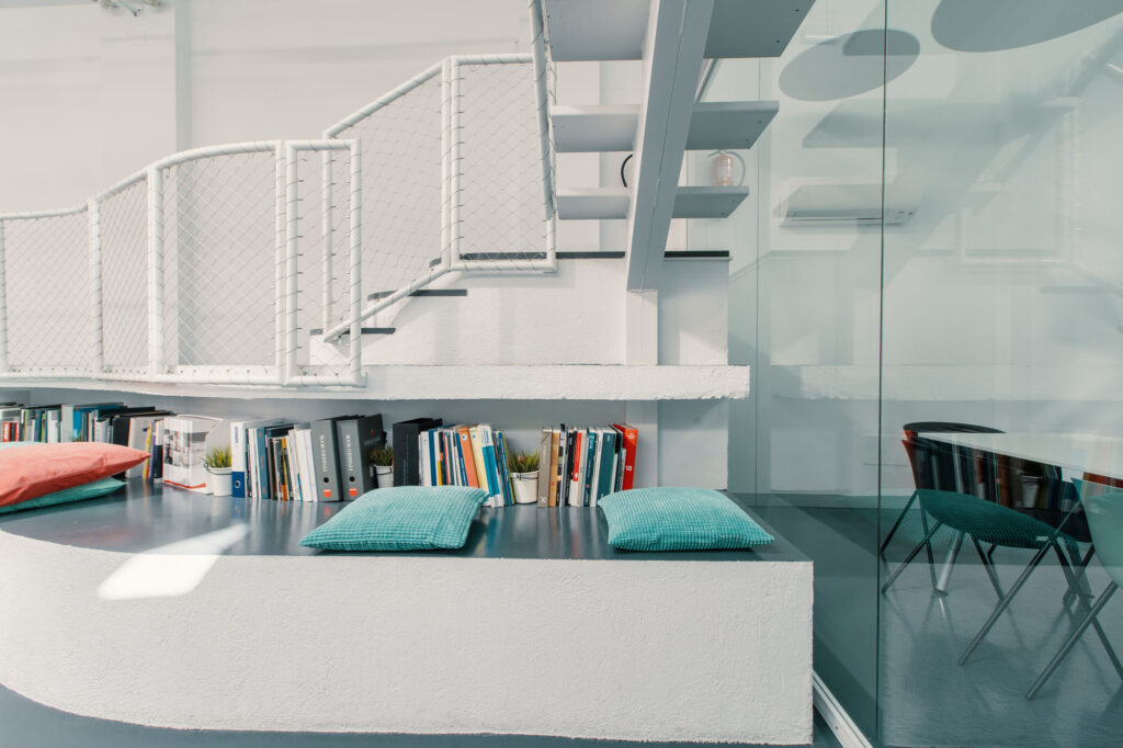
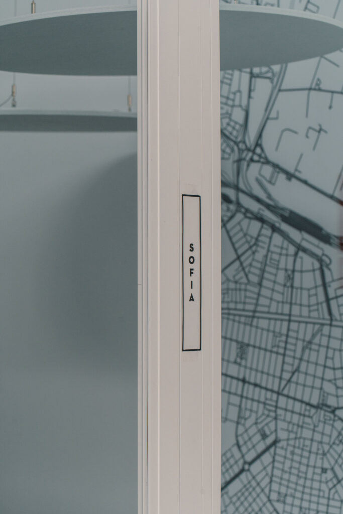
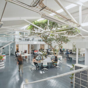
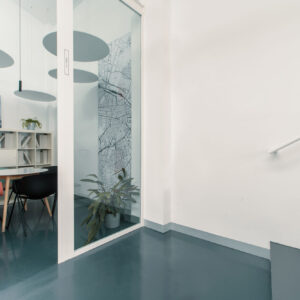
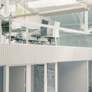
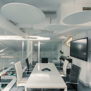
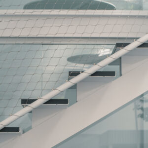
On the blank canvas, ideas begin to be distributed and the architecture studio decides to create a new topography within the warehouse that allows the full height of the warehouse to be used. In this way, several levels are created in which different work and activity areas are distributed, permanently connected with each other through various access areas. On the ground floor the main activity is distributed in an open space, while the upper floor consists of different closed meeting spaces with transparent windows that open the space to the exterior and allow natural light to enter from the skylight in the ceiling.
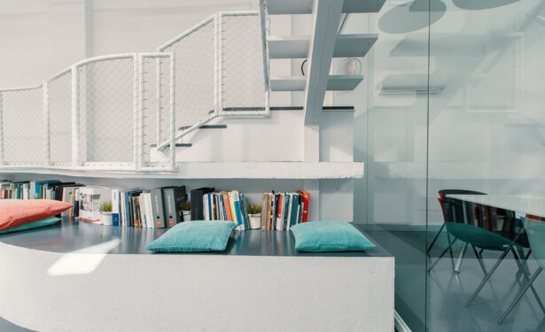
The new topography is finished off with gray surfaces that are used for different elements; floor, table or even seat. Together, the space and the structure integrate their constructive elements in the daily activity of the studio. This idea ties in well with ARQUID’s concept of contributing to the flow of ideas among all team members.
An environment that combines the comfort of home with the functionality of work spaces
The entire process of creating the ARQUID headquarters has been carried out under three fundamental concepts: health, creativity and efficiency. The general concept of the office follows the global trend of the ‘third space’; an environment that combines the comfort of home with the functionality of work spaces. Spaces with atmospheres that help people feel comfortable, enhance team spirit and creative freedom.
The story of this project stems from the desire to offer the studio’s workers a space in which to develop personally and professionally. ARQUID applies in this case a more personal than conceptual architecture, in which the space is specifically designed for the people who are going to inhabit it. An idea that fits in with the team’s way of working, in which the transit and flow of ideas is enhanced, working collaboratively.
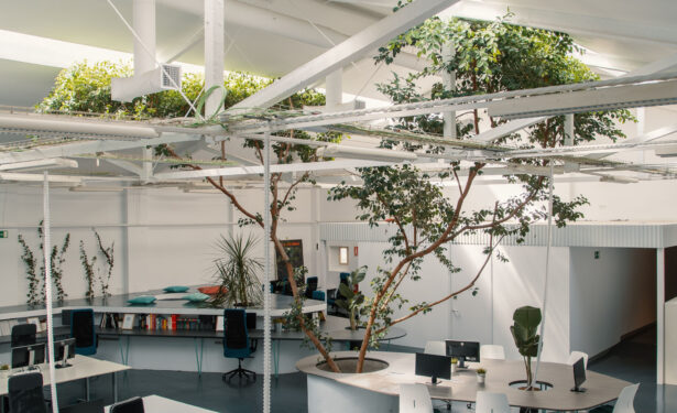
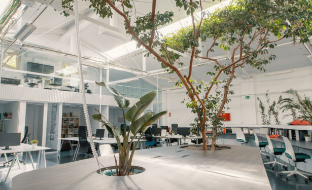
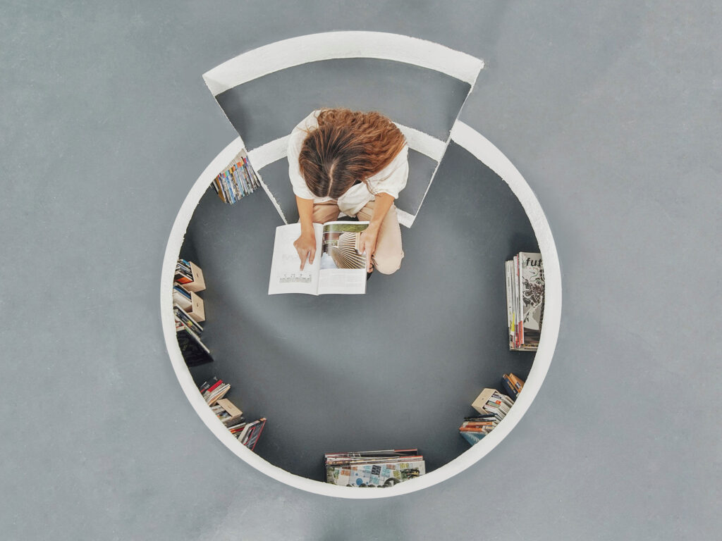
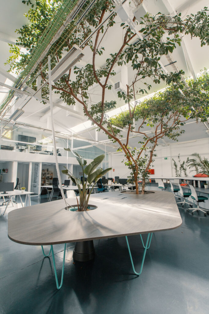
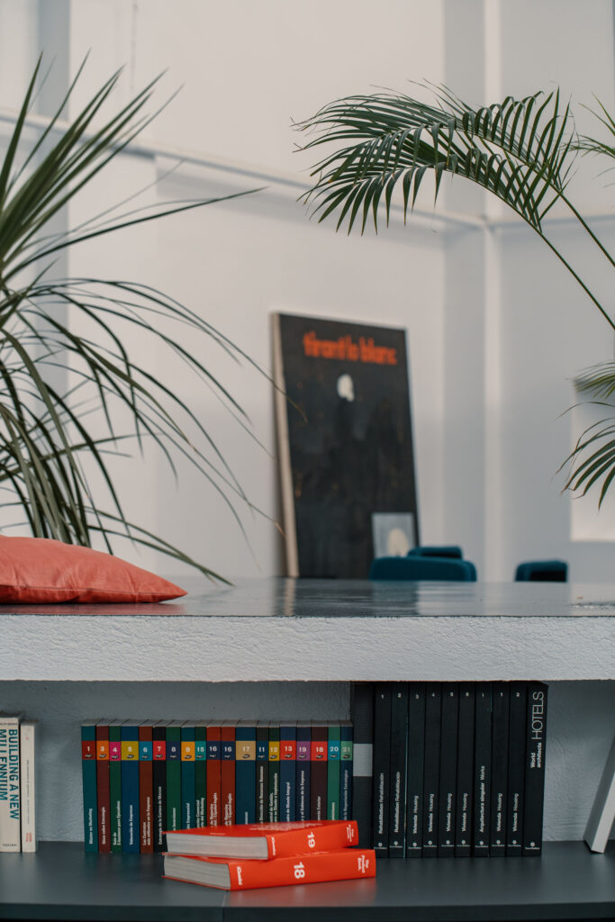
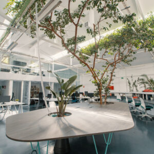
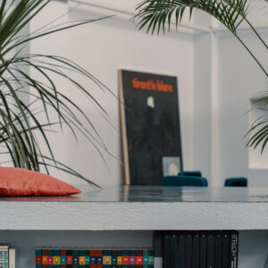
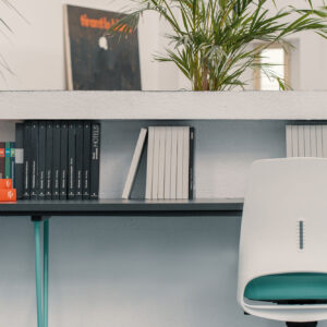
The location and nature of the original ficus, which gives the space its name and becomes the heart of the studio, established the idea of creating an open space, without walls or separations, in which this collaboration would flow. Located in the center of the ground floor, around the ficus the different spaces are distributed in a flexible way: the work tables, which flow around the structure in straight and curved lines; several ‘quiet focus’ spaces, where to find calm and concentration; the ‘meeting rooms’, to meet with the team for brainstorming sessions; the library, where to find material and inspiration; the grandstand, which becomes an informal meeting space; and the lounge-café, to eat, chat and take breaks.
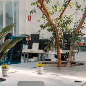
The green elements were another of the main tools to configure the office spaces, under the faithful belief that vegetation helps to create a more fresh and pleasant environment. The objective was to integrate nature into people’s daily lives, starting with the central ficus, accompanying it with other interior plants on the walls, tables and stairs. Every corner becomes a natural space; a resource to turn the office into a more comfortable place, where the tranquility of nature wins the battle against the frenetic energy of the city.
The furniture was custom designed around the ficus, which is constantly framed by the light from the skylights, providing curved shapes that contrast with the linear structure of the building and that facilitate circulation through the warehouse. In total, an area of 365m2 dressed in industrial minimalism and a color range that alludes to the corporate identity of the studio and its collaborators.
‘FICUS OFFICE’ represents the evolution of ARQUID and its workers, a space that is much more than an office; an oasis of serenity for their hectic lives and a place to enter in the search for a parenthesis from the urban life. The studio has made use of the benefits of architecture to create the ideal work space, where ideas sprout and in which they continue to create more architecture.


