- 16 February 2024
- 301 defa okundu.
Transformation With Additions in Wood
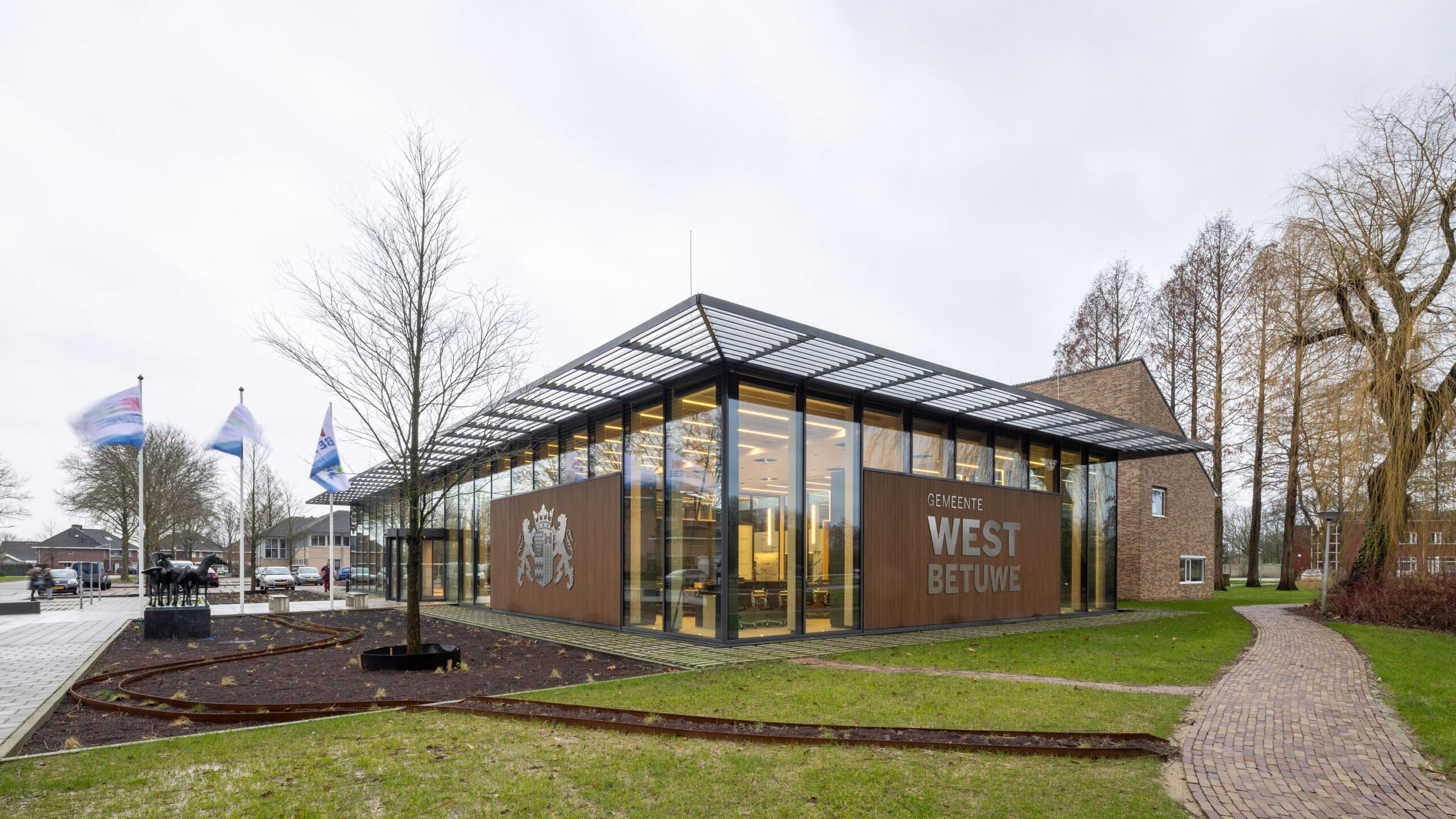
The brand-new West Betuwe merged municipality focuses on transformation and bio-based materials for its new accommodation. cepezed designed the architecture and interior of the building, which previously served as the town hall of Geldermalsen. Old and new blend seamlessly, sightlines emphasise the relationship between inside and outside, and the building is much more sustainable than before.
Photos: Lucas van der Wee
The West Betuwe merged city council, in existence since 2019, prioritised reuse and circularity in the architecture. The result is a daylight-rich building with two new building parts made of wood and lots of PV panels on the roof. Existing furniture and to be removed building components were inventoried with a focus on reuse. The same goes for the art collection, from which the most beautiful sculptures, engravings and paintings were chosen. The garden surrounding the building was also redesigned.
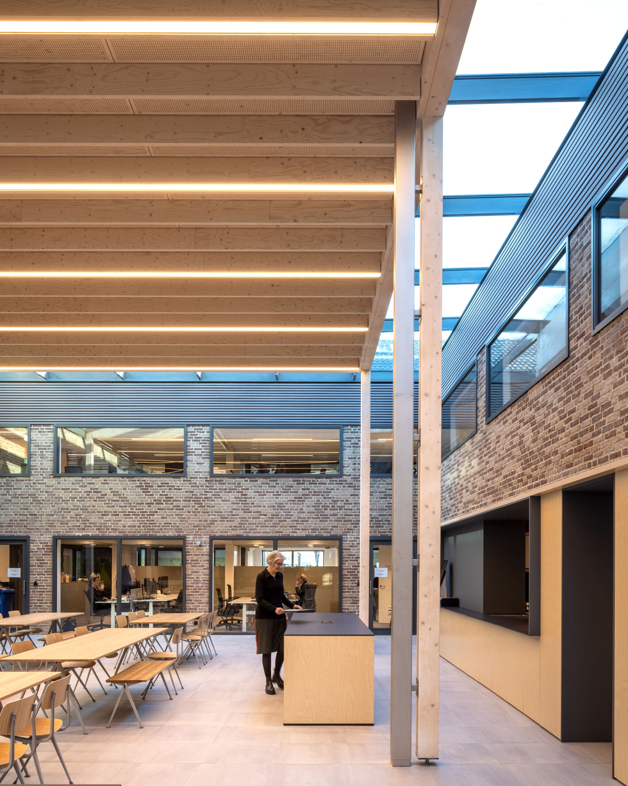
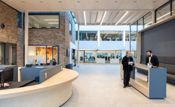
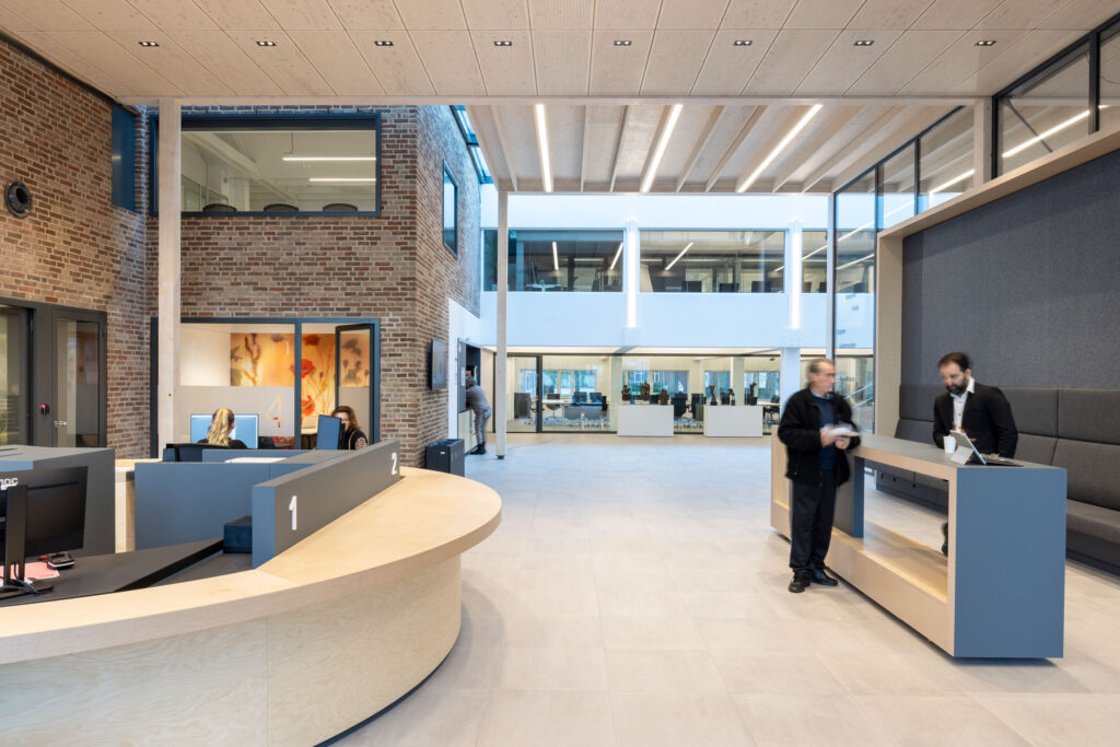
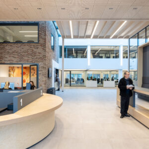
The existing city hall was a cluster of building parts from 1984, 1996 and 2010, situated around a patio. It was a dark, rather labyrinthine building whose acoustics left much to be desired. cepezed made a custom-made plan with energy-efficient choices. The roofs, for instance, contain re-used PV panels, supplemented by 260 new panels. The departments for civil servants, civic affairs, the municipal administration and the political groups were given their own zones. The patio at the heart of the building is roofed over and forms a ‘meeting square’ with workplaces, a coffee bar and a kitchen.
Demolishing a building section and reorganising the building improved the routing and gave the surrounding garden more body. The strict choice of wood makes the two new additions ‘readable’, as does the choice not to connect them directly to the old building: there are skylights between the wooden sections and the existing building, and above new stairs. New additions are modest in tone, so that the existing building does not lose its expressiveness.
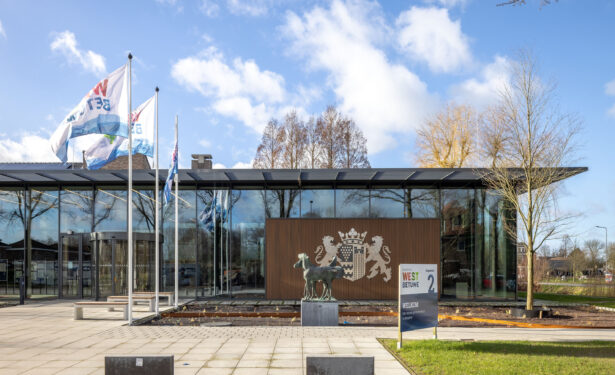
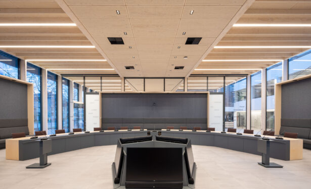
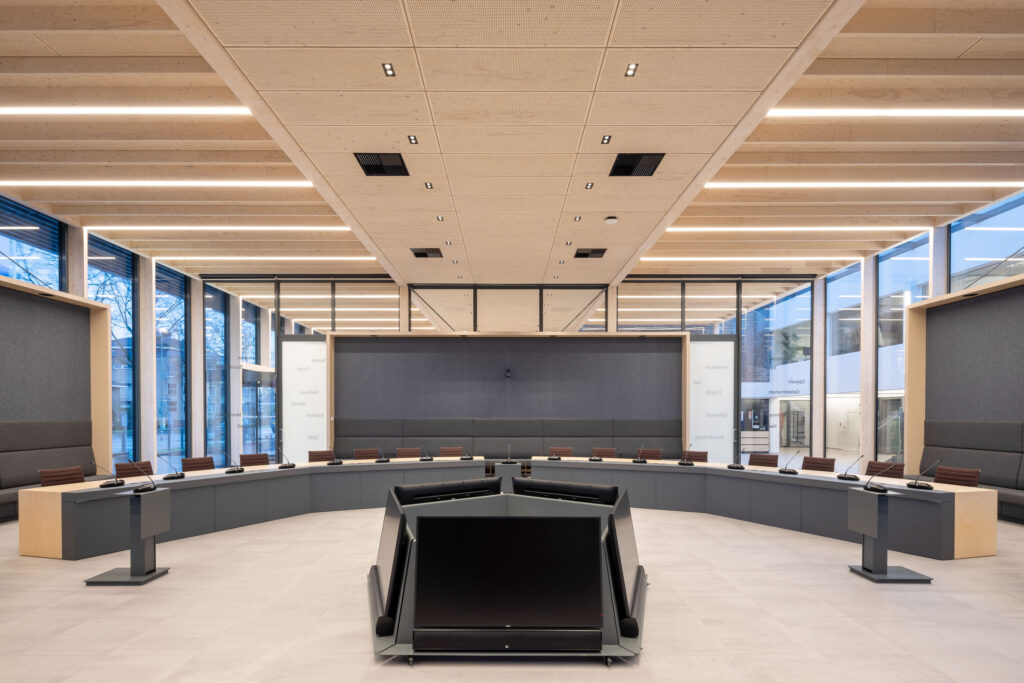
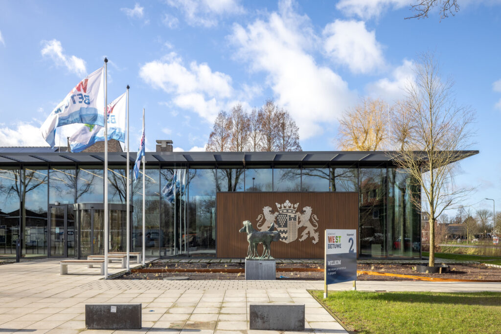
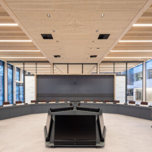
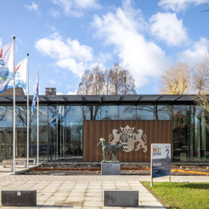
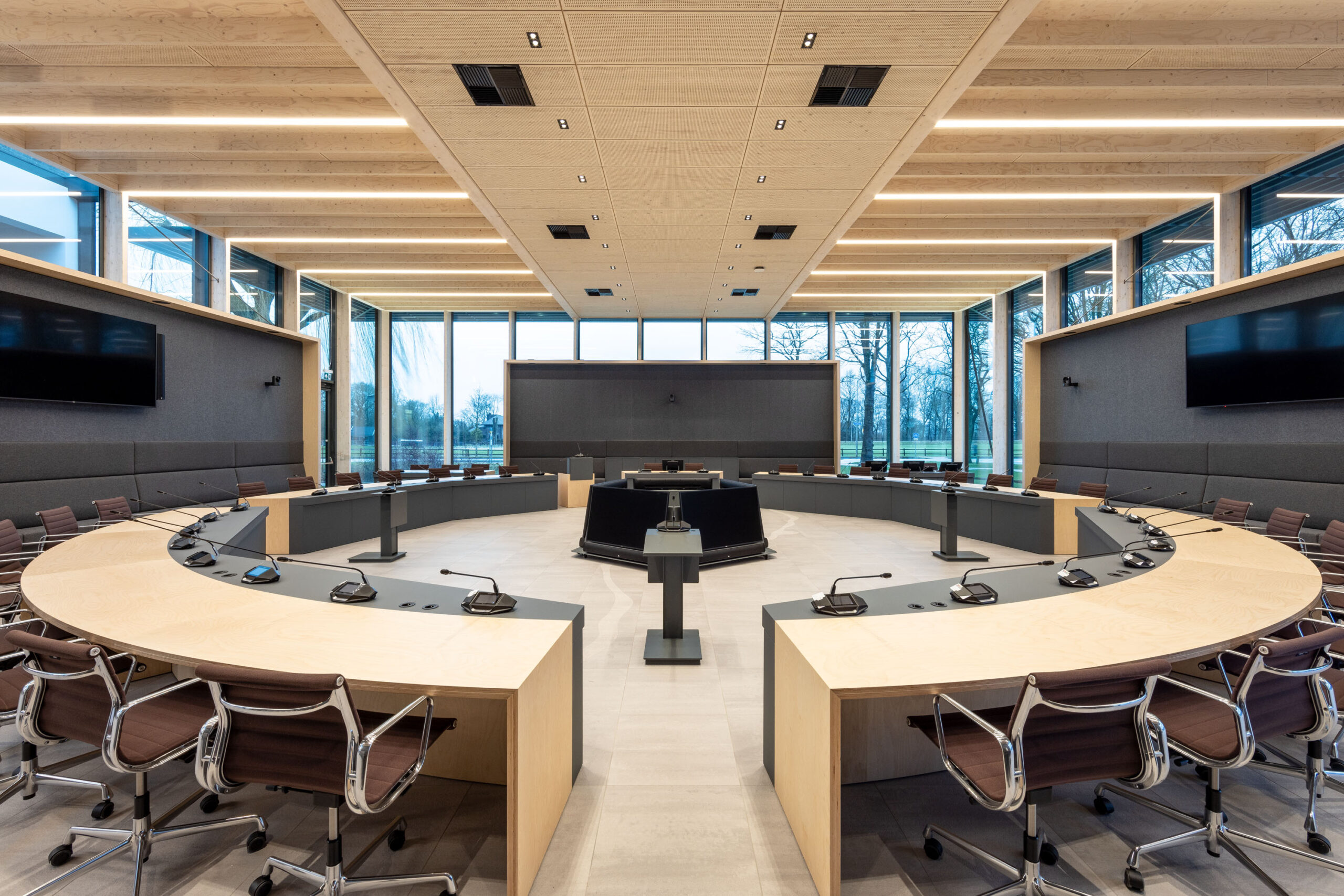
The public entrance is in a new building section, which looks like a pavilion because of the prominent horizontal line of the canopy and its glass facade parts. The building section fits in between the existing building, the pond and some monumental trees. Next to the entrance are the public counter, consulting rooms, waiting room and council chamber. The canopy creates unity, provides protection from the sun and softens the transition between inside and outside. The council chamber is a multifunctional space, which can also be used for meetings, events, concerts, lectures and weddings. The hall provides access to the preliminaries, which are housed in the old building.
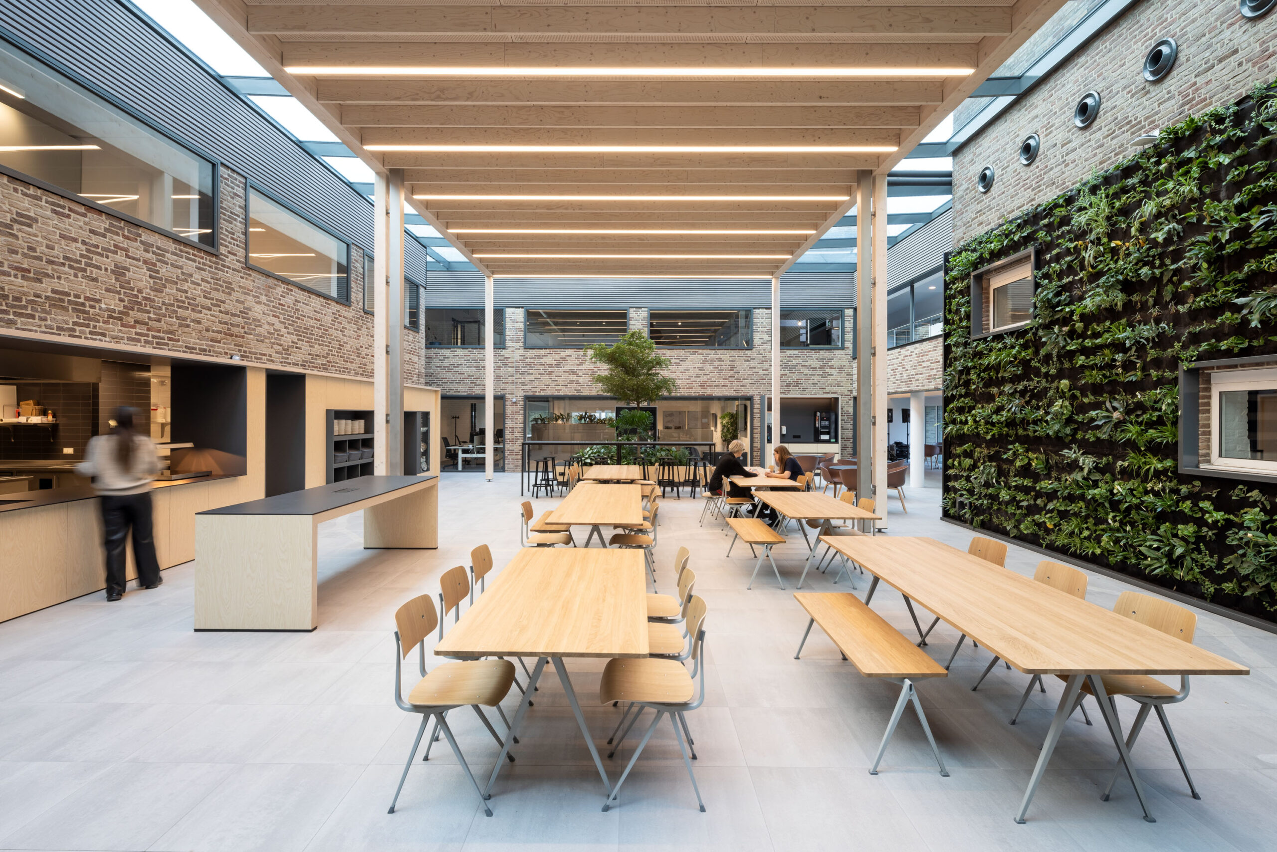
Like the new building section on the patio, the ‘entrance pavilion’ is a prefabricated wooden structure. The façade columns follow the rhythm of the glass façade panels. A steel base disconnects them at floor level. This simplifies maintenance and makes the connection just a little more elegant. Moreover, such a steel base is less vulnerable to moisture and dirt. Because of the design with prefab elements (kit of parts), the two new building parts can in theory also be dismantled and reused again, should the future demand this.
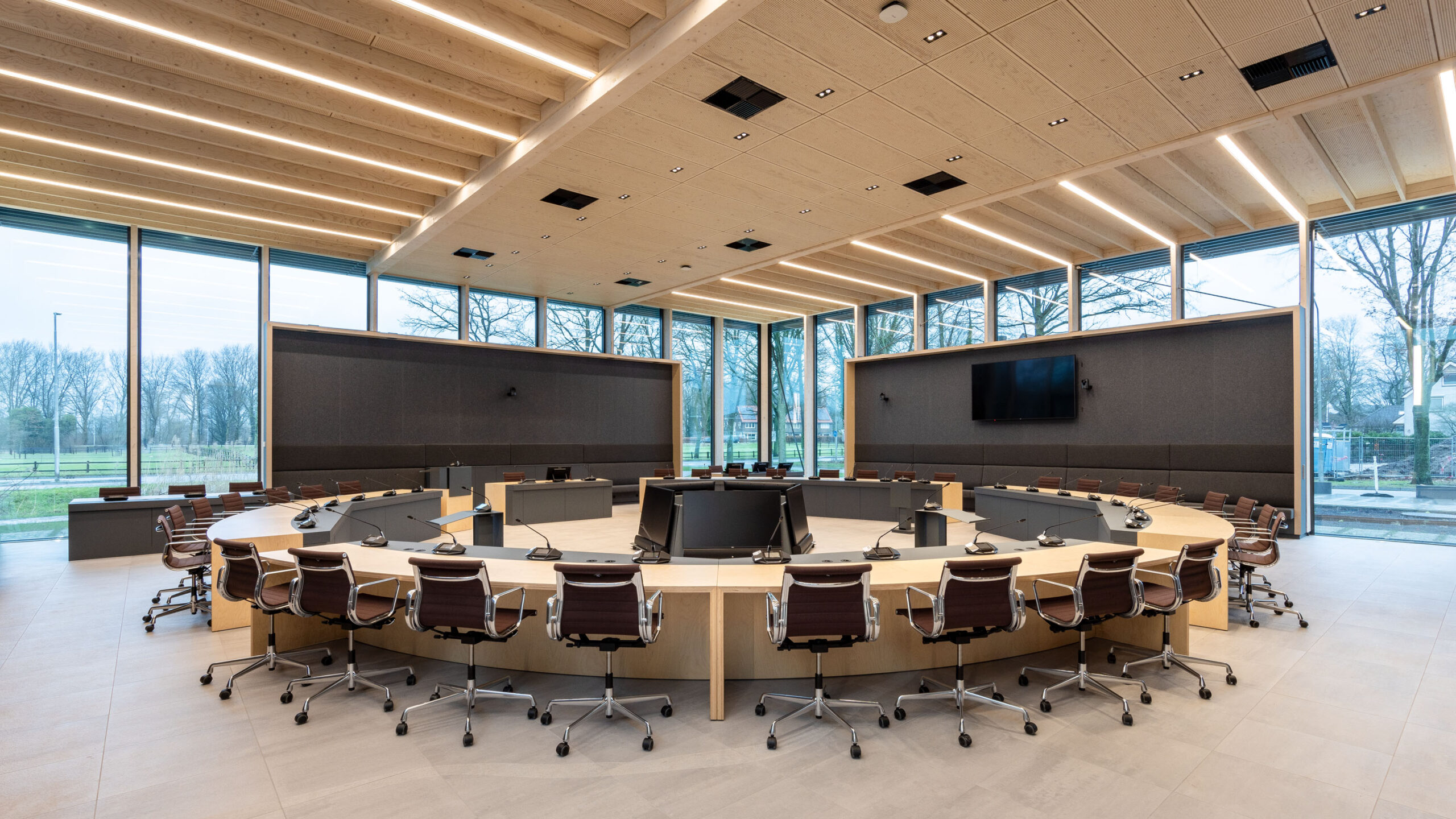
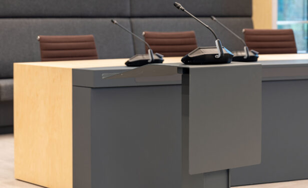
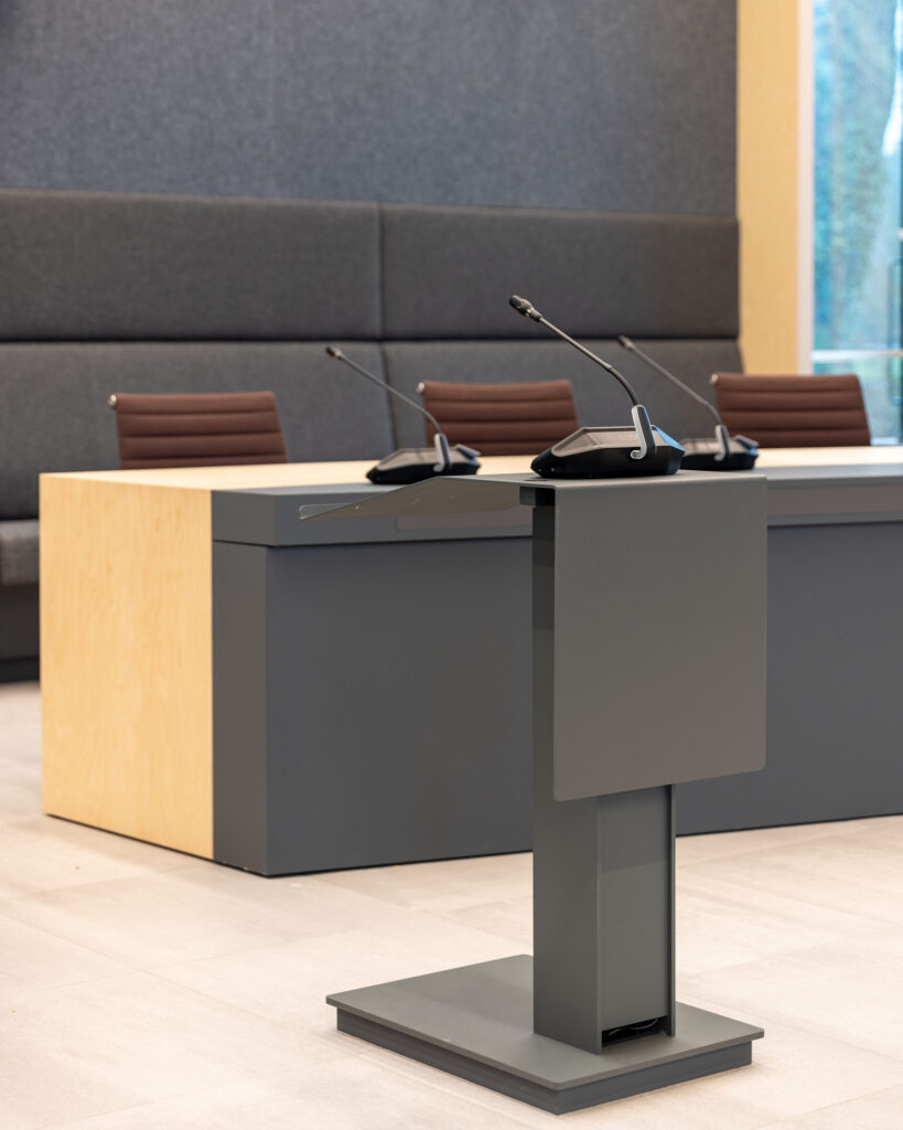
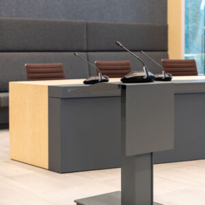
Existing furniture has been carefully selected and re-upholstered. The new wooden furniture that cepezedinterieur designed especially for the West Betuwe town hall is, if possible, tailored to multiple functions. Thus, the wall elements in the council chamber are simultaneously a bench for the public, a cupboard and a screen. Moreover, they limit views from outside. Besides these elements, cepezedinterieur designed separate furniture for the council chamber. The tables are switchable, so that they can be placed in a circle, but also in a large plane or smaller groups.
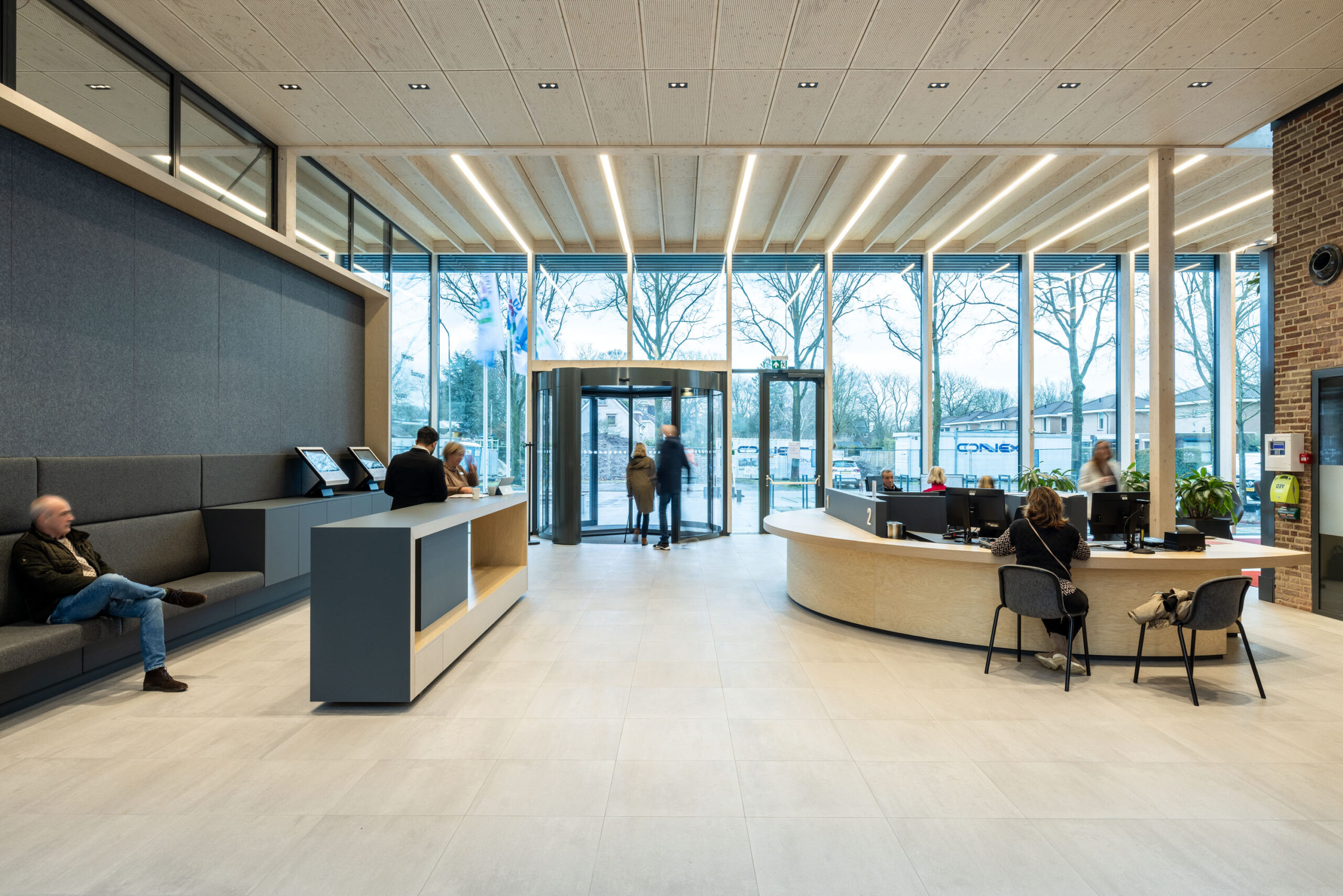
Lighting is incorporated in the wooden prefabricated roof elements, with wooden acoustic absorption between the ribs of the elements. The existing building is partly painted white, with organisational wooden panels and some felt walls in rooms and call cells. New rooms are materialised in a restrained manner with a light grey ceramic floor, wooden structures, furniture and cabinets, and anthracite-coloured felt where acoustics demand it. The panelling of internal steel doors and furniture bumpers are also anthracite.
The three colours of the city logo, red, blue and green, recur in the interior as accent colours: the three areas for citizens’ affairs, civil servants and council were each given their own recognisable colour. A special and very nice part of the interior design was the inventory of the new city council’s art collection. A nice choice was made from a multitude of art objects, based on the place where the work in question would be shown to its best advantage. Thus, architecture, art.
