
- 27 February 2024
- 353 defa okundu.
Apartment Building at the Foot of the Hill
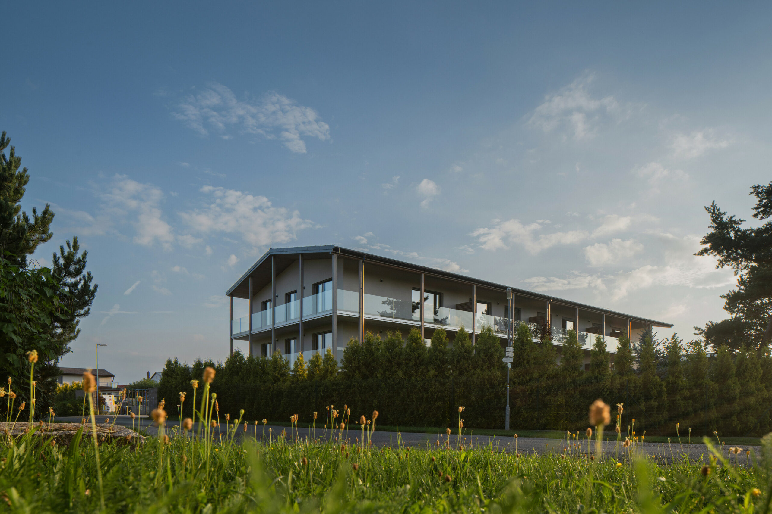
Karnet Architekti designed the residential project to transform three original buildings in a small village at the foot of the Brdy hills in the Czech Republic into a unified, compact whole, utilizing wood as a unifying element and integrating modern design solutions for energy efficiency and functional living spaces.
At the Foot of the Hill
In the shadow of the Brdy hills, a dense fog veils the landscape in mystery.
The morning rays of the sun, piercing through it on their way to a new day, gradually unveil the contours of spruce trees.
And where there once stood a carpentry workshop and an old school, now emerges the silhouette of a new house.
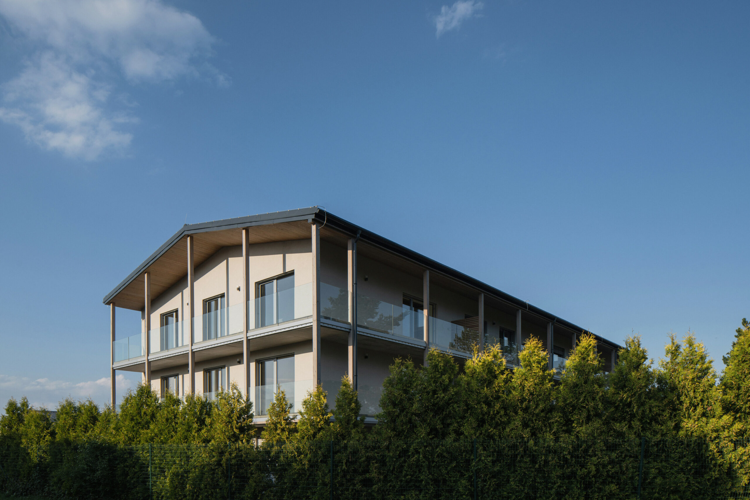
To deal with the form of a residential building in the middle of a small village, not a city, was an interesting challenge for us.
The existing non-functional production area was also losing its sense in this location in terms of urban planning and future development of the village.
We quickly identified with the investor’s intention.
We cleaned up the volumes of the three main original buildings of the site to archetypal shapes without later additions, used the generous courtyard as a car park, and began to design the new phase.
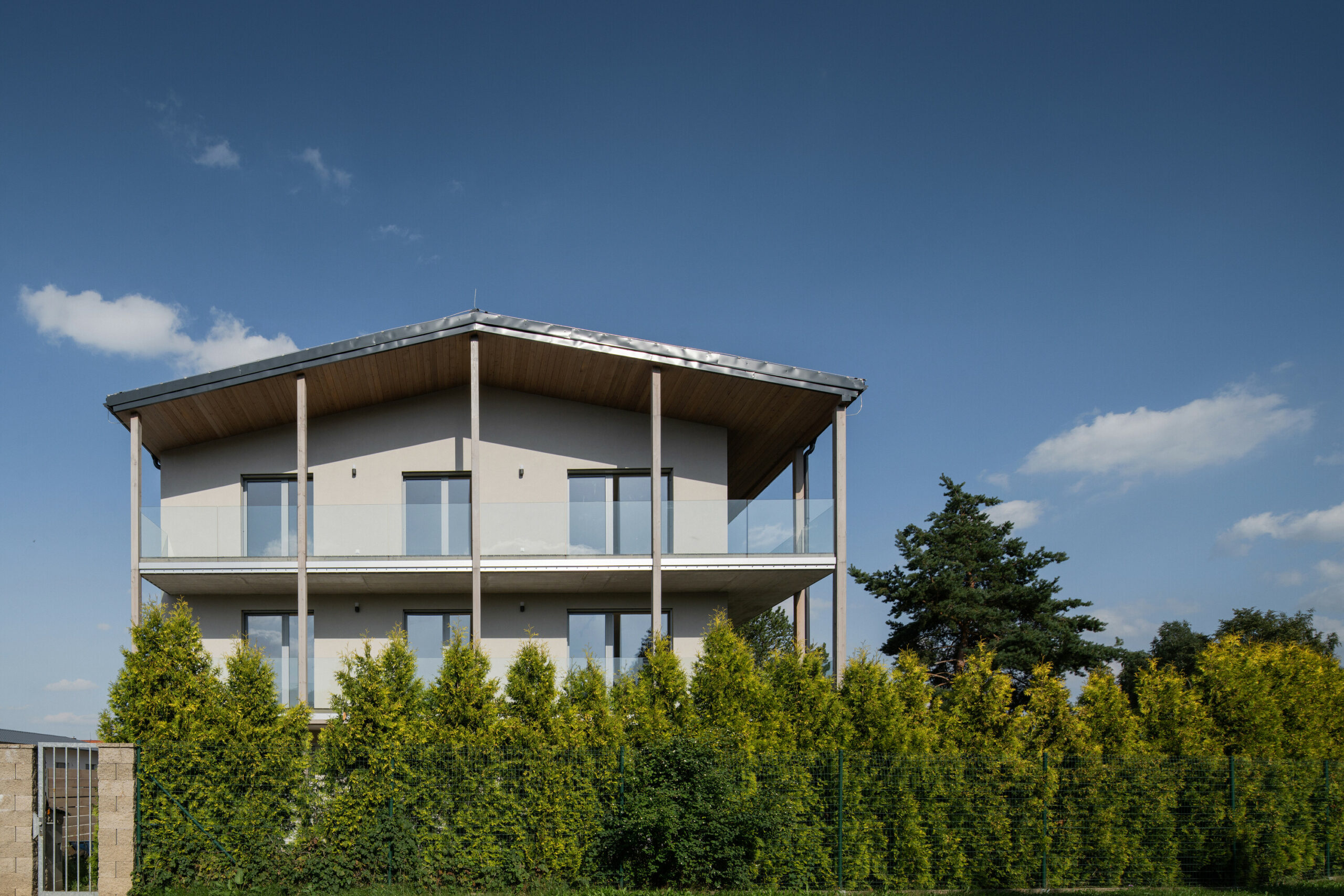
On the footprint of the southern structure, which was demolished due to poor foundation conditions, a new three-story building was built.
Along its southern and eastern facades, we designed continuous balconies that provide shade and own terrace for each apartment.
By extending the gabled roof and creating a column arrangement, we unified the space into a compact silhouette.
The ground-floor apartments are connected by an entrance directly to the parking lot and use the original garden on the south side.
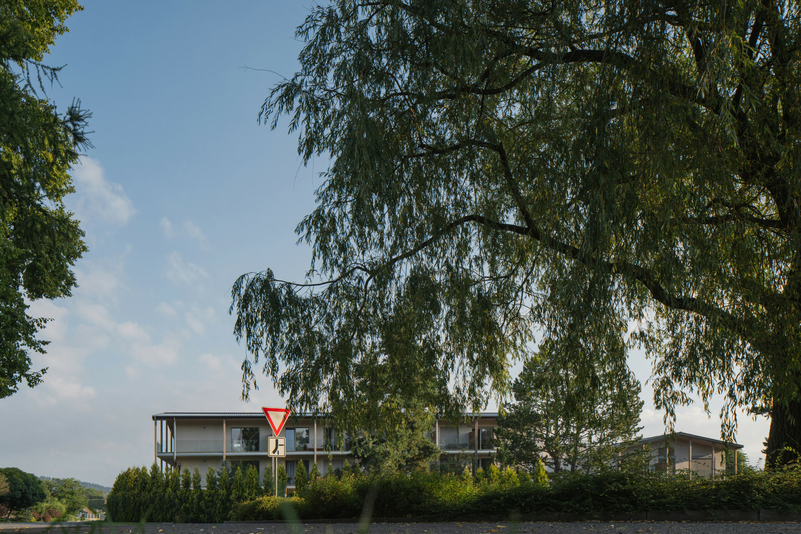
The eastern building, the old school used as a warehouse, had massive brick walls and a high stone base.
In this part, we propose maisonettes. These terraced houses, with the first floor at the level of the parking area, feature private gardens with views to the west towards the Brdy forests.
Each maisonette has its staircase entrance on the east side.
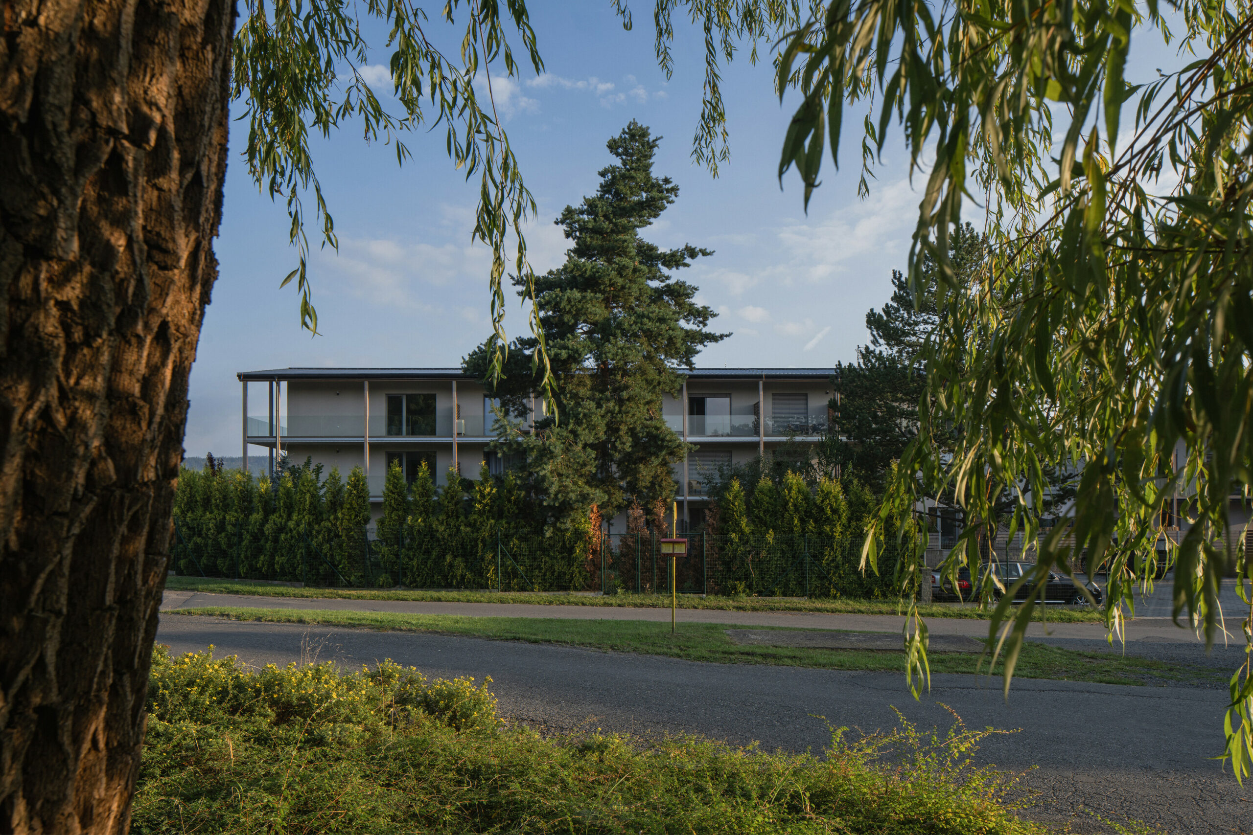
The third, northern building remains unfinished according to the original design.
The design intended to unify all the buildings, to architecturally harmonize them into one compact whole, which naturally follows the countryside morphology.
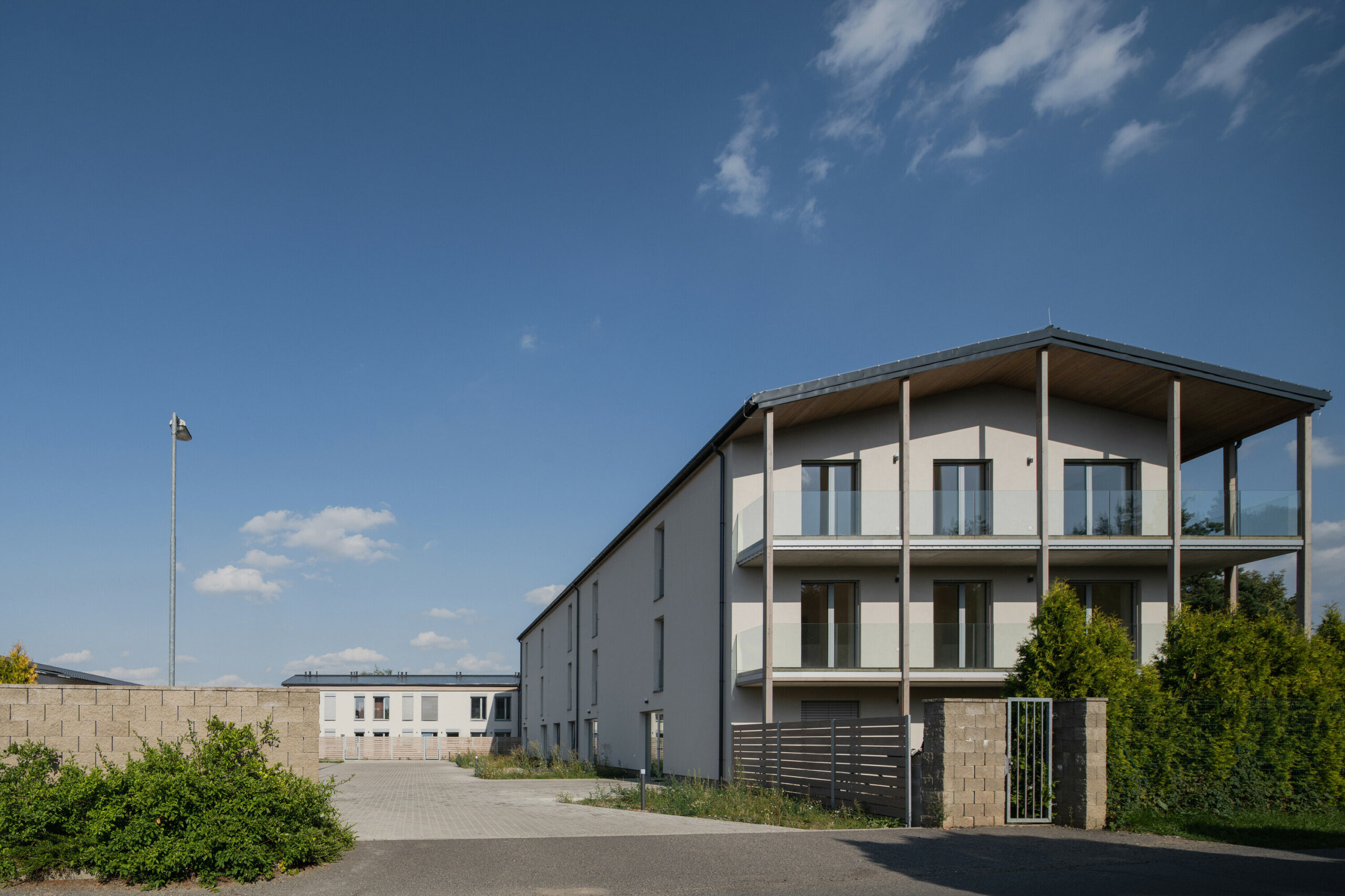
In designing, we were able to afford materials that would not make sense in a larger village.
We used wood as a characteristic architectural element for each building.
Its shades are unified throughout the site, as are the profiles of the railings, the color of the windows, and the door and window handles.
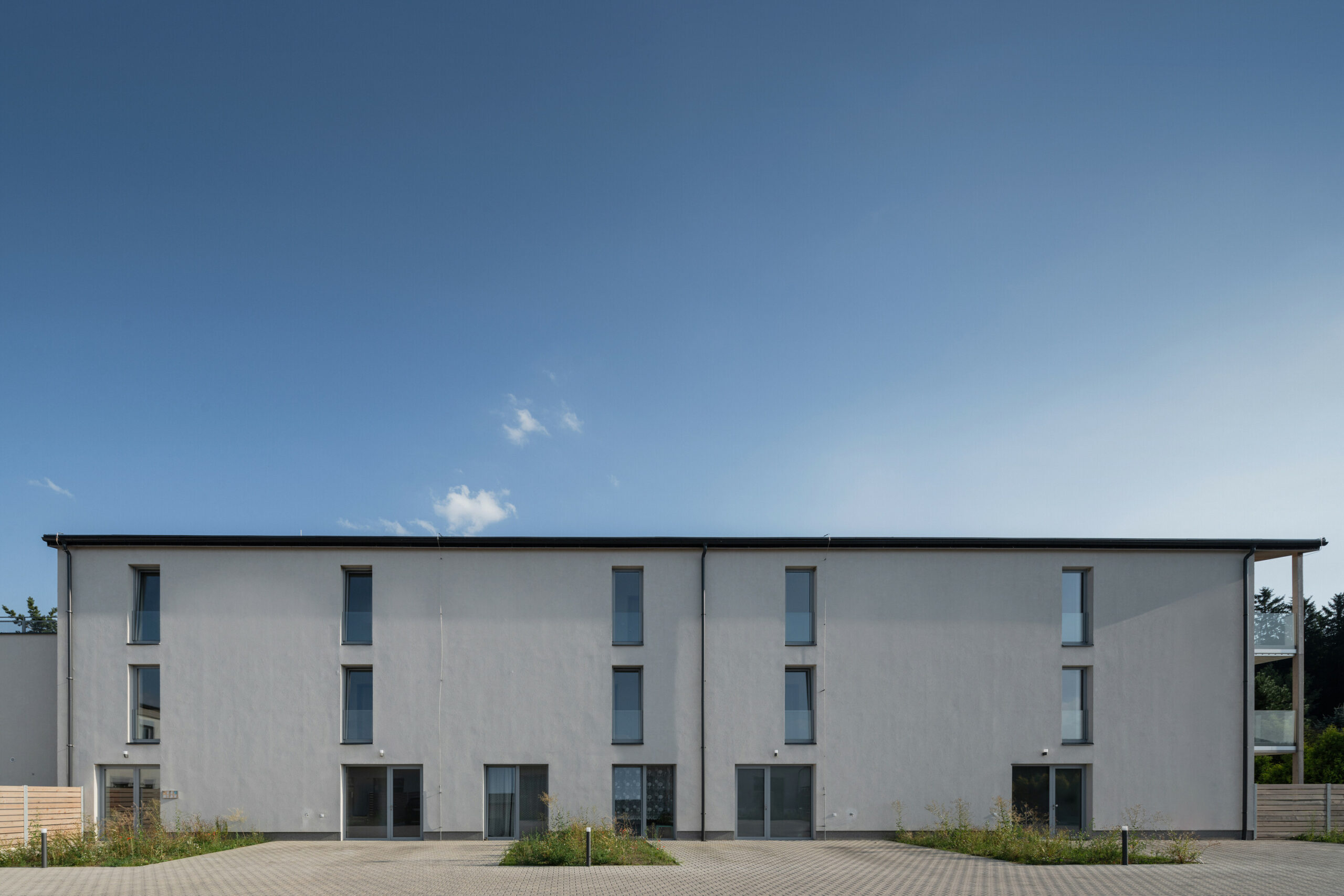
The design solution is different for each building and the roof is tin due to the low original pitch.
The southern building is constructed of Porotherm blocks and insulated with polystyrene according to the current energy standards.
An iso-beam system was used for the construction of the balconies due to the subtlety of the front edge and the possibility of visual treatment of the concrete.
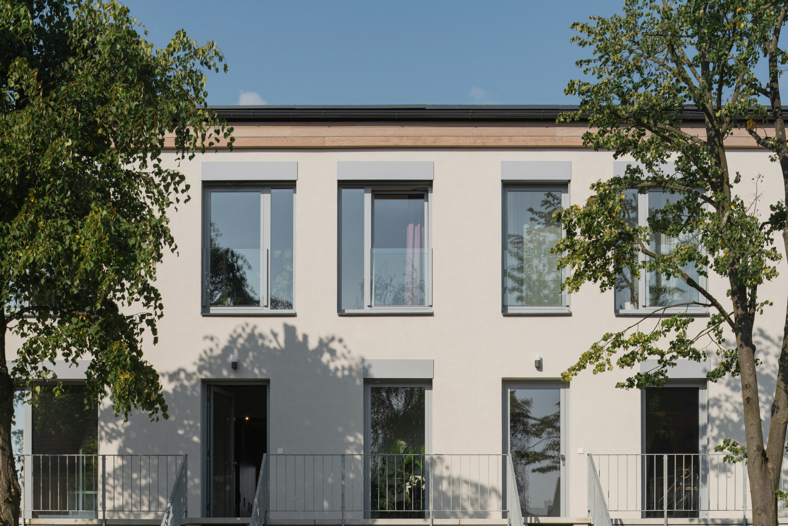
The eastern building has the original brick construction, which is provided with polystyrene contact insulation.
The external staircases are composed of precast concrete elements. In the maisonettes, a monolithic concrete ceiling structure is used.
Heating is centrally provided for all units by three powerful air-to-water heat pumps. Hot water tanks are located in the central technical room.

Long-Wardrobe Apartment
As part of the residential building design, there was also a detailed solution for one of the maisonette apartments in the eastern structure.
The relatively long and narrow apartment was conceptually divided into three zones in the longitudinal direction – closet, hallway, and everything else (bathrooms, rooms, kitchen, entrance hall, staircase).
The hallway connects one facade to another with a view from the entrance door to the garden.
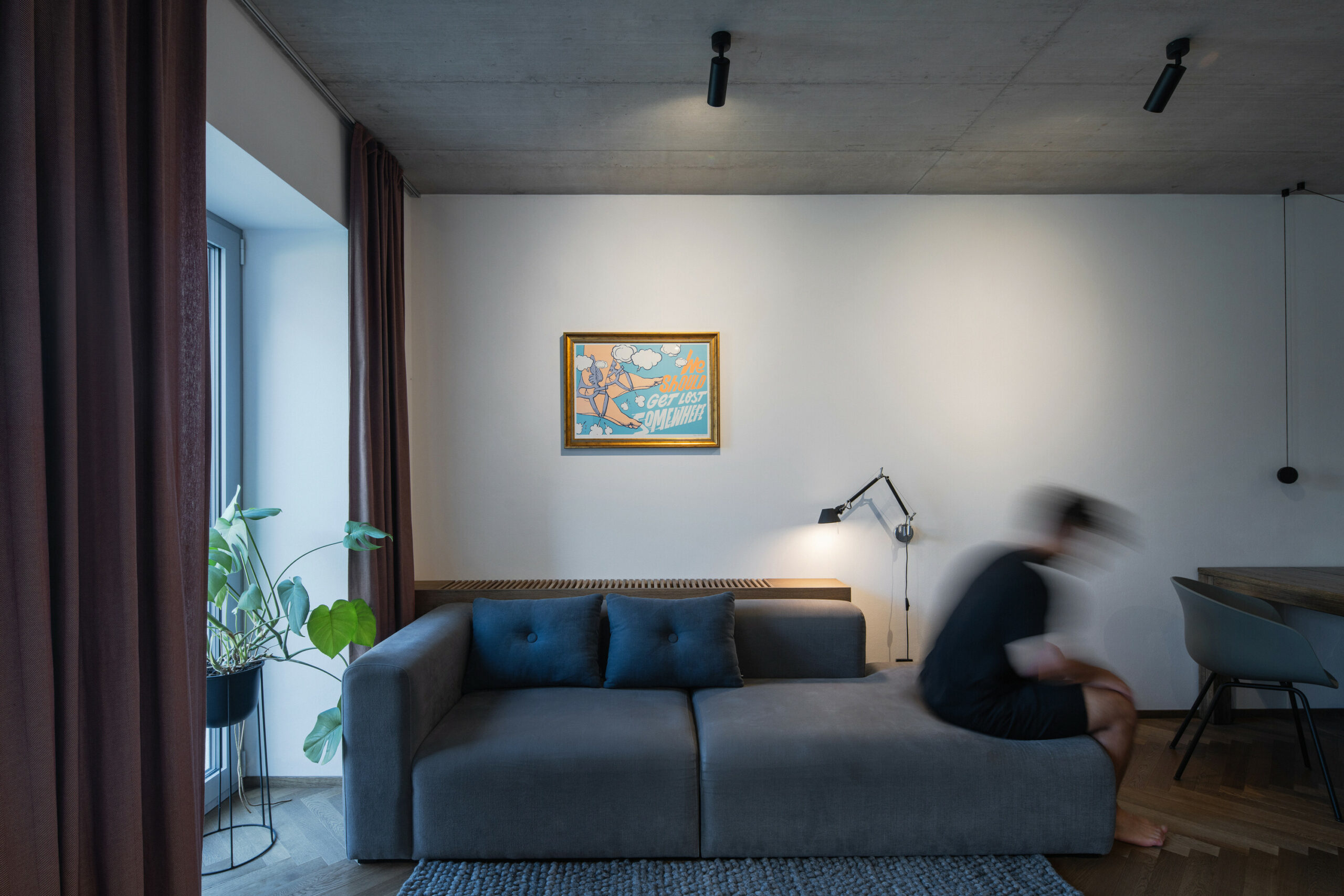
In the interior, we left uncovered a monolithic ceiling structure in contrast with the oak floor in a parquet pattern.
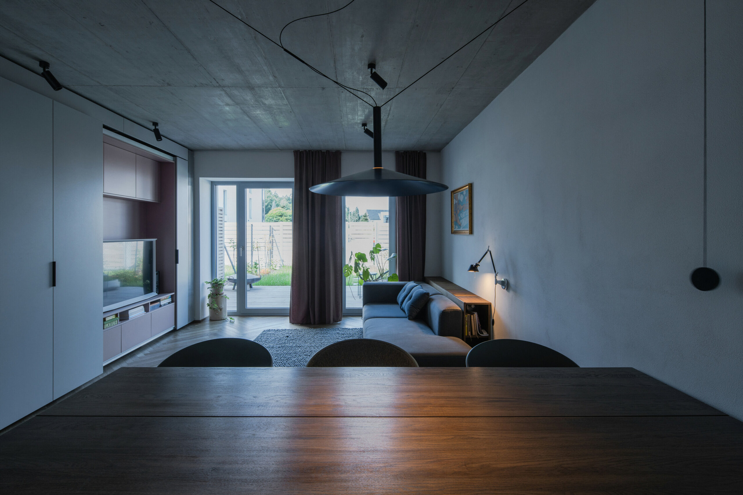
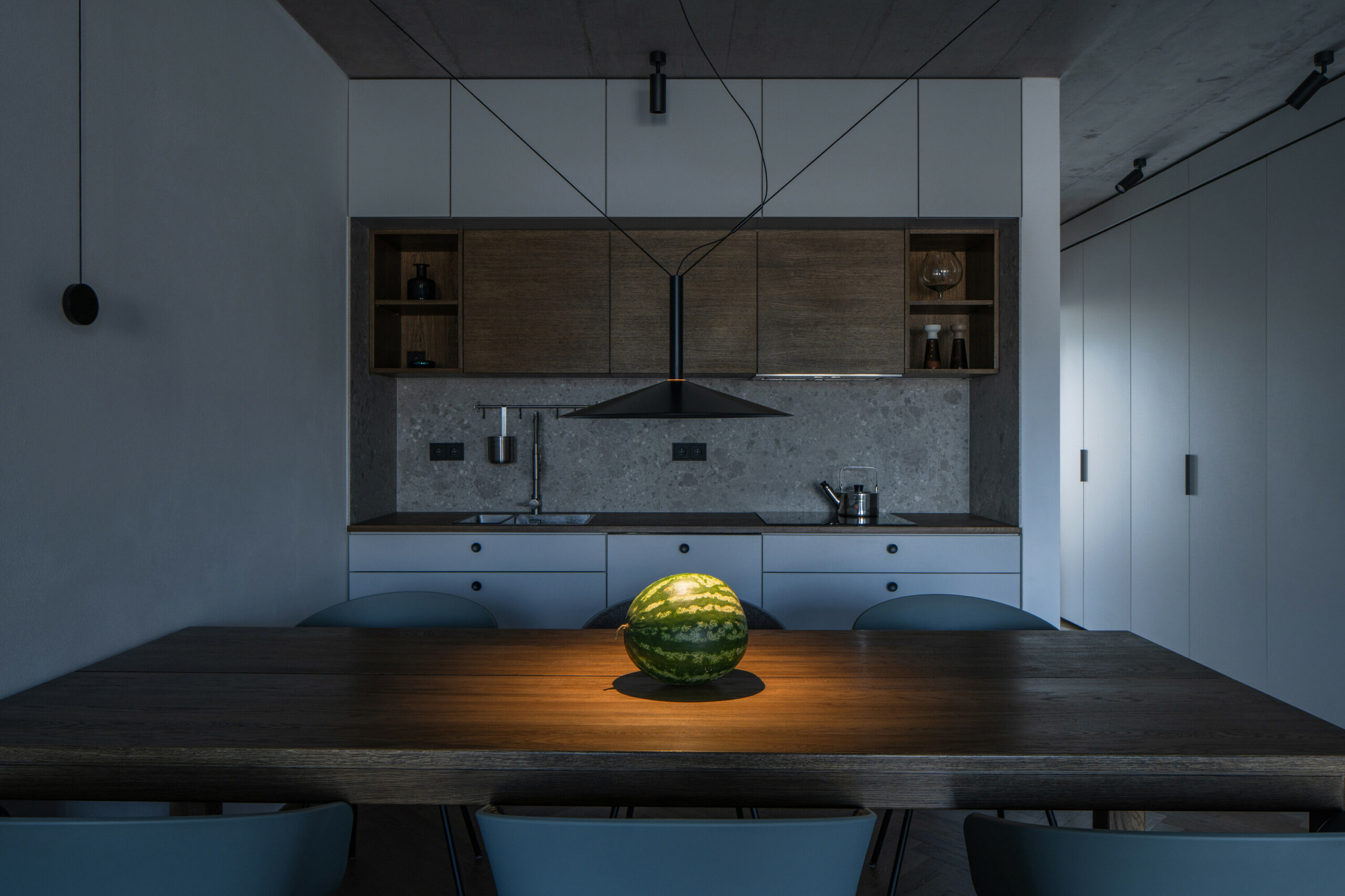
Along the side wall, a built-in wardrobe runs through the entire apartment, which adapts its functionality to the room: in the living room, a triple panel hides the TV wall, at the dining table it expands the kitchen area, and in the hallway opposite the bathroom we can find a cosmetic corner and other storage spaces.
Etiketler


