

- 28 September 2024
- 184 defa okundu.
Anamorphic Expression of Store Design: Teresinha Carteiras Bolhão
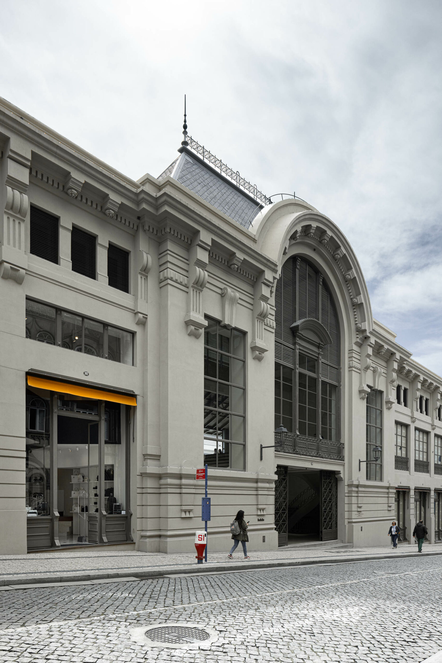
Designed by Anarchlab Architecture Office in Porto, Teresinha Carteiras Bolhão stands out as a striking example of how interior architecture and design philosophy merge, offering an unforgettable aesthetic experience beyond shopping.

Recognising the importance of making a good first impression, Teresinha Carteiras Bolhão uses innovative and expressive elements in its architectural design, providing an unforgettable experience for customers entering the interior.
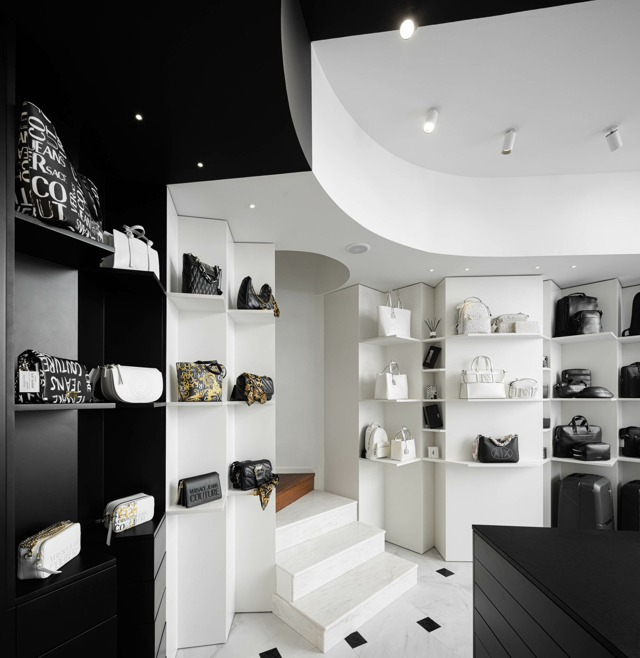
At the entrance of the shop, 45° displays showcase the products inside, attracting customers’ attention and allowing them to perceive the depth of the shopping area.

The periscope trick used in this design by Anarchlab Architecture Office in Mercado do Bolhão makes the interior architecture of the store more impressive, creating an eye-catching sense of depth at first glance.
The anamorphic design technique makes the perception process of the brand logo in the form of a large letter “T” at the entrance of the store unique.

When customers walk in, this logo is only clearly visible from the position and angle in which they are at that moment.
This unique approach strongly reflects the brand’s identity and design approach, while at the same time increasing visitors’ curiosity and enriching their shopping experience.

Teresinha Carteiras Bolhão, a shop identified with a large letter “T”, is not only a store, but also a striking example of how architectural design creates interaction and perception into an experience.
This building offers its customers an artistic design experience as soon as they enter the interior, demonstrating the emotional impact and aesthetic value of architecture.

Etiketler


