- 28 February 2009
- 854 defa okundu.
Besiktas Fishmarket
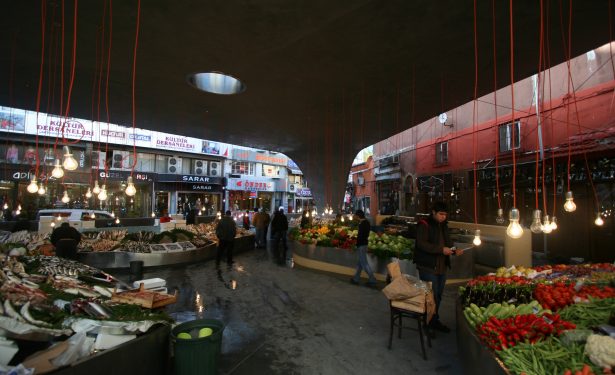
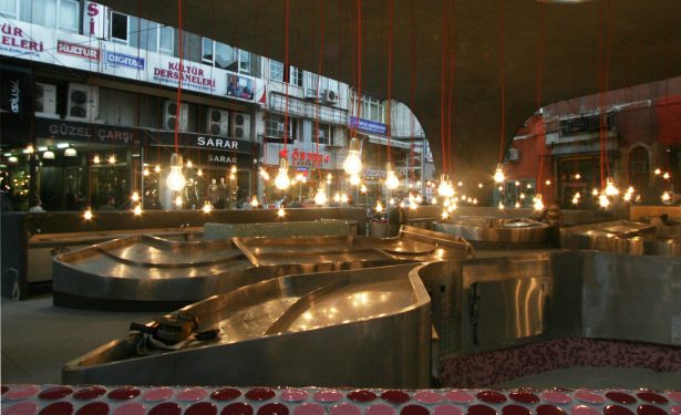
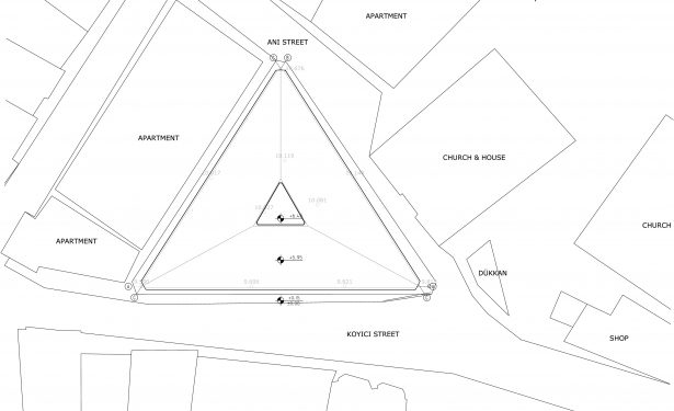
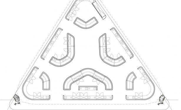
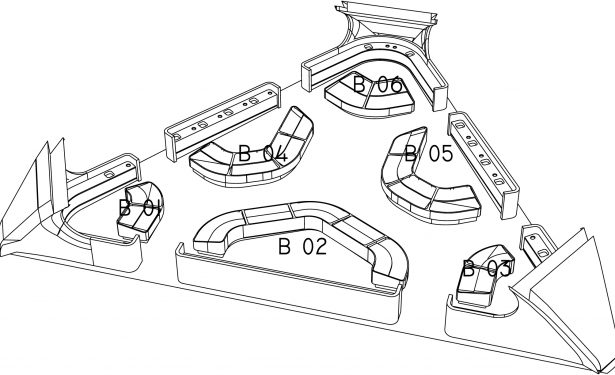
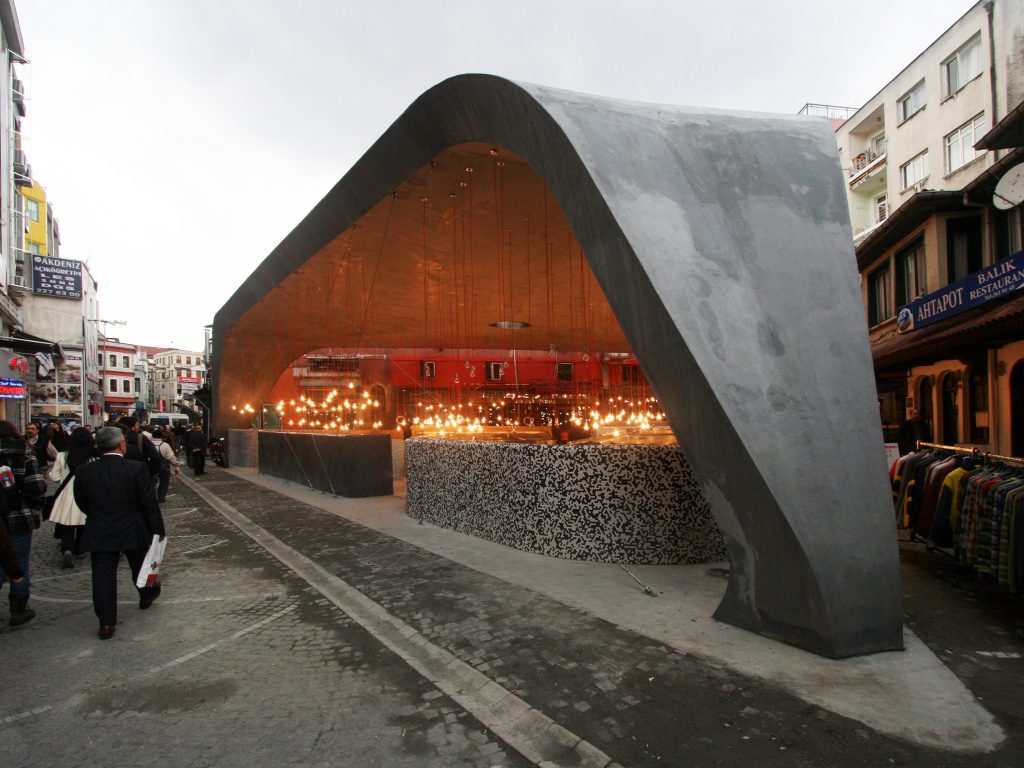
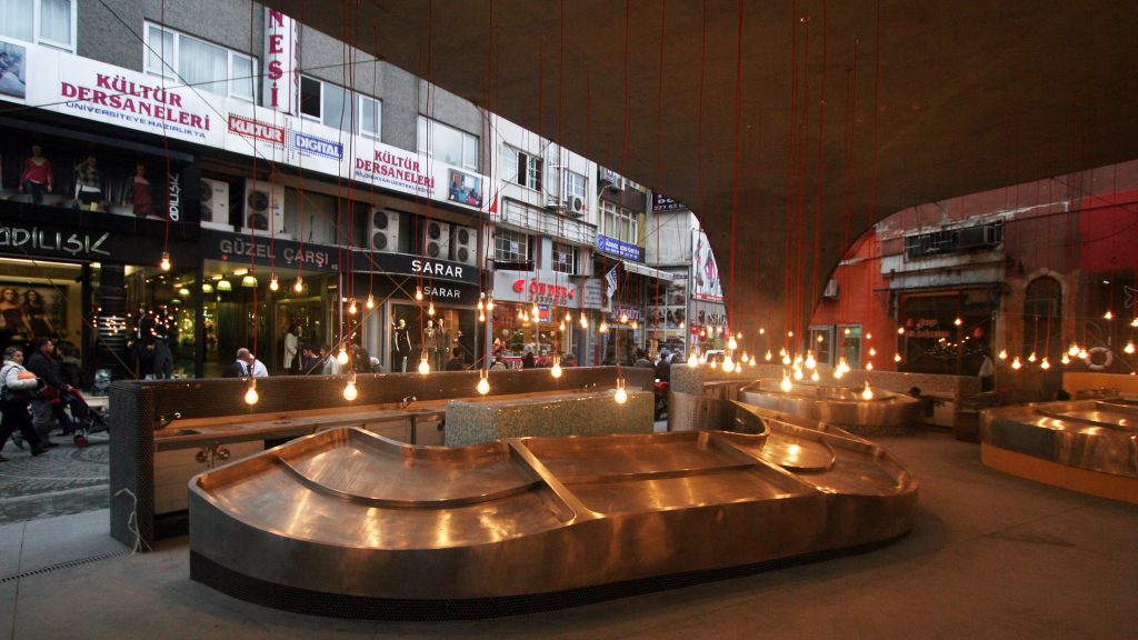
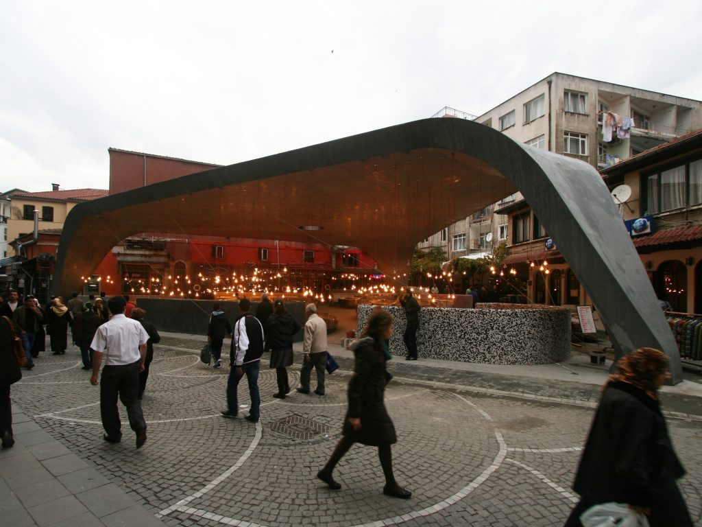
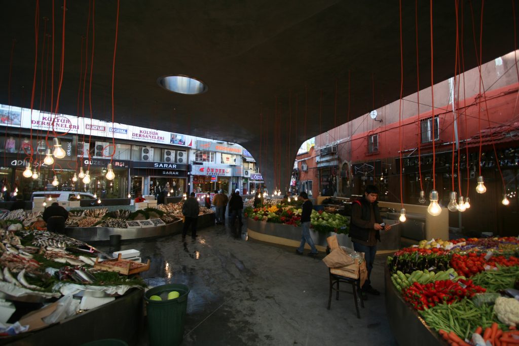
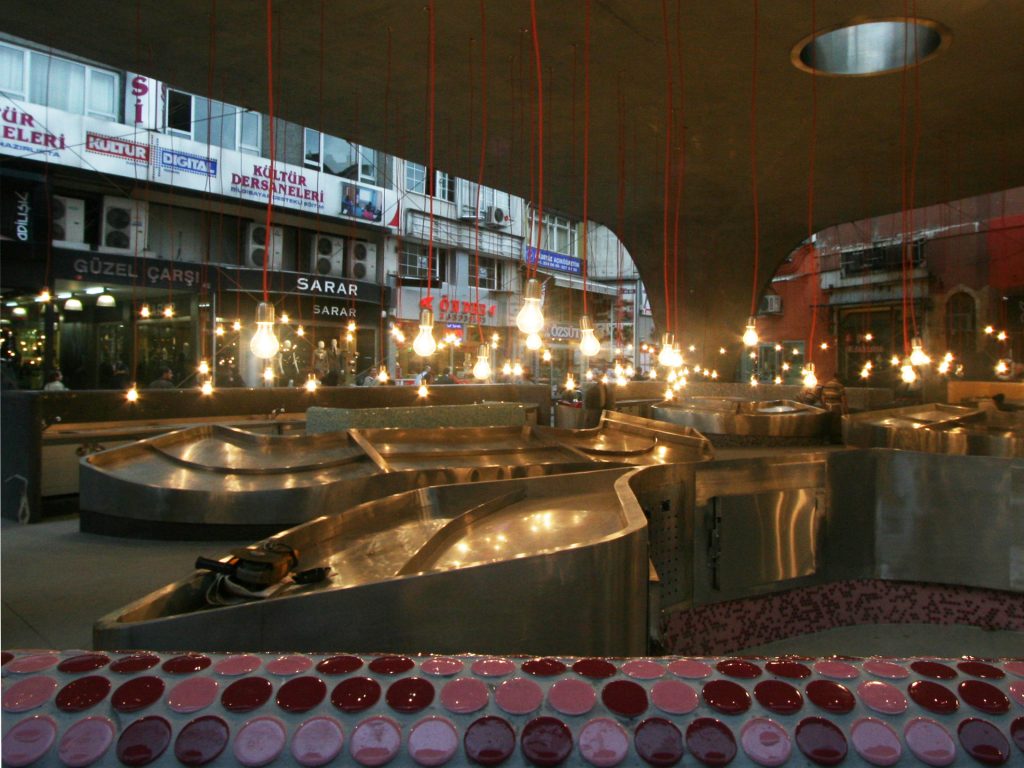
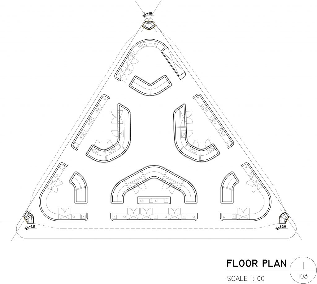
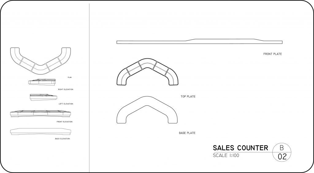
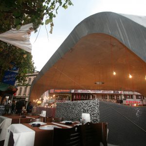
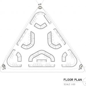
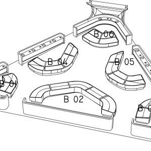
The design strategy behind the refurbishment of the historic fish market in the central Istanbul district of Besiktas was based on improving infrastructure and hygiene while organizing the stall and shop owners in a more contemporary retail environment. The seafood stalls of the many new supermarkets and shopping malls that had recently been constructed in Istanbul were more appealing with their modern appearance and infrastructure. The aim was to make the Beşiktaş Fish Market competitive with these new outlets yet retain the urban character of the area.
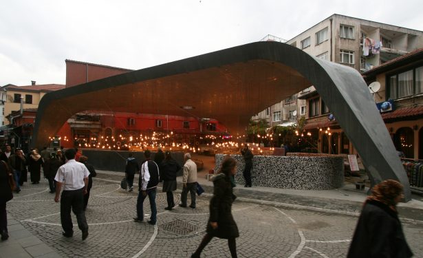
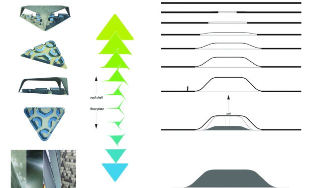
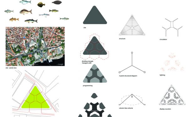
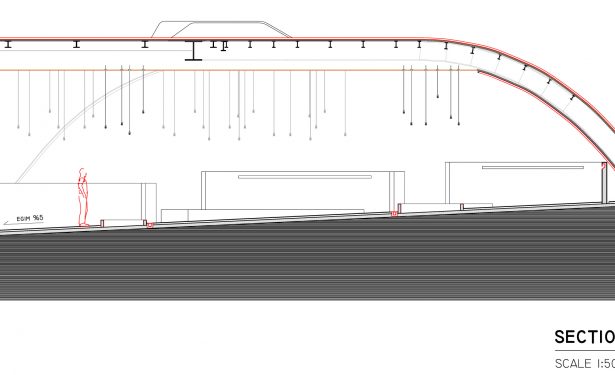
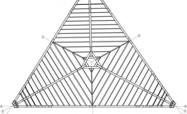
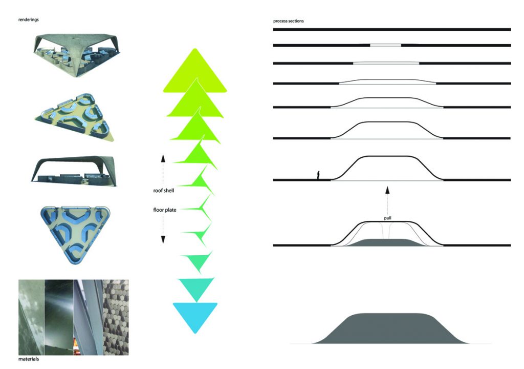
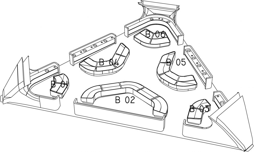
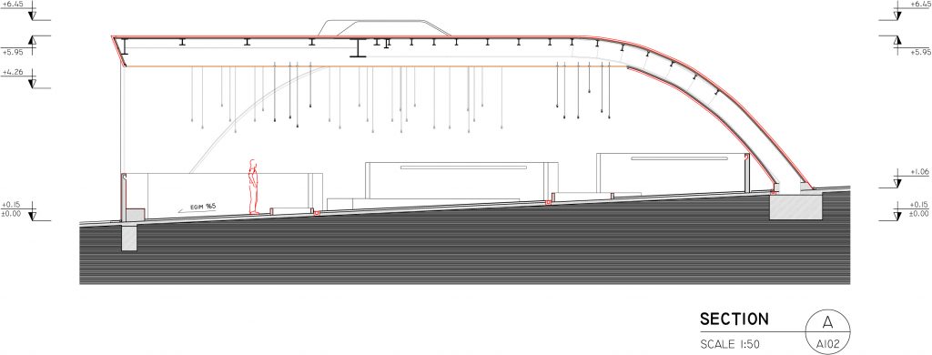
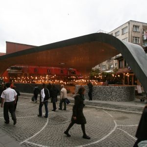
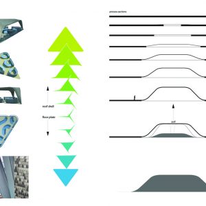
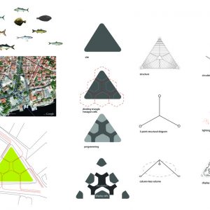
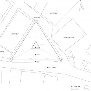
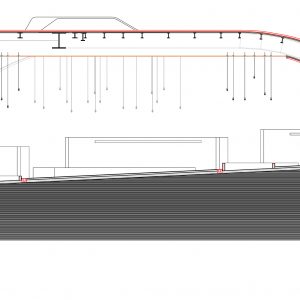
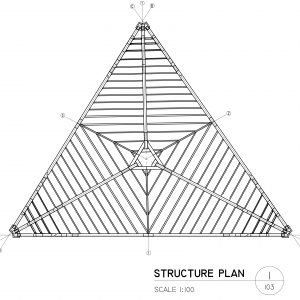
The design process started with a series of manipulations of the triangular site and its ground surface. This began by boosting the surface of the site, raising it up to create a slight rise. This was a ready solution that preserved the symbolic nature of the site in the urban fabric and the project design by drawing it out of the constrictive shape of the site.
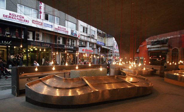
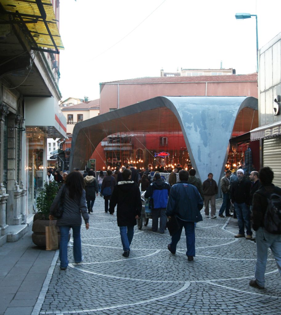
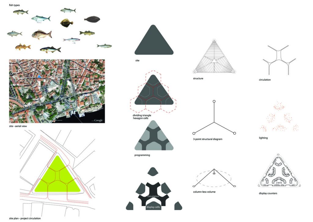
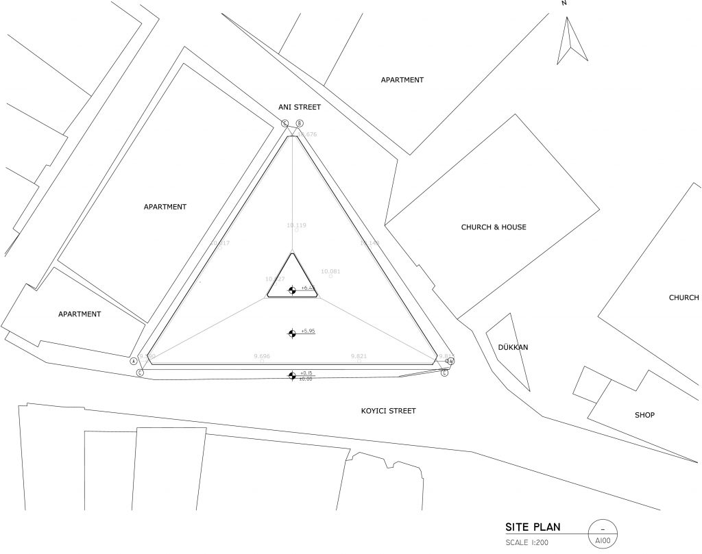
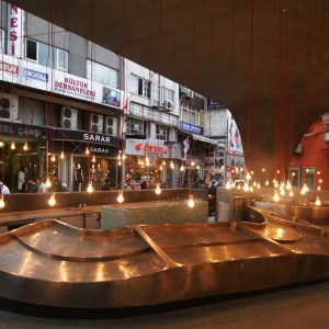
Other site considerations that influenced the design were the underground tunnels leading from the nearby Byzantine church that prevented deep excavations, local business owners insistence on a design that didn’t obscure their shop windows and very narrow medieval streets that were unfit for large vehicles to enter the area affecting delivery.
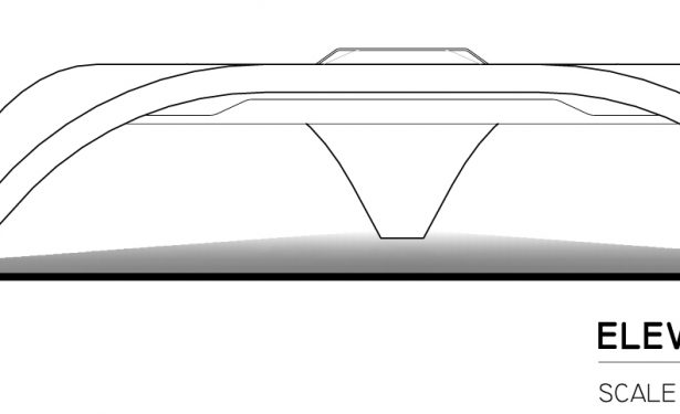
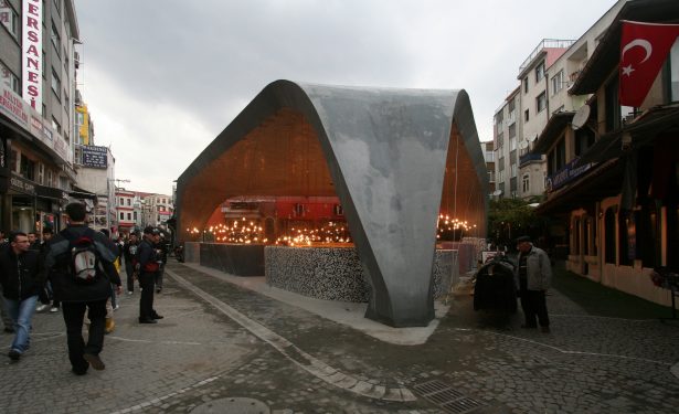
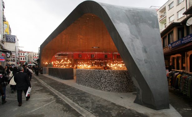
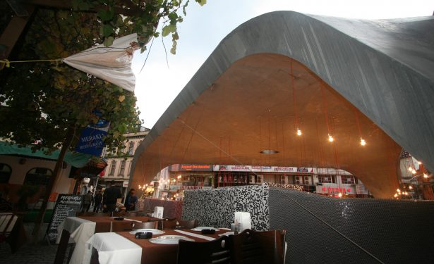
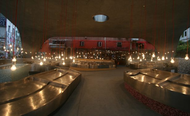
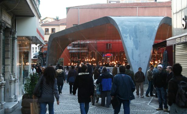
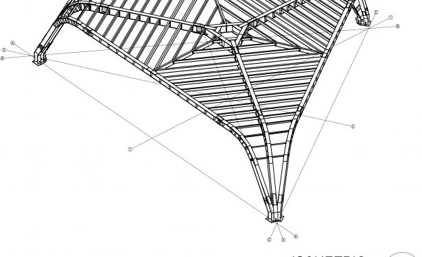
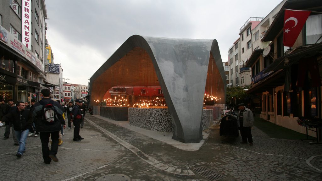
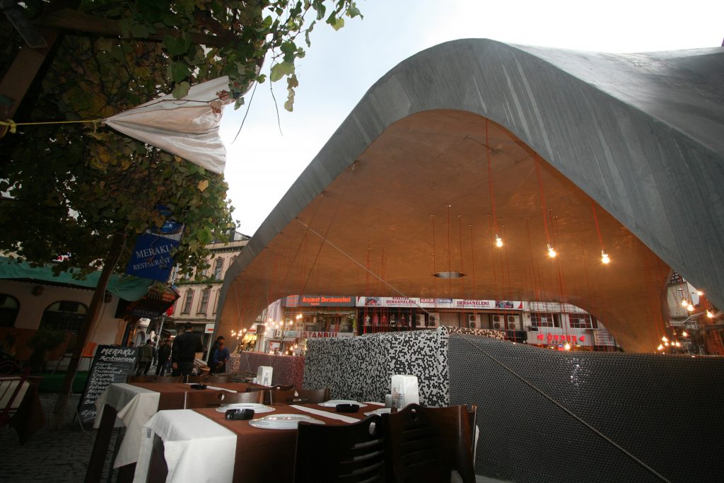
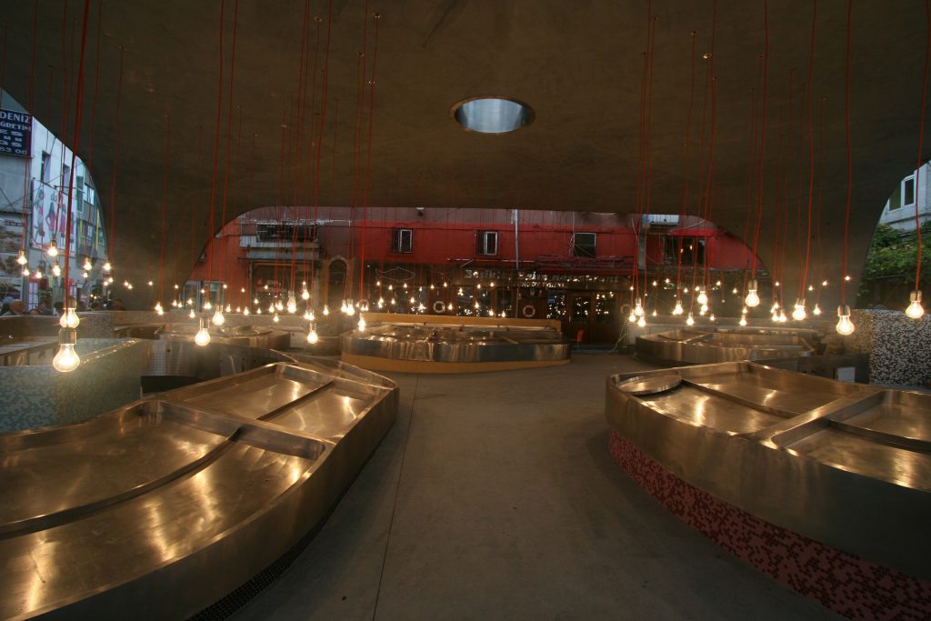
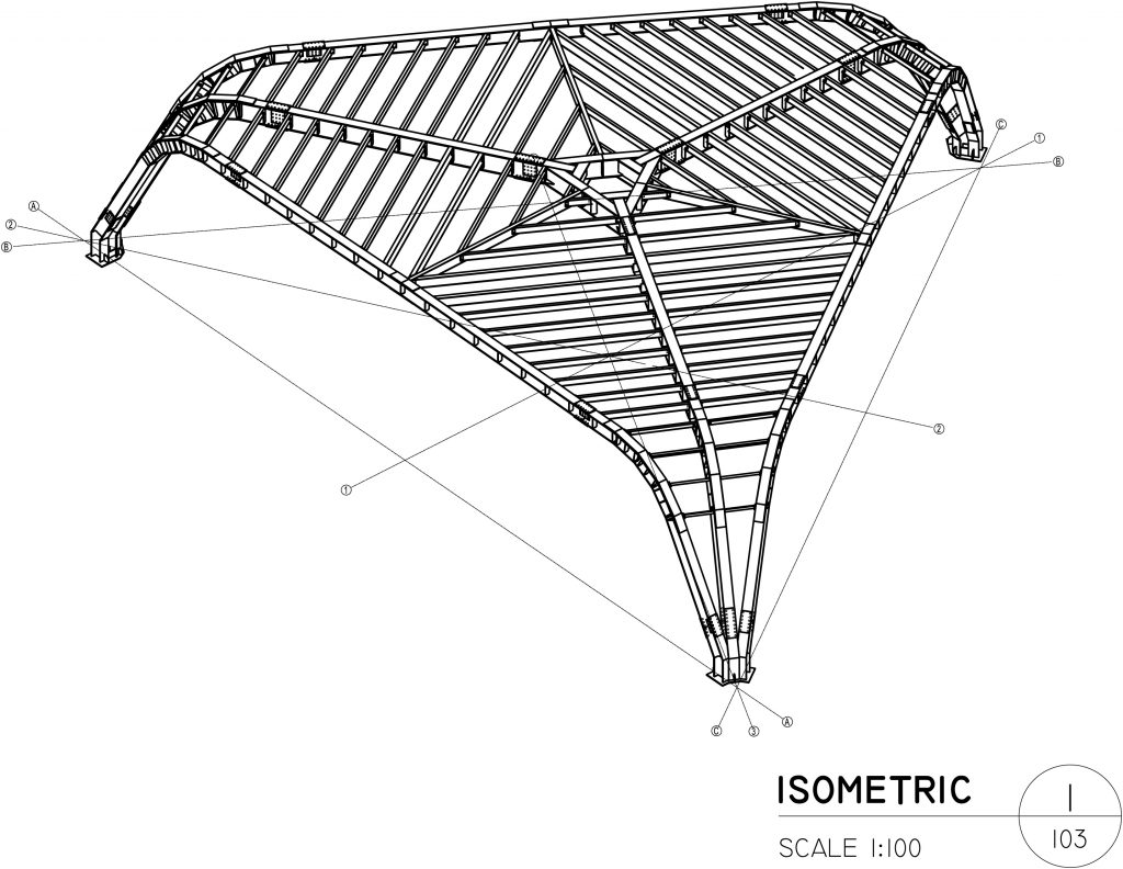
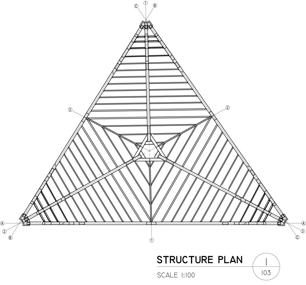
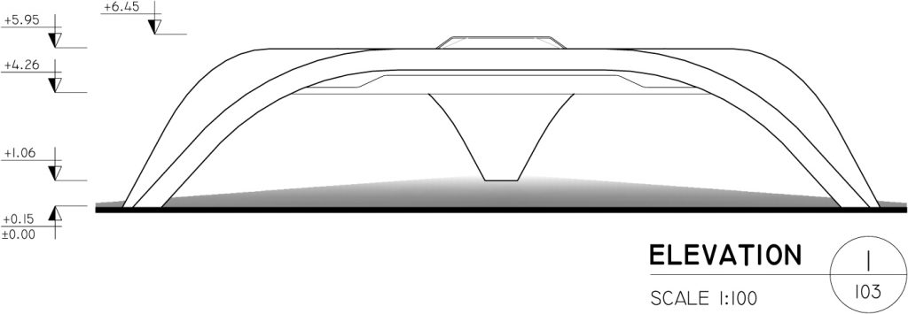
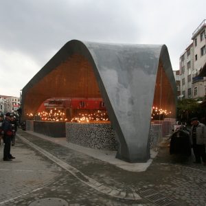
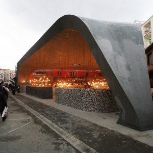
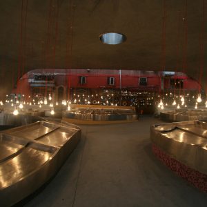
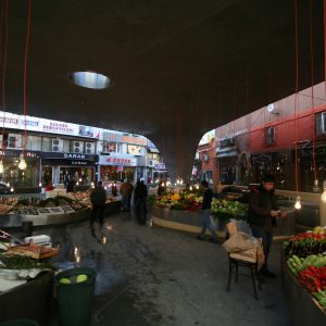
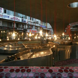
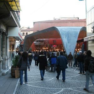
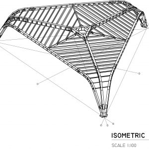
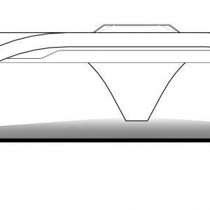
To achieve a welcoming appearance, the primary façade or surface was punctured along the site’s border resulting in a dynamic sweeping form in concrete that allows programmatic and circulation elements to easily mix and flow. The design was developed into a simple yet iconic concrete and steel seashell-like form covering the entire site with large openings at street level. The sturdy porous shell provides a column-free interior space, optimizing the project’s programmatic needs, while also providing a dramatic market and public space at the street level. The aim was to allow the circulation paths to easily connect the internal space to the larger, extended historic urban fabric of the district of Beşiktaş. In this way despite the principal shell form being quite strong to balance the hard volumes of the nearby buildings there was a dynamic, open flow of space to facilitate circulation and commercial activity that was the main intent of the design.
The new design presents a contemporary and pragmatic solution for the famous Fish Market in this important urban location; it has become a proud beacon of the community’s effort to improve their market and neighborhood. GAD working collectively with the primary stakeholders, the municipality and fishmongers, realized a design that met the programmatic needs of the Fish Market as a retail outlet but perhaps more importantly realized a modern public space with an innovative approach to form and materials in the traditional fabric of the city.
Etiketler

