- 19 November 2022
- 1009 defa okundu.
Bond Street Station
A new point of arrival into London’s West End designed by John McAslan + Partners with engineers WSP creates an uplifting passenger experience that celebrates the urban realm of Bond Street station.
Two new spacious and refined colonnaded station entrances on Hanover Square and Davies Street designed by John McAslan + Partners and engineers WSP will accommodate nearly 140.000 Elizabeth line journeys daily through the newly opened Bond Street station, allowing direct access to the West End from outside the capital.
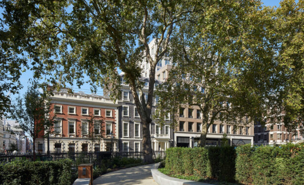
A work of major and intricate transport infrastructure and engineering, the new Bond Street station connects the Elizabeth line below ground to the platforms of London Underground’s existing Central and Jubilee lines. Above ground, it is an integral part of a transformative urban redevelopment embracing new mixed-used buildings rising above the two new entrances on Hanover Square and Davies Street. The scheme also incorporates a new pedestrian square, Medici Courtyard, the first in Mayfair for over a century. Significant landscape improvements, meanwhile, have been made to Hanover Square.
The station entrances play a key role – practically and visually – in an updated Mayfair streetscape, responding to and heightening the character of their immediate surroundings. The focus for John McAslan + Partners has been to articulate the entrances as confident and clearly legible front doors to the new station while responding carefully to the existing grain and fabric of this long-established and high-end quarter of central London. The response needed close engagement with the client, the City of Westminster and other local stakeholders.
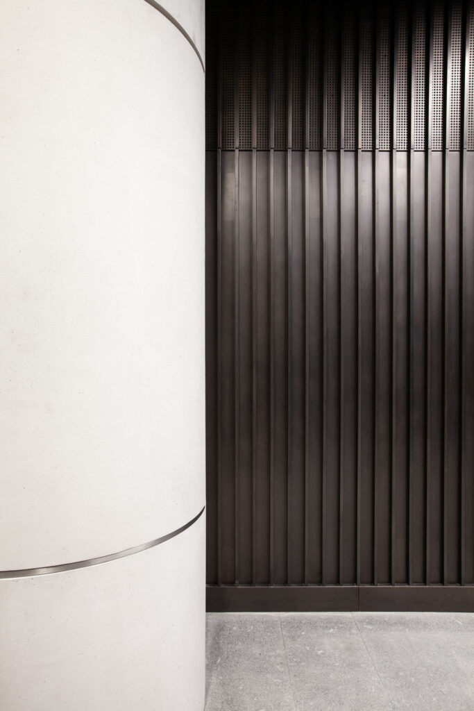
In terms of local elements informing the station entrance designs, John McAslan + Partners looked at existing materials and character of Hanover Square and Davies Street. The dominant building materials of Hanover Square – one of the West End’s first Georgian squares – have been Portland stone and brick as dominant materials. The Hanover Square Elizabeth Line entrance exhibits Georgian proportions and is faced in Portland stone. In contrast, the western entrance on Davies Street responds to a local vernacular of sandstone and red brick established by the period style of Victorian and Edwardian architecture. Spaces between columns along the stations’ colonnades are filled with glazed window panels or bronze- framed ventilation panels and bronze-hinged grille doors.
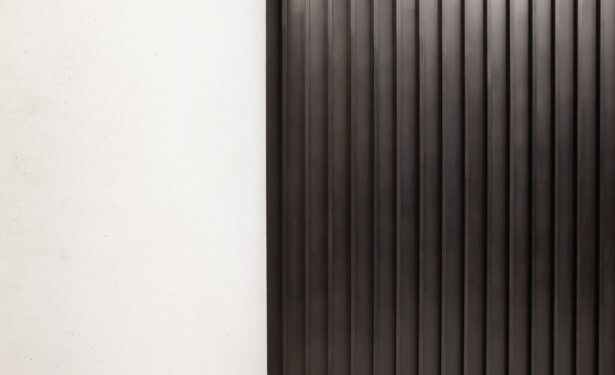
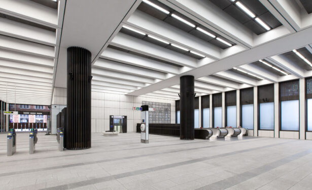
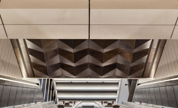
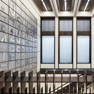
The high and spacious, coffered ceilinged interiors of both station buildings are concerned primarily with clarity and ease of movement. Grand floor-to-ceiling colonnade windows bring generous daylight into the ticket halls while generous views out allow passengers, especially those leaving the station, to orient themselves. Both entrances employ a high-quality, pared-back palette of materials emphasising their simple, elegant scale and proportions. Fluted bronze columns are self- conscious references to the classic Underground stations designed by Charles Holden in the 1930s.
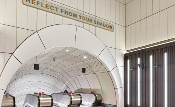
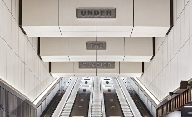
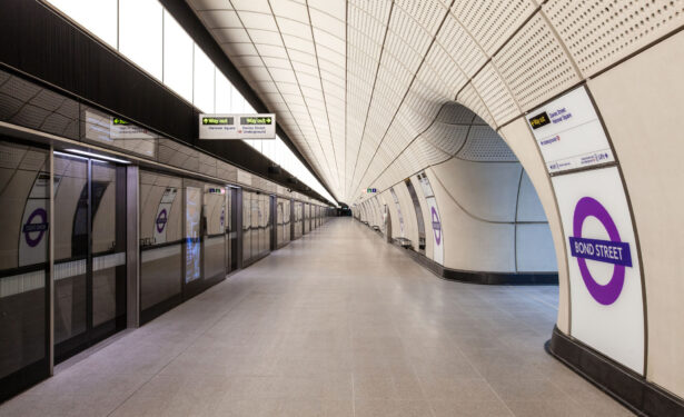
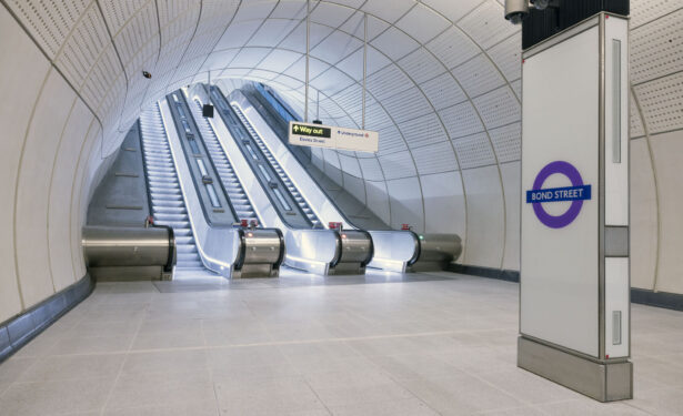
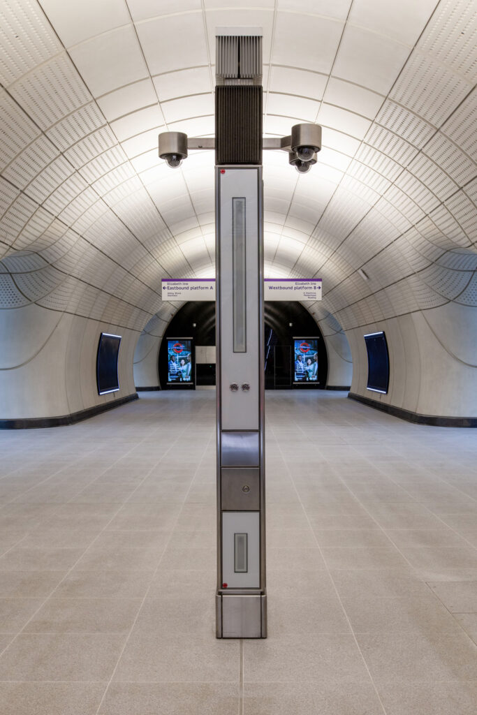
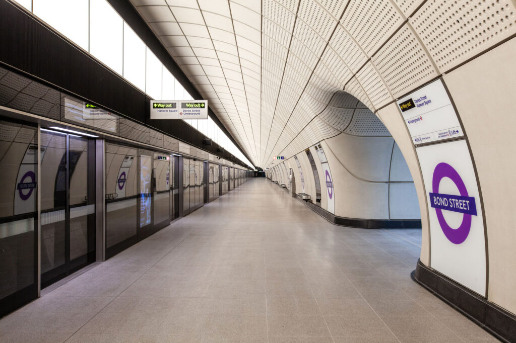
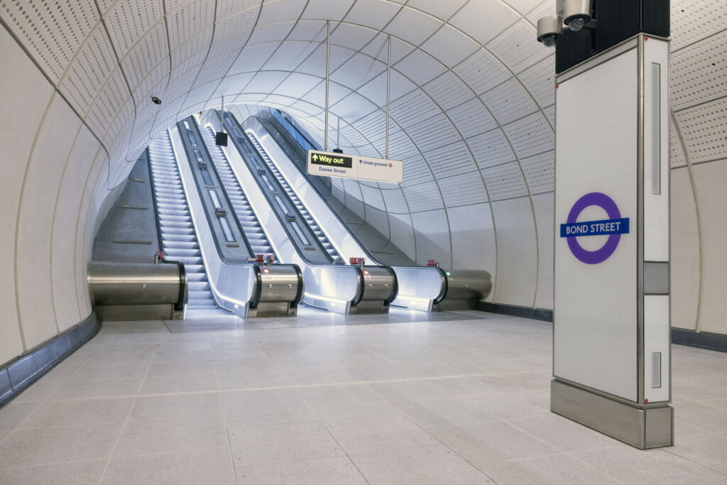
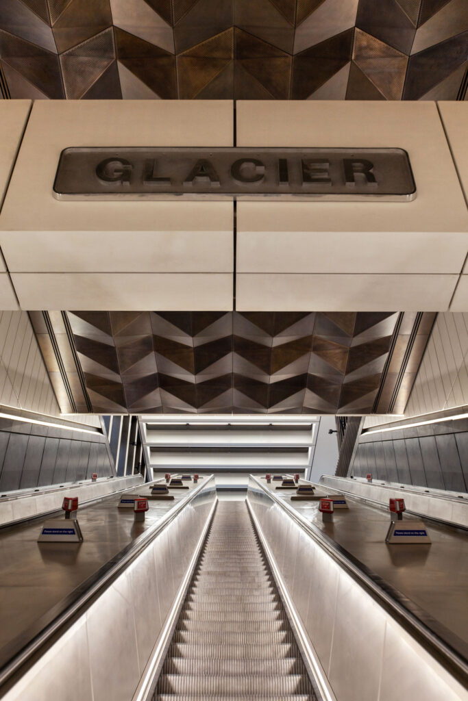
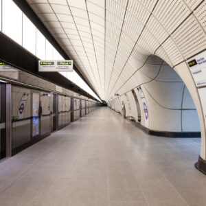
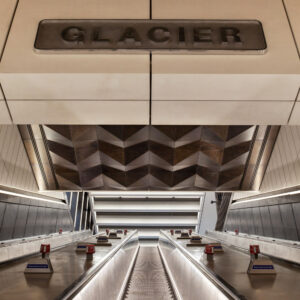
Wayfinding through the new step-free stations is intuitive across terrazzo floors to the rounded portals leading via escalator shafts – with bronze panelling above for decoration and sound absorption – to the uncluttered standardised Elizabeth Line passageways and platforms 28-metres below ground.
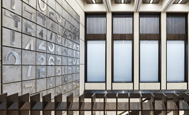
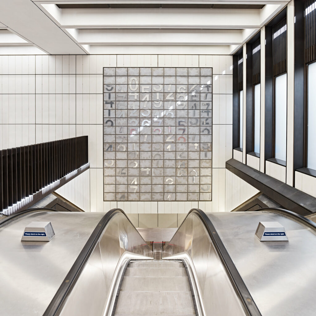
Three installations by British artist Darren Almond, with the support of the White Cube gallery, Selfridges and the City of London have been sited permanently above and around the escalators of the Davies Street entrance as part of the Art programme of the Elizabeth Line. A meditation on the mechanics of time and space, ‘Horizon Line’, ‘Shadow Line’ and ‘Time Line’ are cast in bronze and aluminium in the same aesthetic as the embossed numberplates that once adorned British Railway locomotives.
John McAslan + Partners’ Head of Transport Colin Bennie says,
“Bond Street Station will be one of the busiest on the Elizabeth Line, providing a significant new gateway for those travelling to London’s West End. It was therefore important to create legible entrances while establishing a compelling narrative with the existing physical and cultural character of the area, referencing local material and form. We also wanted to lift the user experience through the use of daylight, generous linked spaces and the integration of artwork, maximising visibility and creating connections. We have achieved these ambitions with the expert and discreet engineering design of our partners WSP.”
