- 11 March 2022
- 1098 defa okundu.
é é é – BSH Headquarters (Greater Dog Architects)
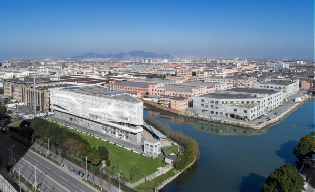
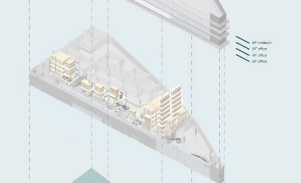
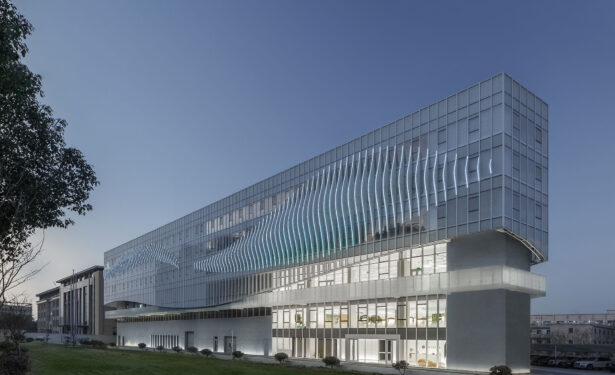
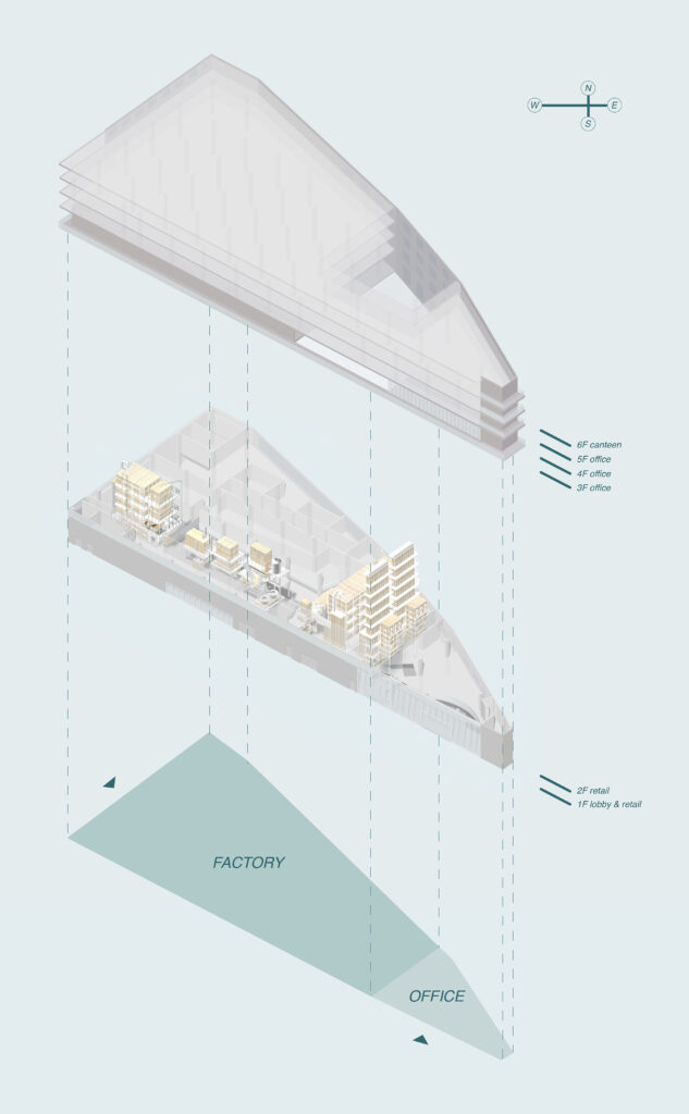
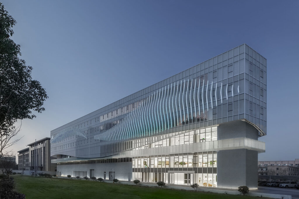
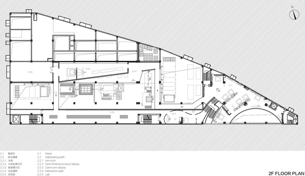
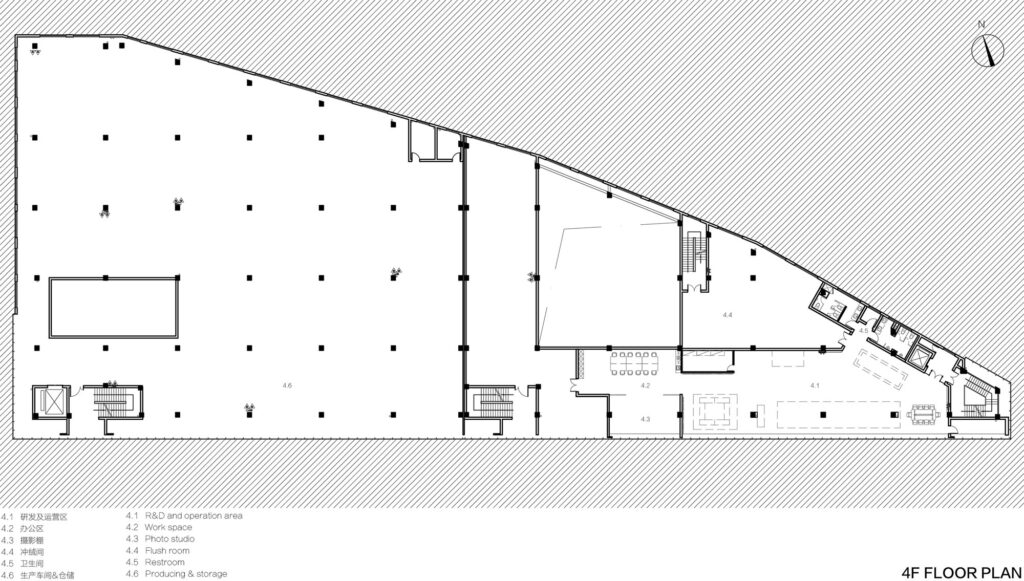
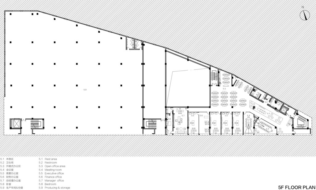
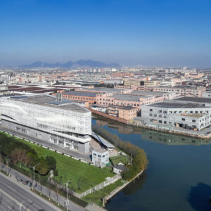
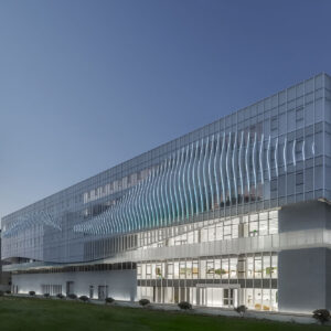
BSH headquarters is located in Shaoxing city, designed by the Greater Dog Architects. The main building called é é é that emerged in the city by its unique quality. é é é is a comprehensive functional building integrating retail space, office, restaurants, R&D and production, and sightseeing factory.
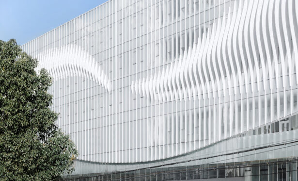
BSH focuses on bedding products that are from high-quality goose down. It finished from a series of production processes of raw materials – cleaning – processing – inspection – filling – labelling. The white linear structure language of the building is inspired by the characteristics of “goose down”.
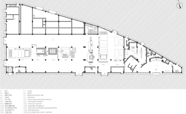
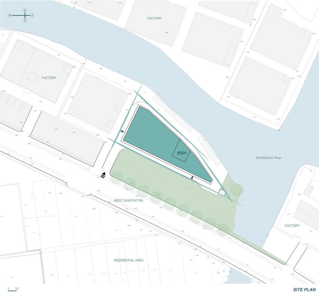
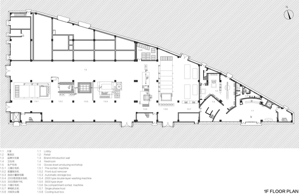
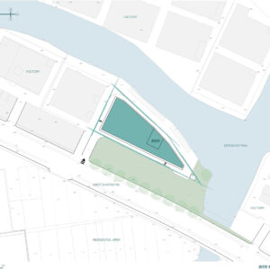
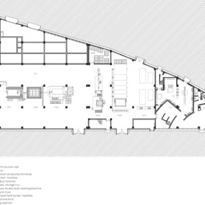
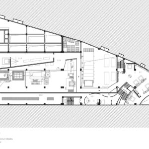
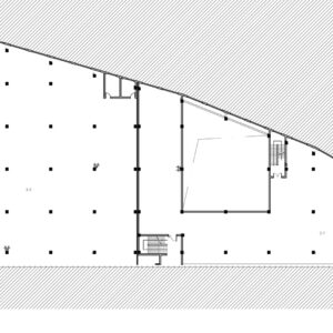
The original building site is triangular. Greater Dog Architects try to break this angular site and combine the softness of goose down to design a soft looking architecture, forming a strong contrast with the surrounding where high-density factory buildings appear, which also makes é é é building a very attractive place in the whole area.
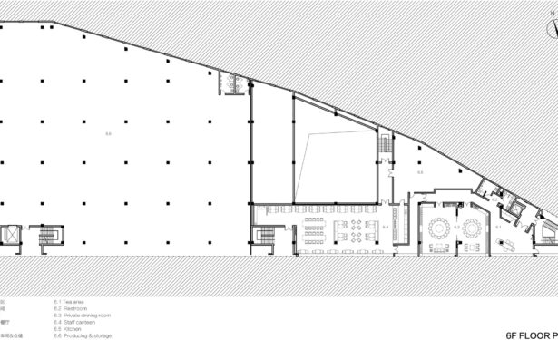
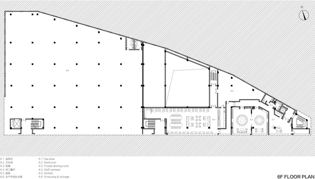
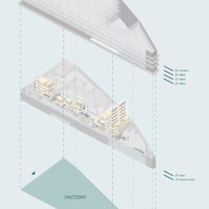
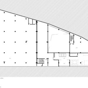
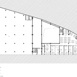
Two-way access is divided by main functions: factory and office. The entrance of the factory area is located in the west of the building, and it is connected with the main entrance by the shortest distance to produce efficient working access. The outdoor space retreats inside 30 meters are far away from the noise of the main road, and it makes the office environment become more independent and quiet. Furthermore, the green land guides the people to the southeast of the building where is an office & retail space are located.
The facade is the interface between indoor and outdoor. It is the attractive part of an elevation, it not only protects the building from external damage but brings opportunities for a comfortable indoor environment.
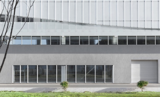
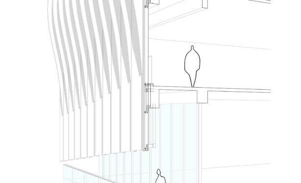
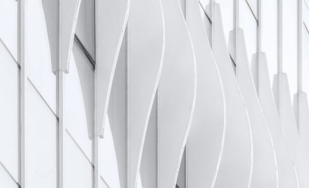
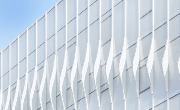
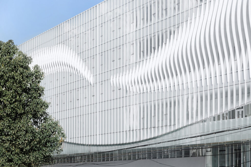
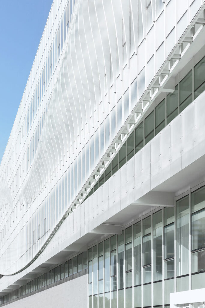
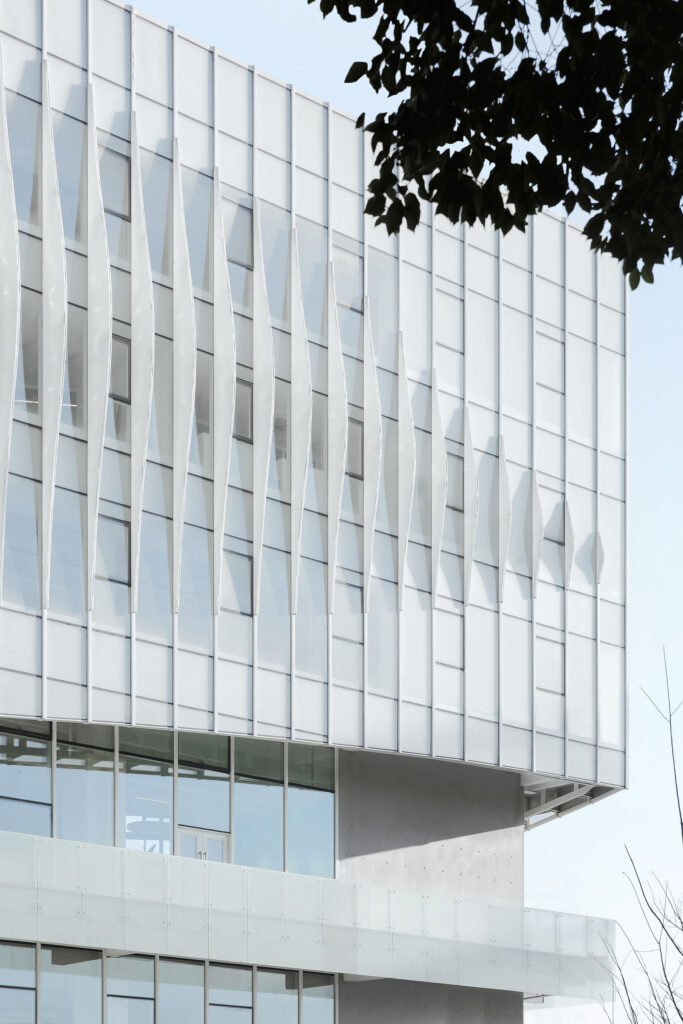
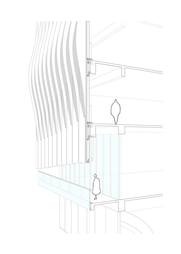
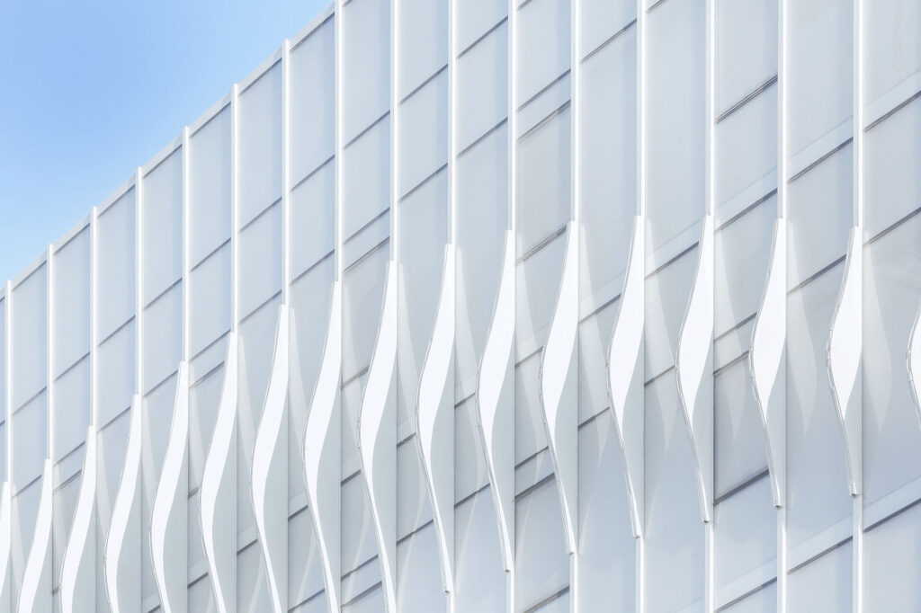
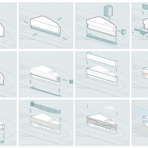
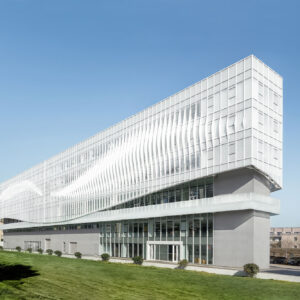
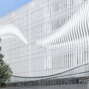
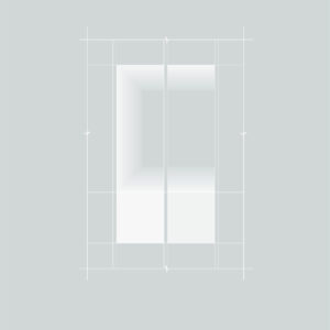
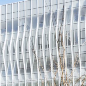
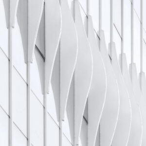
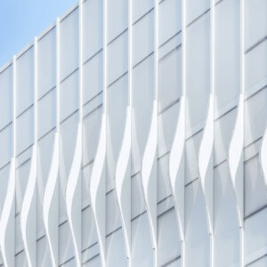
The building is designed as two parts: suspended and solid. The low area is solid concrete, forming a thick and stable building base, and the high area is a curtain wall system with gradient translucent glass and a white curved aluminium plate. The concrete wall is designed to retreat, which makes the white curtain wall more transparent and suspended in the air.
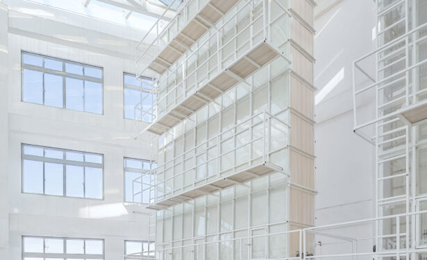
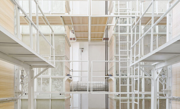
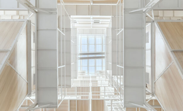
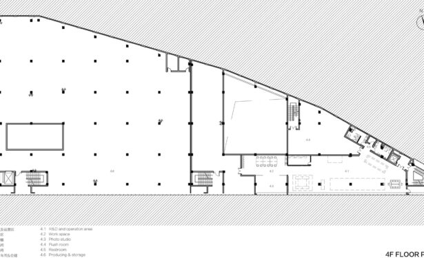
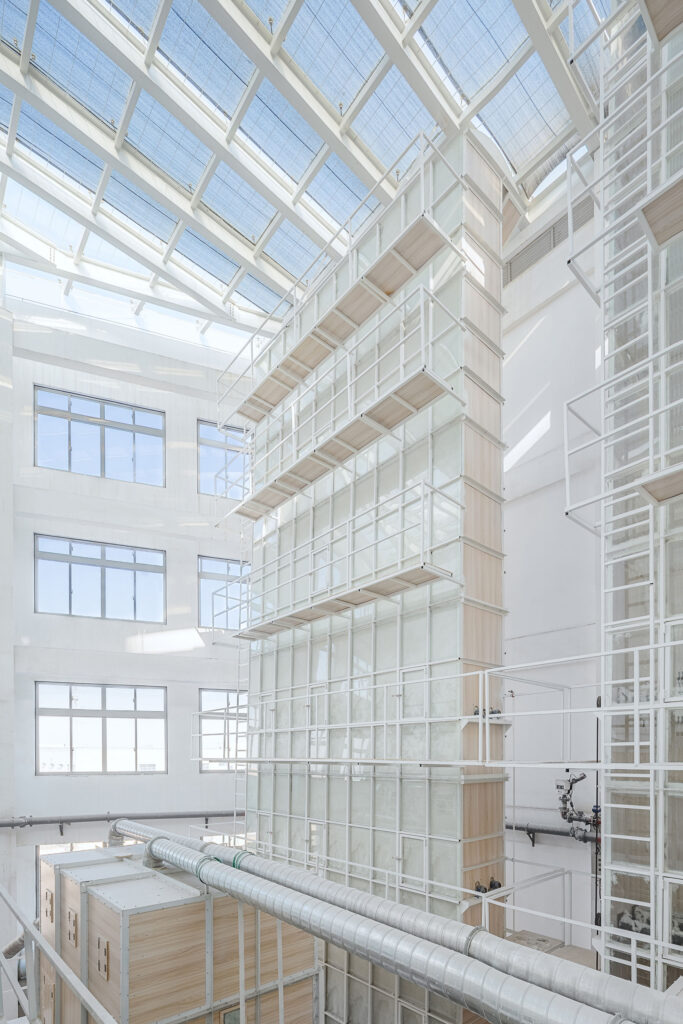
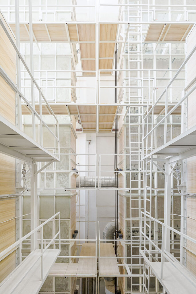
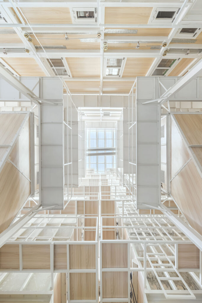
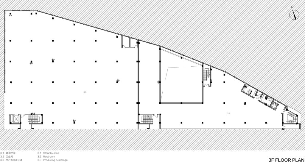
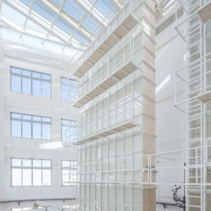
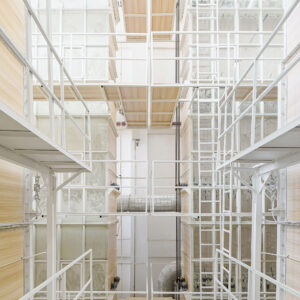
In the southwest factory area where the architect applied foggy glass, which visually avoids the chaos inside. At the same time, foggy glass makes the indoor and outdoor vision become hazy, which makes people curious. Inside of the factory area, the central block is removed, so that the producing machines around the atrium, creating a factory under the skylight for workers.
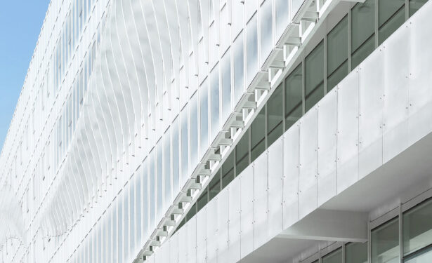
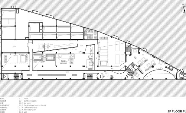
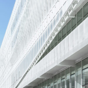
In the southeast area of the building, there are multi-function of interior spaces: retail, office and restaurant. The architect applied two kinds of glass on the facade, gradual translucent glass and transparent glass, to meet the needs of different sunshine demands of interior functions. Meanwhile, it brings a changing visual from hazy to high transparency gradually.
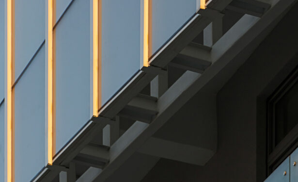
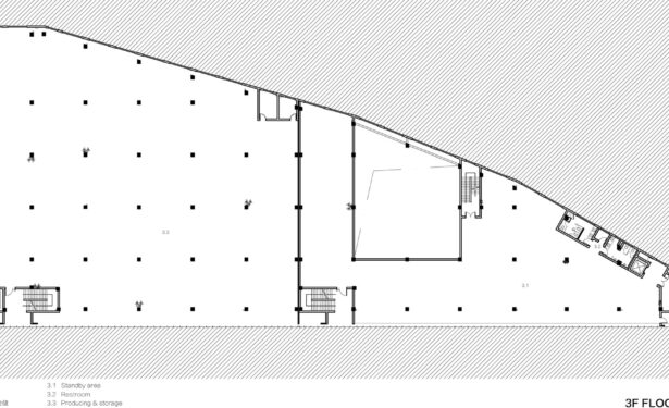
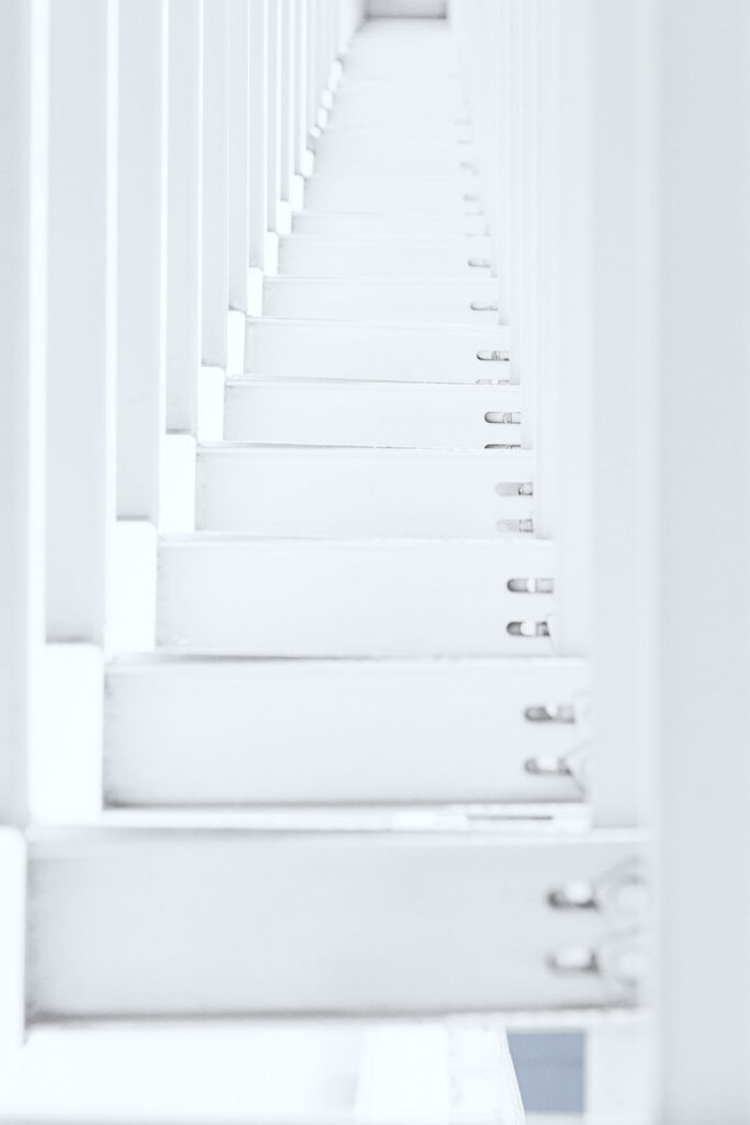
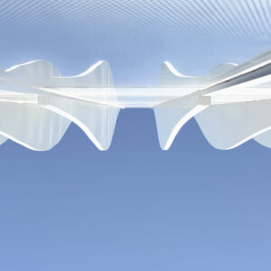
The architect designed the external corridor connecting the factory and office area on the third floor. The corridor is suspended on the facade in the form of semi outdoor, which provides more convenient traffic flow for two main areas, and creates a co-work space for people to communicate. Meanwhile, the external corridor brings balance between two different materials: white glass curtain walls and concrete. The supporting structure of the curved aluminium plate is clearly with the rise and fall rhythm in the corridor.
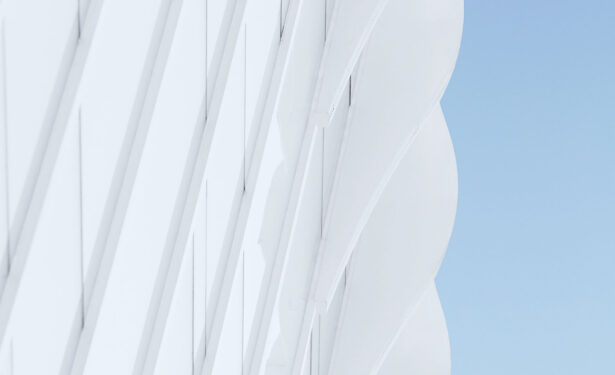
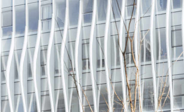
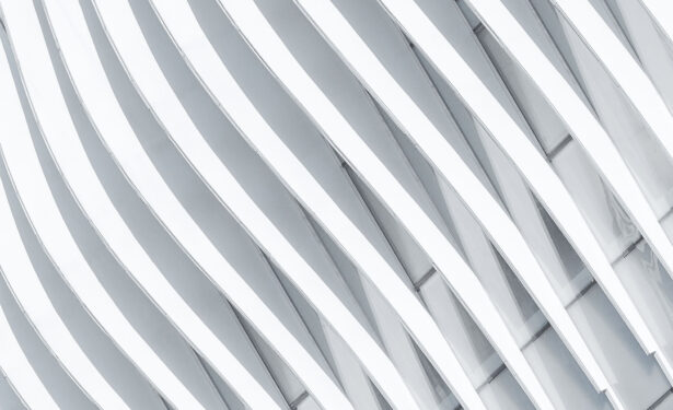
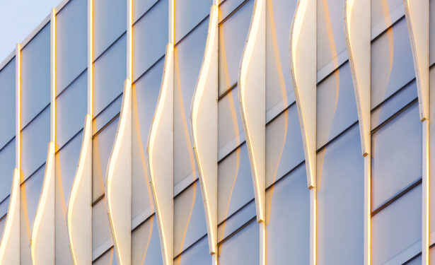
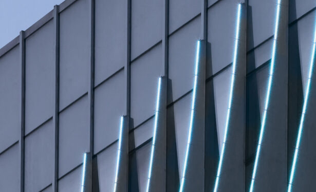
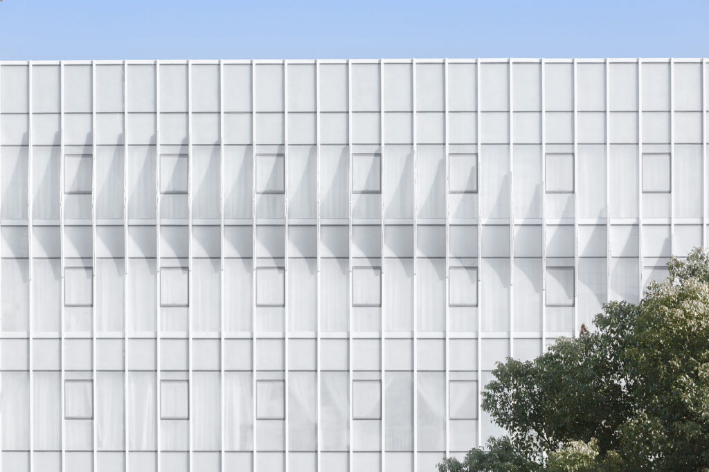
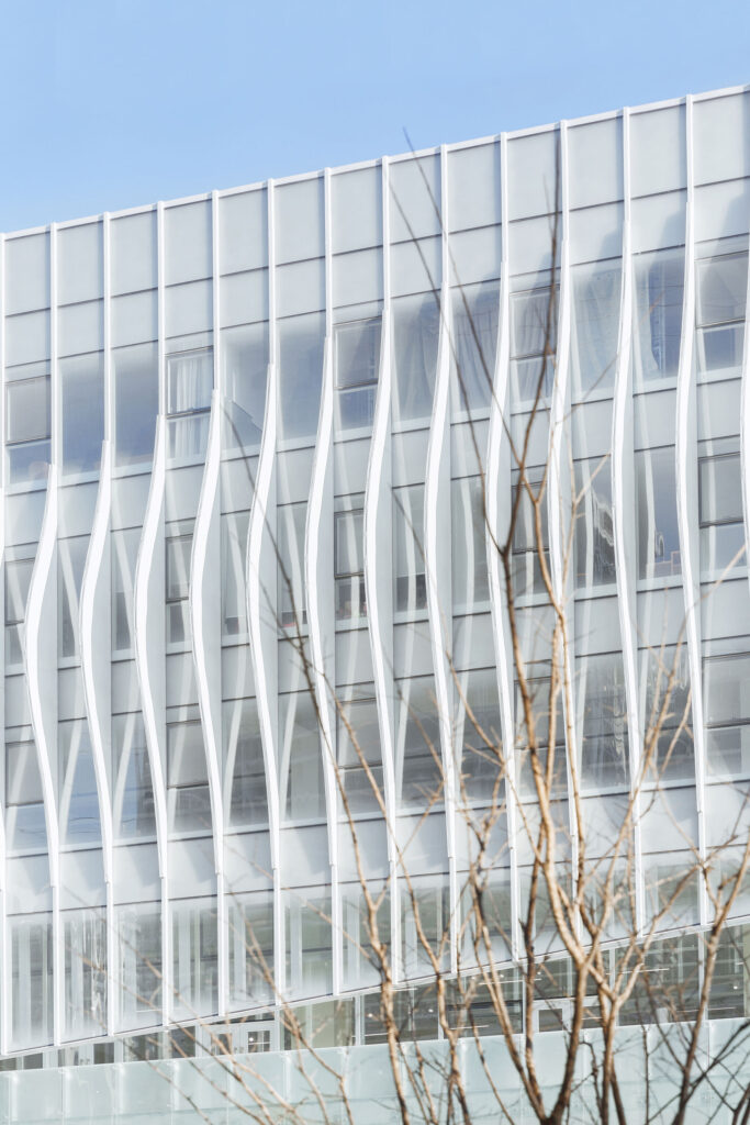
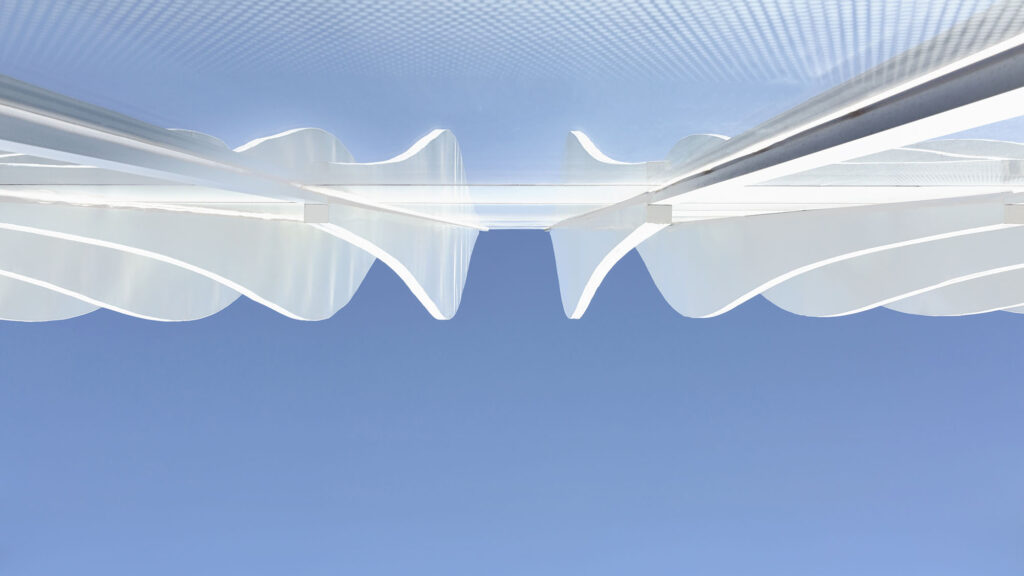
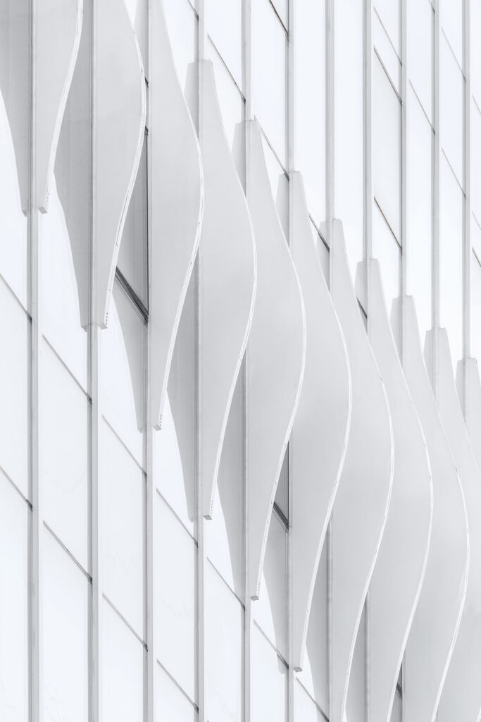
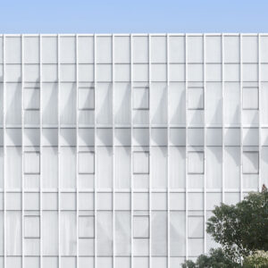
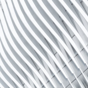
The curved aluminium plate has become the main feature of architecture, both emphasized the freedom of white linear form, and presented the potential rhythm by the curve. It seems simple to use the dynamic cutting method, but it shows the infinite possible rhythm of building skin.
In addition, it also forms a dialogue with light: during the day, while the glass reflects the outline of the surrounding trees, buildings and rivers, the curved aluminium plate changes constantly with the projection of sunlight, forming a rich rhythm of light and shadow on the facade, rather than being in a static and isolated combination.
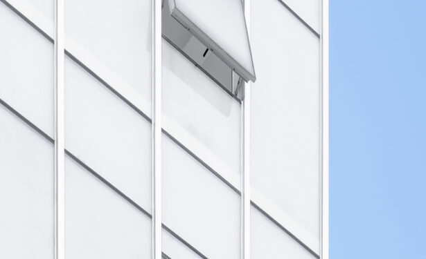
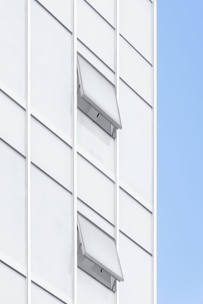
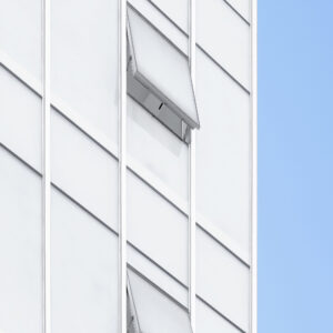
The “white goose down” is in such a poetic way, walking in the gentle breeze, perched on the building. The window opening position has also been accurately considered. By integrating the window opening method in the form of a curtain wall, the corresponding positions in different interior spaces have been realized.
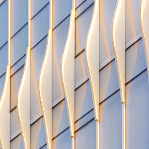
With the coming of night, the rhythmic curtain wall changes from dynamic to static. The LED light clearly outlines the white curved aluminium plate and stays on the building as soft as a sculpture in the night.
Etiketler

