- 13 November 2023
- 559 defa okundu.
Fenwick
Edition Office presents Fenwick St, a project located in Kew, Australia on a remarkable edge of the Birrarung/Yarra River, adjacent to Yarra Bend Park, with northern vistas to the valley beyond.
Perched on the edge of the escarpment, with immediate views along the river as potent as the expansive horizon which unfolds to the north, the site allows unencumbered connections to landscapes which are rare this close to the city. The site also sits within an area which has a high concentration of well-preserved 50’s and 60’s post-war houses, athletically meandering across the sloping sites adjacent to the river.
The site demands these connections be drawn deep into the plan, and through the site to the street, allowing this link to the distant vista to remain part of the public realm.
Balancing density with visual porosity was critical to maintaining this linkage.
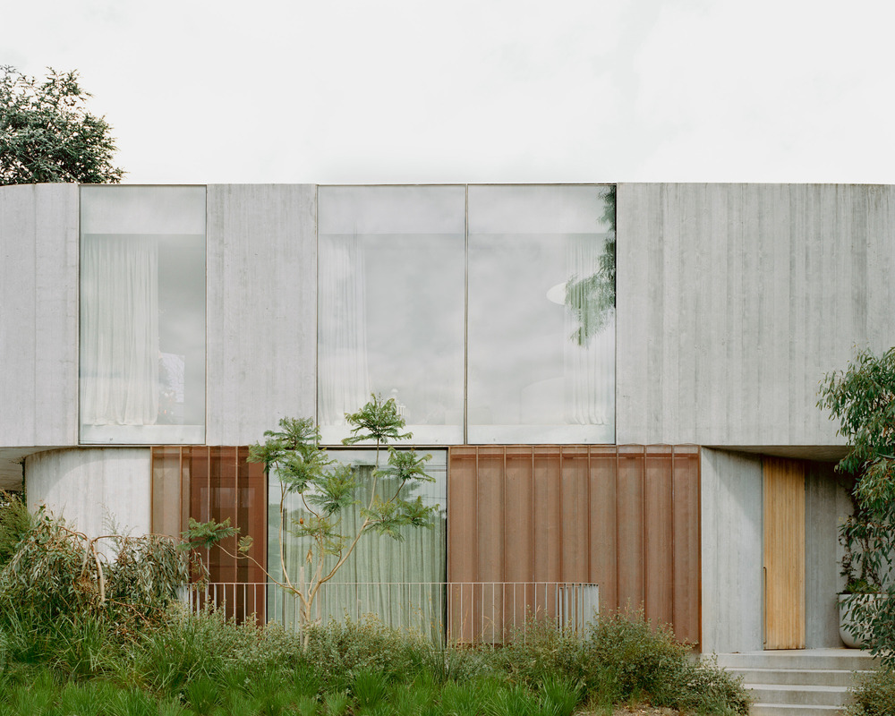
Three visually independent pavilions, rather than a larger whole, could allow a balance of similar scaled forms with the neighbouring houses, while connecting to more immediate green spaces surrounding them. These pavilions also reframe and hold views through the site, rather than simply seeing past its edges.
Located at a sharp bend in the street, the split between pavilions occurs at the fulcrum as one pivots past the site. The pavilions, linked by a common basement, push back into the hill, lowering the scale at the street to that of the residential neighbours, and increasing in height as they absorb the terrain falling towards the escarpment.
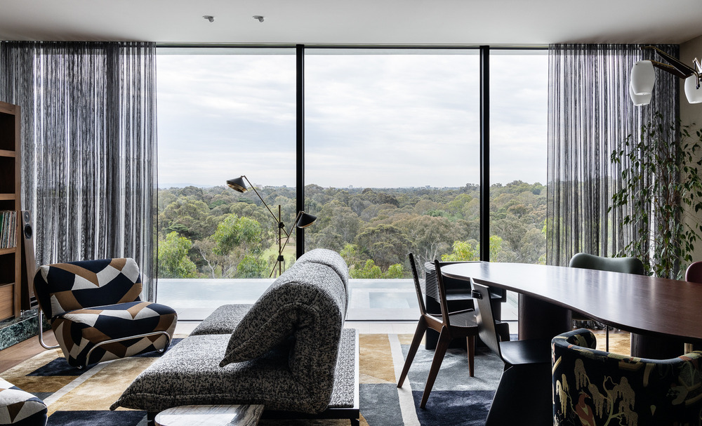
Living spaces open to the north, the river, and the valley, planned such that circulatory paths link to this space, drawing the distant landscape deep into the plan, with bedrooms and ancillary spaces opening to the green spaces between pavilions, viewed through a copper mesh privacy veil.
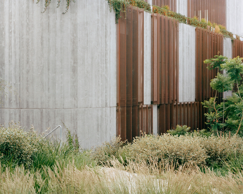
The landscape design has set in motion a desire for the building to become absorbed into the landscape. The need to drop and anchor into the site to absorb the basement meant the building would appear anchored to site. Mass and scale were feathered by shifting and rotating each floor plate slightly, bringing movement to shear walls. Copper screening, which will weather and age gracefully, allowed a level of delicacy to an otherwise purposefully robust, textured, pre-cast concrete construction.
While living within and being connected to landscape was an important driver, so too was internal delight – light filled private spaces full of comfort and detail. Flack studio brought an intuitive response to landscape and context into the interiors, evoking warmth and calm, with moments of dramatic nuance. Material tactility and evolving patina, displaying signs and patterns of life, registered with the weathering of the copper screens and the gradual maturation of the surrounding gardens. A sense of joy in navigation was important, junctions, thresholds, and the associated interplay of materiality were carefully crafted and assembled.
The brief required the creation of nine new dwellings on a site that previously provided for one. Within a location of immense environmental and cultural value, the design sought to erode the potential mass of a single large volume and instead allow the creation of three distinct forms upon the site that each yield to the domesticate patterns and scale of the existing streetscape. Working alongside the natural fall of ground across the site, the buildings appear modest in scale in both height and perceived mass. Each pavilion is formed as a wedge, meeting together at their narrowest points in a moment of architectural exuberance that extends away from the densely planted centre, allowing clear visible sight-lines between and through to the horizon beyond.


