
- 16 August 2024
- 251 defa okundu.
National Rugby Training Centre
Designed by Blight Rayner Architecture in the heart of Australia's rugby culture, the sports complex offers a functional centre for high performance training and community events in a low-budget yet impressive design.

This project is the fulcrum of high-performance rugby training in Australia, but it is also designed and programmed to do much more.


Its location – Ballymore – is synonymous with Australian rugby and for decades was the home of the Queensland Reds state team until they were moved to a larger stadium in the hope of attracting bigger crowds.


Ballymore then languished for twenty years until a number of factors coincided to re-ignite its potential.
One was the poor performances of the national Wallabies team and recognition that Australia needed a national training base.


Another was the dramatic rise in women’s participation in the sport.
And thirdly was the palpable community nostalgia for the game to return to the bucolic days of Ballymore.


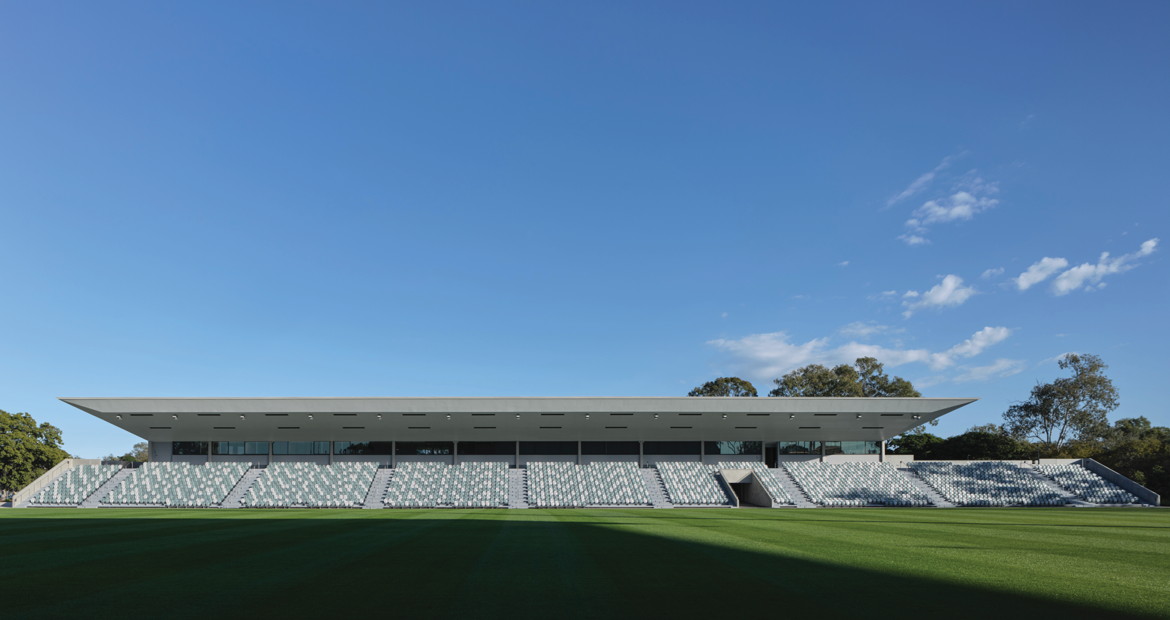
The functional requirement was for a 3000-seat grandstand and facilities supporting both matches and training – a large gymnasium, dual men’s and women’s change and locker rooms, health and wellbeing facilities at ground floor, with a players’ lounge, coaching and administrative centres, and viewing suites at the level above.
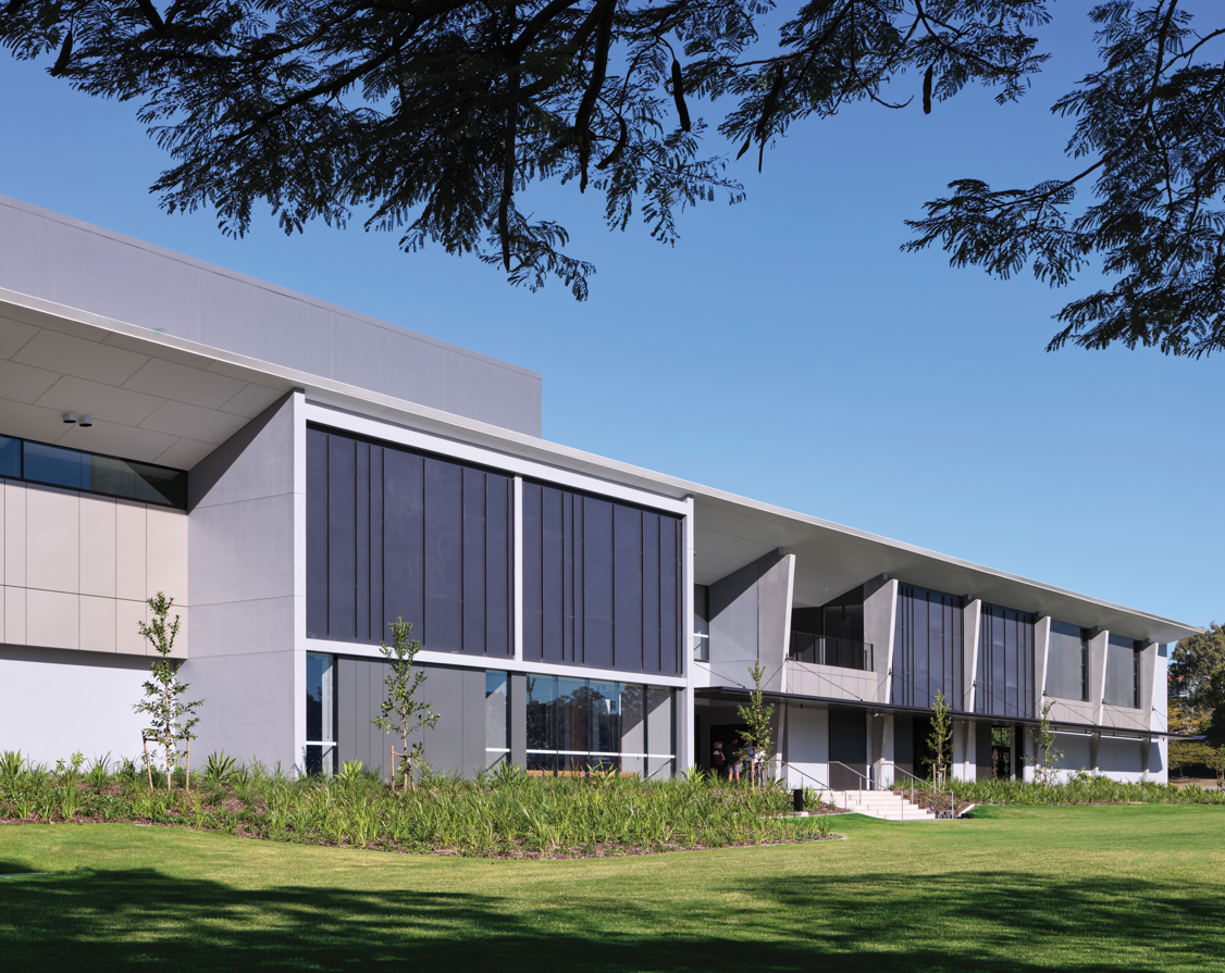
The plan simply organises the larger functions at the ends, connected by a circulation spine with smaller functions to each side.
Along the spine, widenings enable people to move freely to the edges to view fields on either side and bushland beyond.


It is the section that forms dynamic relationships between functions, the upper level rising and falling to provide unexpected visual connections as well as daylight penetration, including into the ground floor gymnasium and change facilities.
But it is the architectural expression of the plan and section which has gained the building increasing interest publicly and in media (published in April in Architecture Australia).


This is because the expression is the opposite of the trend of creating ever more ‘gymnastic’ stadium architecture worldwide.
Part of the reason is cost as this facility had only a $31 million budget and was not intended as a ‘grand’ sports venue.
The other part of the reason was to attract community life back to Ballymore whether for school or club games in rugby, football, hockey and other field sports.


Our approach was to create a simple, hovering plane above the fields, unadulterated except for origami-like geometry at each end that thrusts the eye skyward and forms knifed edges all around.
The effect of this architecture has been to create an unintimidating environment which invites the sports community of Brisbane in its graceful simplicity, defiant of its minimal cost outlay.
It is presented as sublime resolution of form and function, and potentially as a direction for stadia away from overt sculpture toward contextual resonance.


Etiketler


