- 4 January 2024
- 287 defa okundu.
Stereotomic Traces: Walk With Me Store
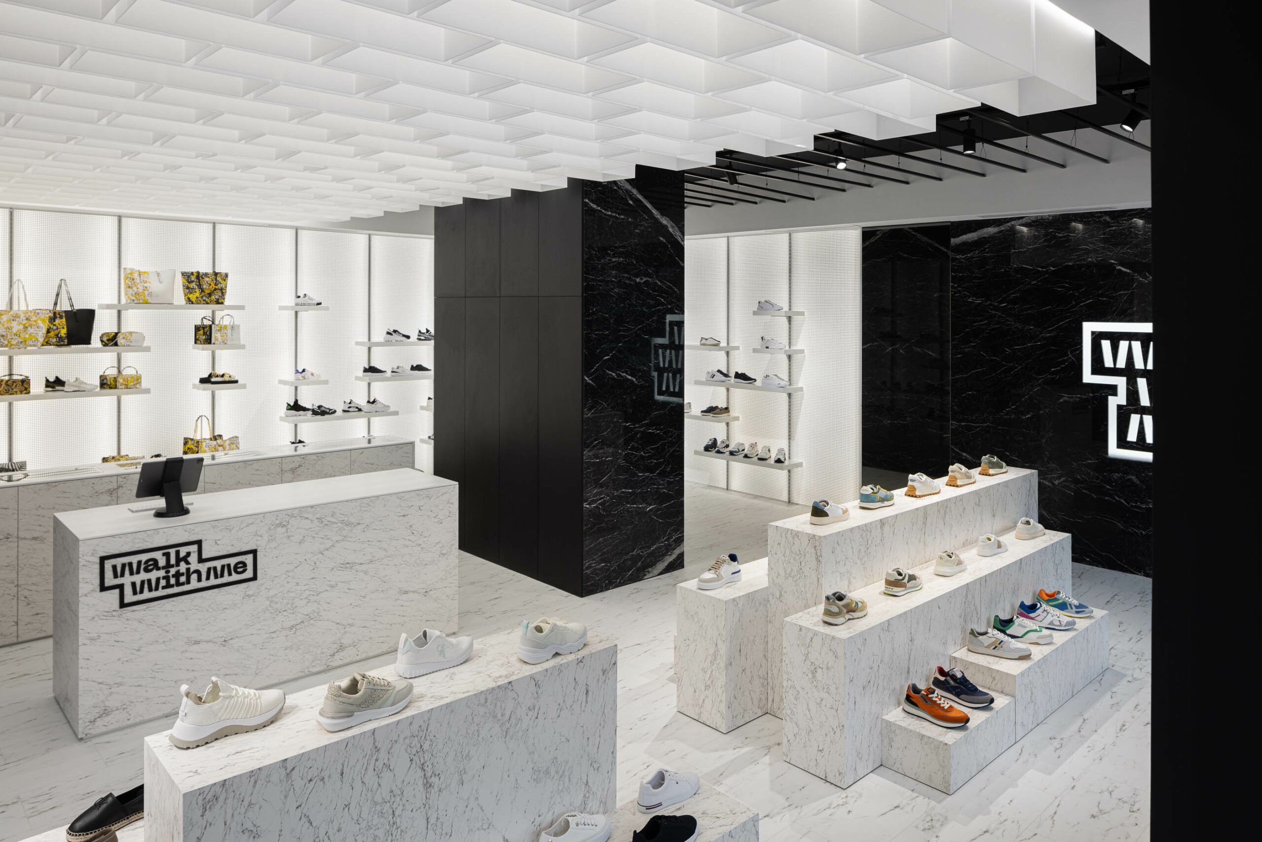
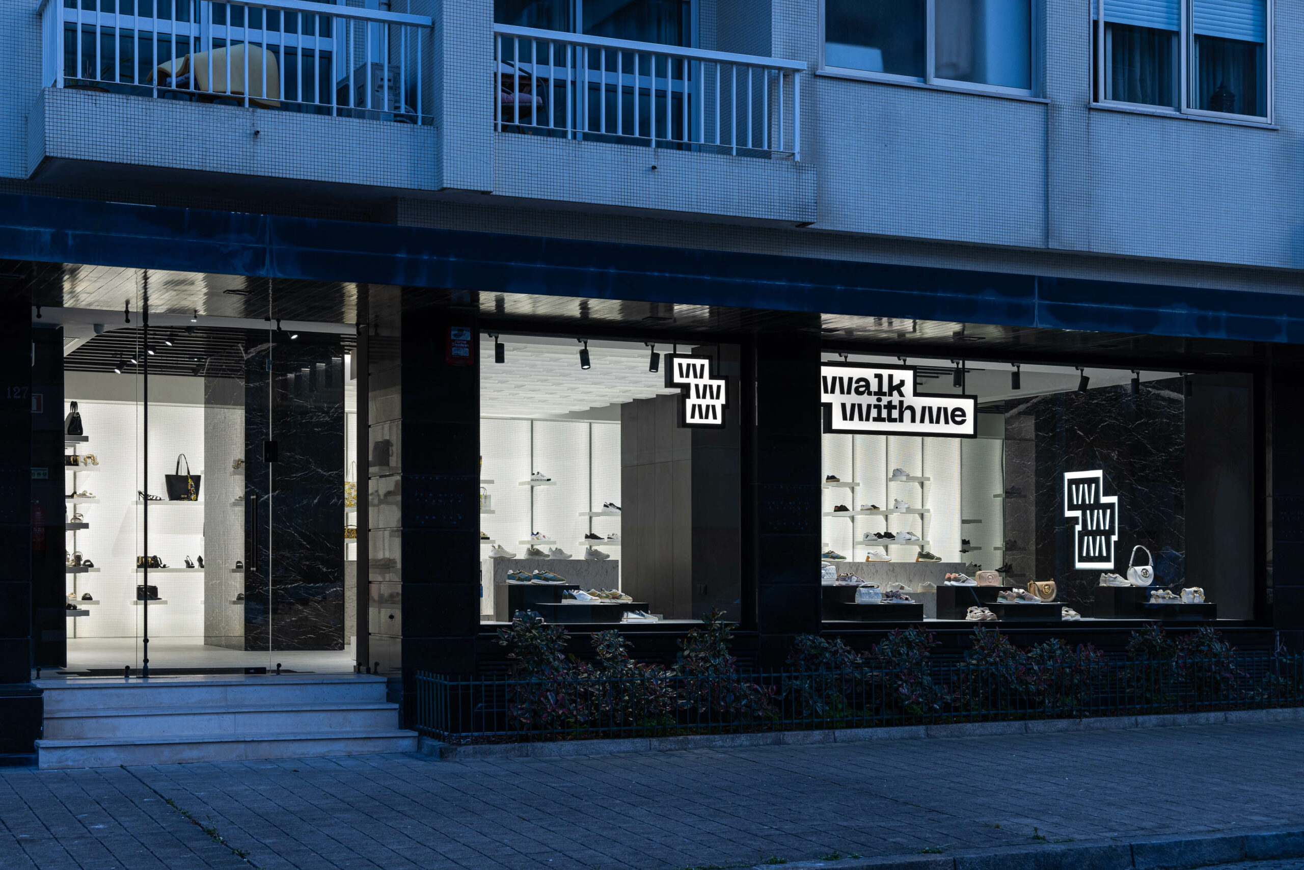
"Walk With Me," a shoe store designed by REM'A Studio, explores the fundamental concept of "walking" through the intricate compositions of pavements and their stereotomy. The aesthetic-spatial concept is captured by transposing the floor's stereotomy into a unique light installation at the center of the space, creating a distinctive atmosphere.
Photos: Ivo Tavares Studio
In this project, as the inaugural space for a new retail footwear brand, the primary goal wasto establish a uniqueidentity through the interpretation of the brand’s name, the product line to be marketed, and the target audience.
The name “Walk With Me” inspired us to delve into the composition of what underlies the act of “walking”-the flooring, and its stereotomy, which became the essence of the aesthetic-spatial concept.
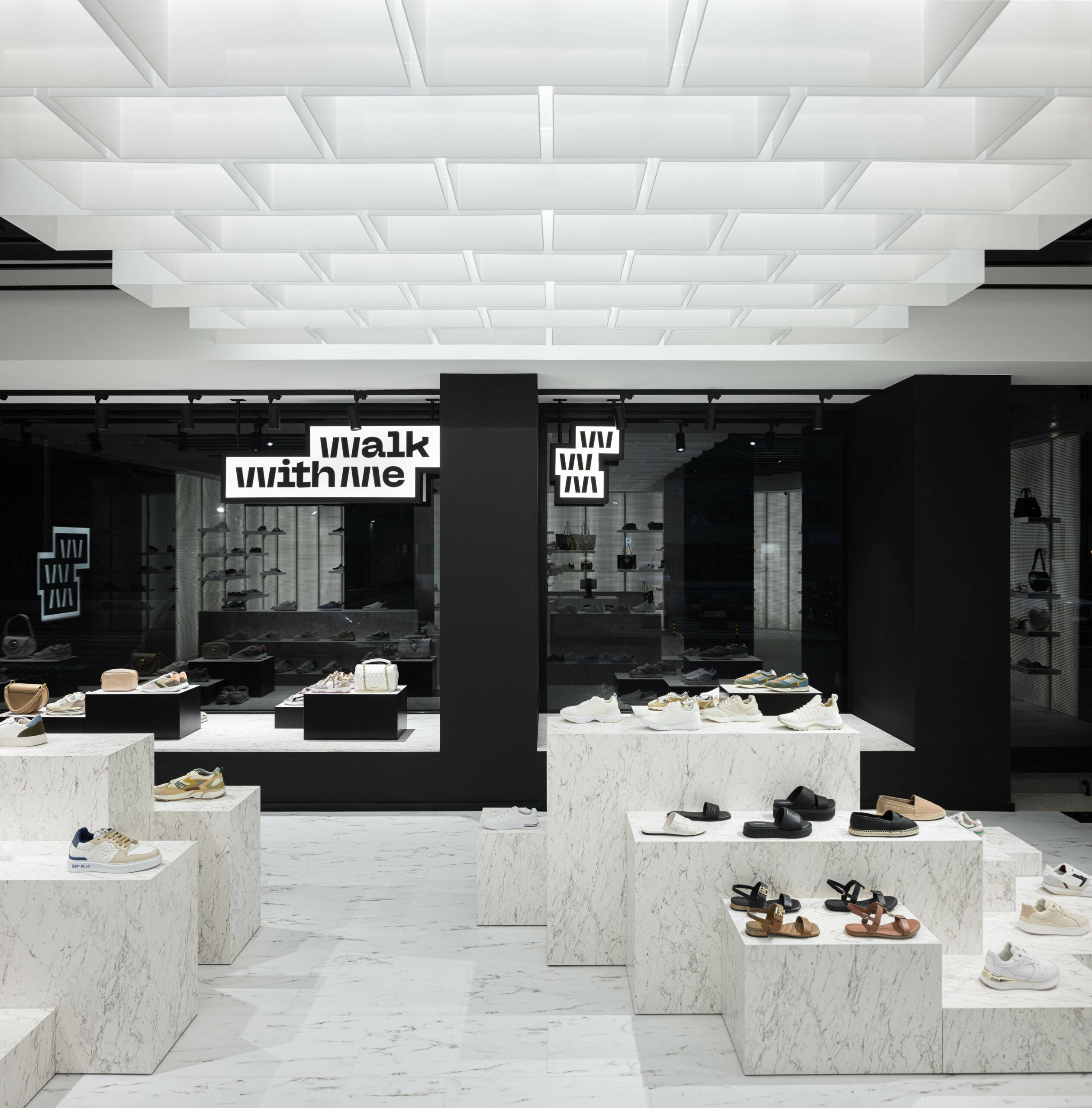
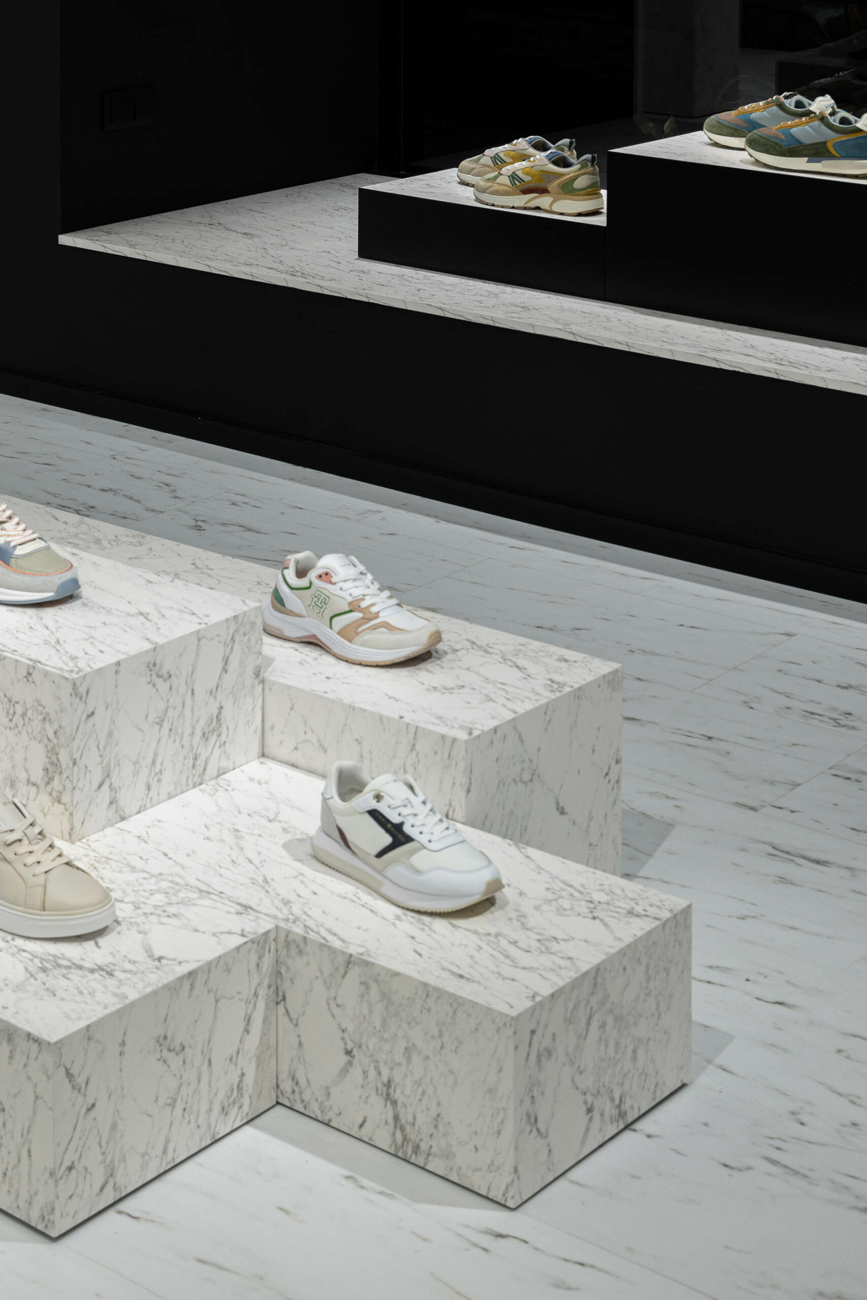
Starting from thispremise, we examined the stereotomy of the flooring, seeking a metric that would give rise to the displayelements.
These elements, serving as the foundation for product presentation, are high-relief representations ofthe various dimensions of each flooring piece, enabling diverse compositions depending on the quantity ofproducts to be exhibited and/or new collections.
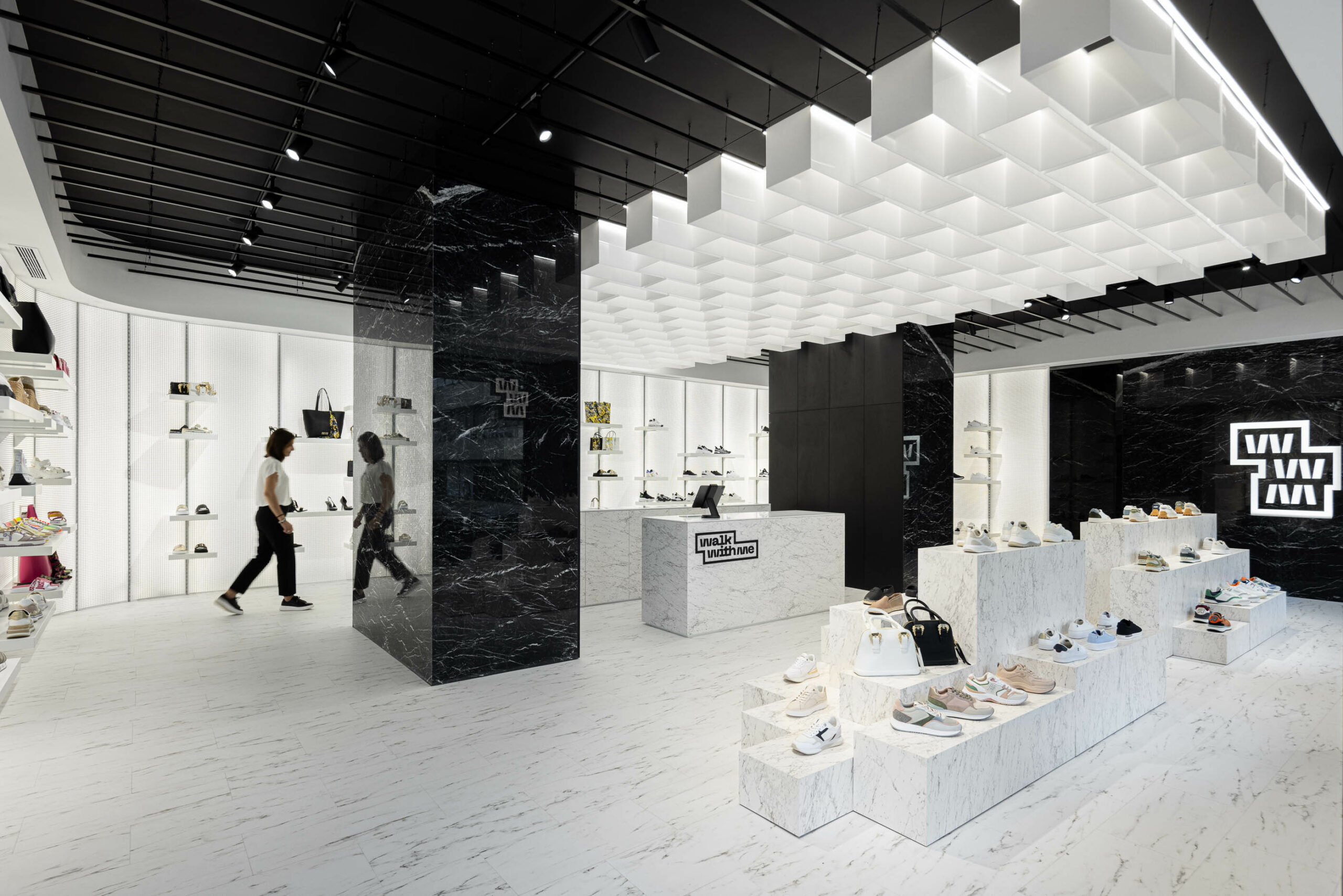
The chromatic and material definition of the space is suggested by the brand’s logo, where we explore blackand white stone materials, using textures of Calacatta and Marquina marble. This chromatic duality allows theproducts to naturally stand out in the space as integral compositional elements.
White is consistently associatedwith the products, while black is linked to the “sterile” zones/parts/elements of the store.
The criteria for the wall display involved a system that not only allowed for various compositions but alsoprovided evenillumination of the products.
To achieve this, we proposed backlit panels composed of whiteopaline acrylic and perforated metal sheets.
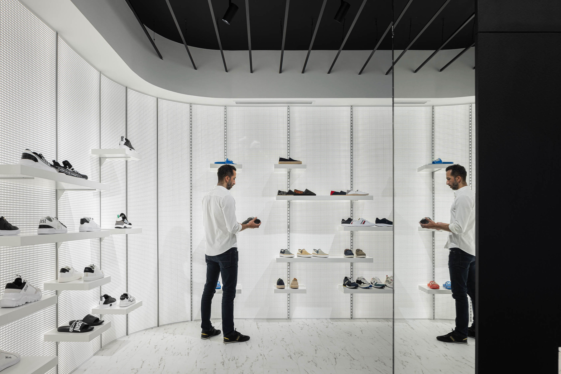
Two types of shelves were defined for this system, “single” and”triple,” offering multiple combinations in the tripleconfigurations and product highlights in the single shelves.
The area for trying on shoes is located at the rear of the service counter, providing some privacy and directinteraction with the staff.
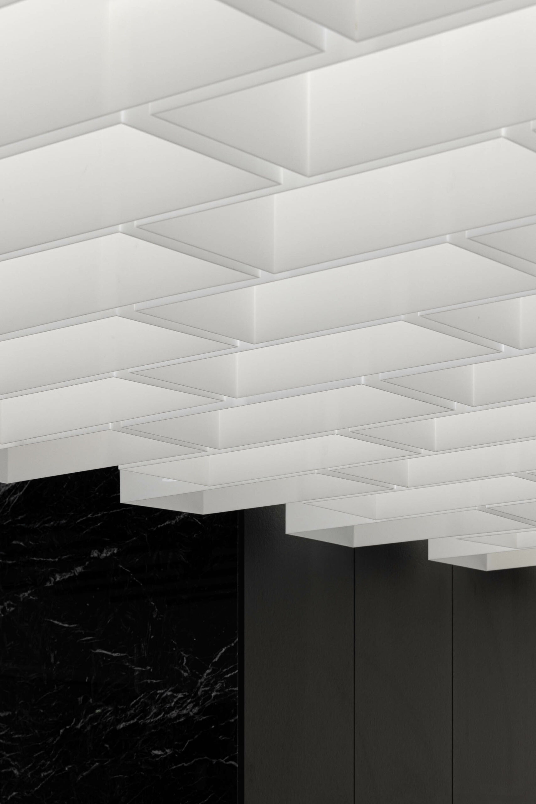
The intention to conceal structural elements presentedan opportunity to centralize theservice counter, encouraging a perimeter-circulation layout within the store.
This design creates a smooth andsequential shopping experience for customers.
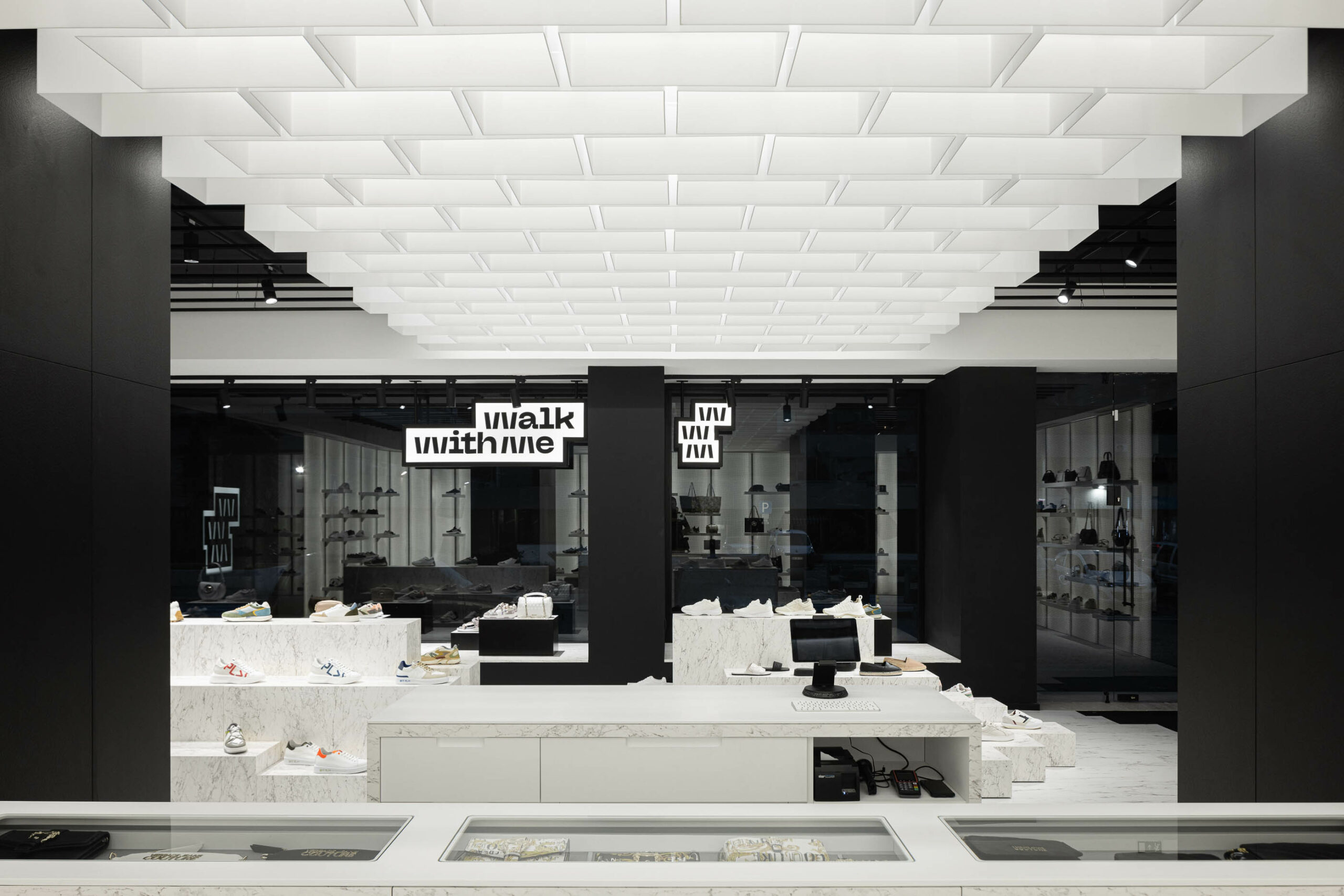
Given that the public area of the space has a rectangular configuration, with the longer side facing the street,we introduced an identity element in the ceiling with hollowed acrylic boxes.
These boxes harken back to themetrics of the existing flooring’s stereotomy, establishing a strong connection to the exterior andgiving specialprominence to the core of the store-the service counter.
