- 31 May 2023
- 7270 defa okundu.
Tiedup Concept Store
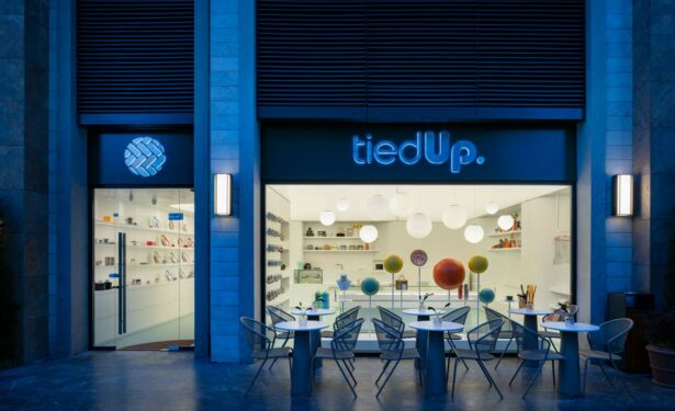
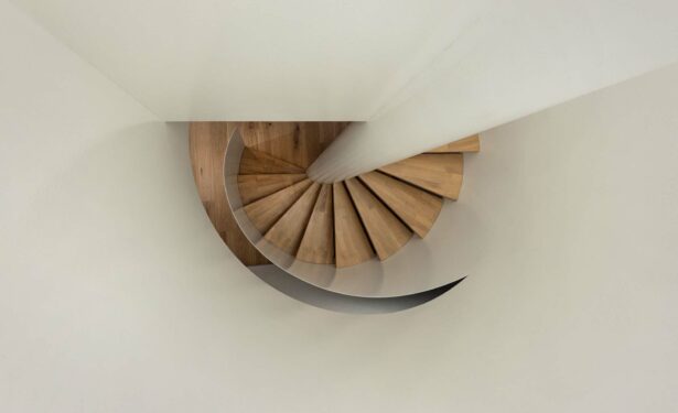
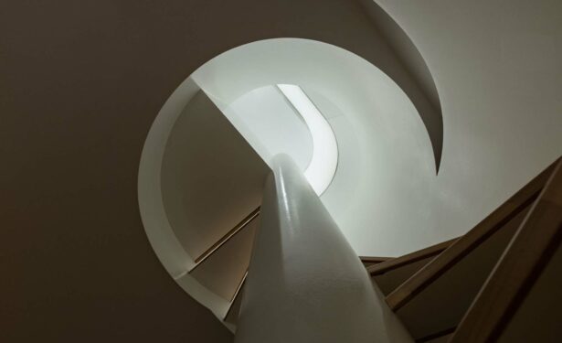
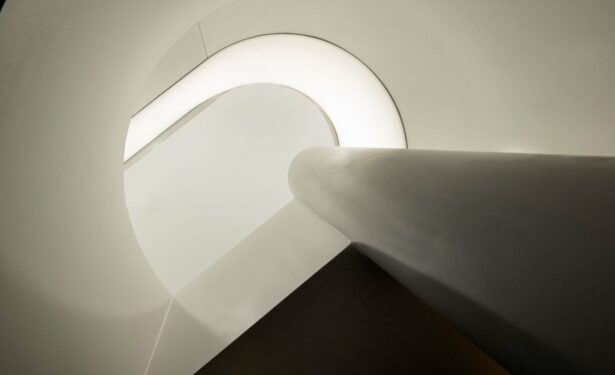
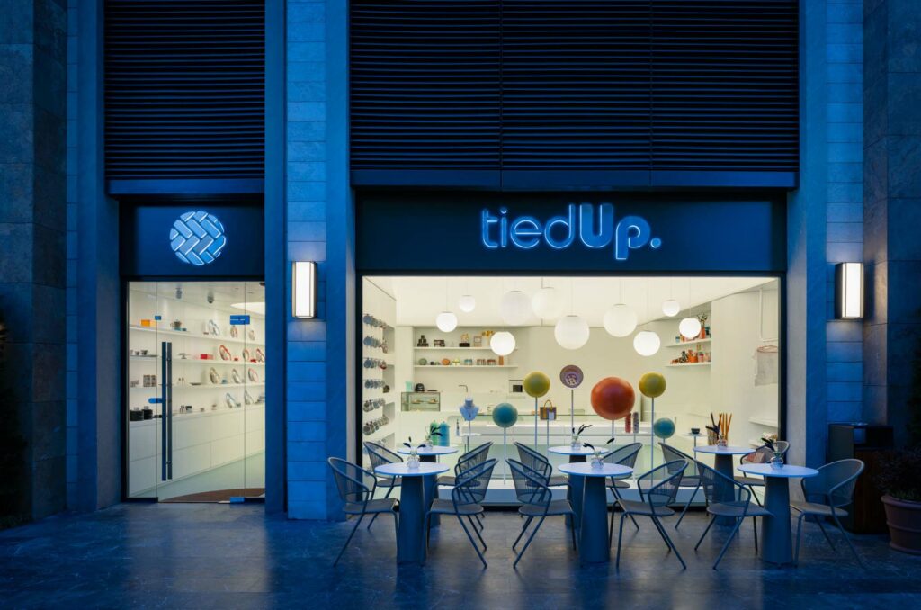
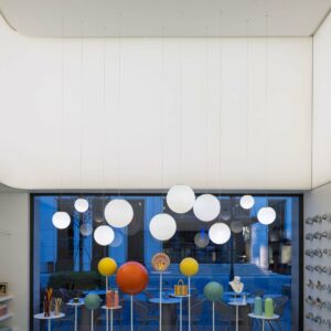
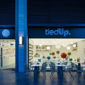
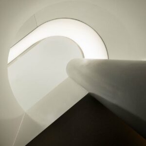
Tiedup Concept Store in Fişekhane was designed by Lift Studio.
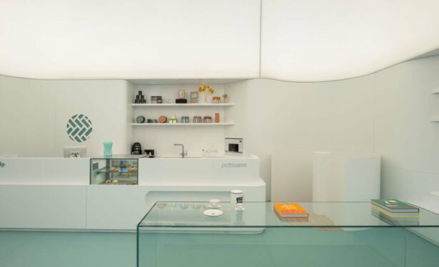
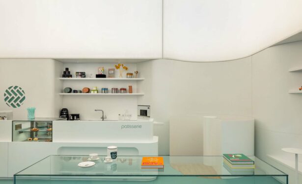
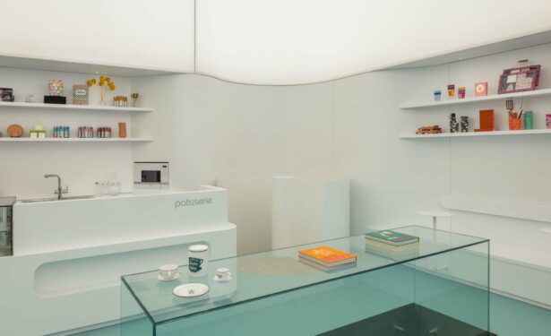
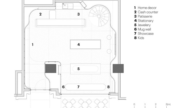
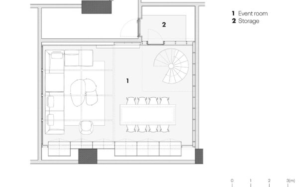
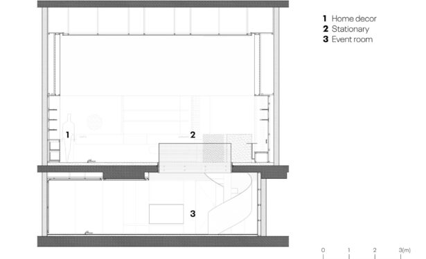
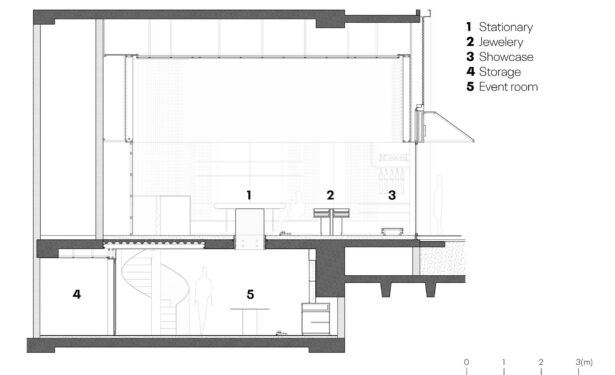
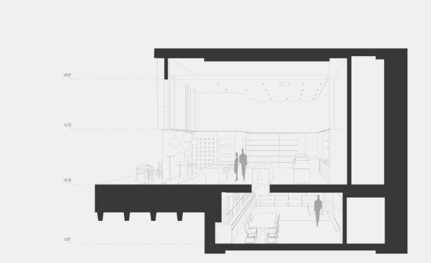
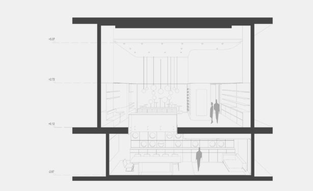
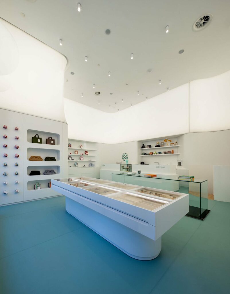
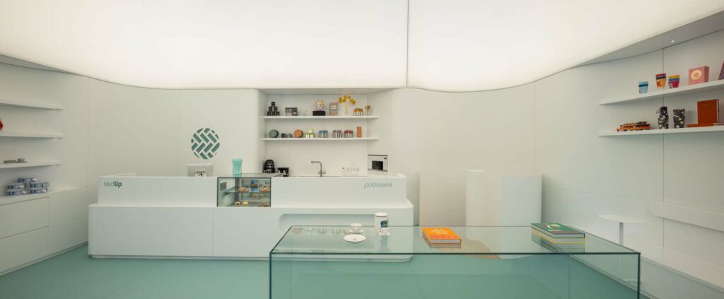
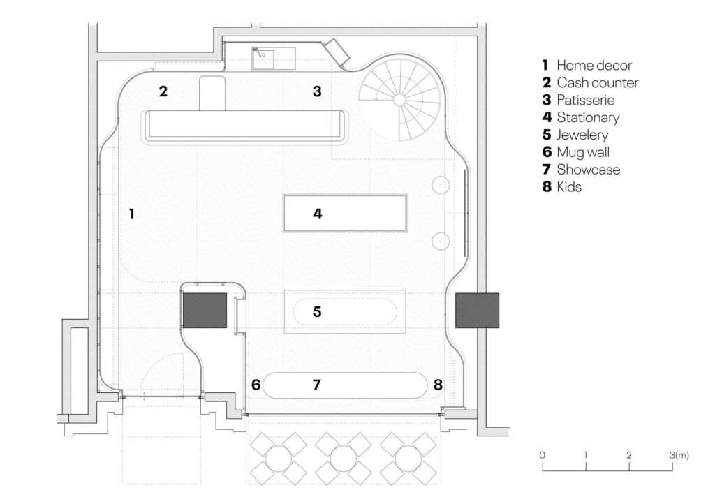
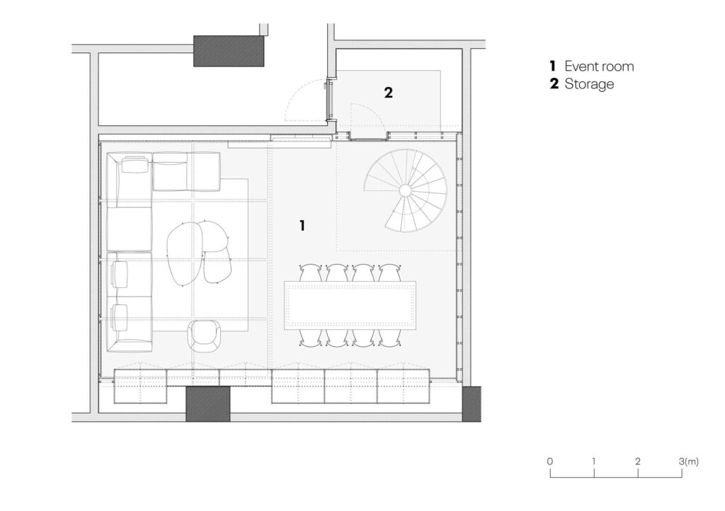
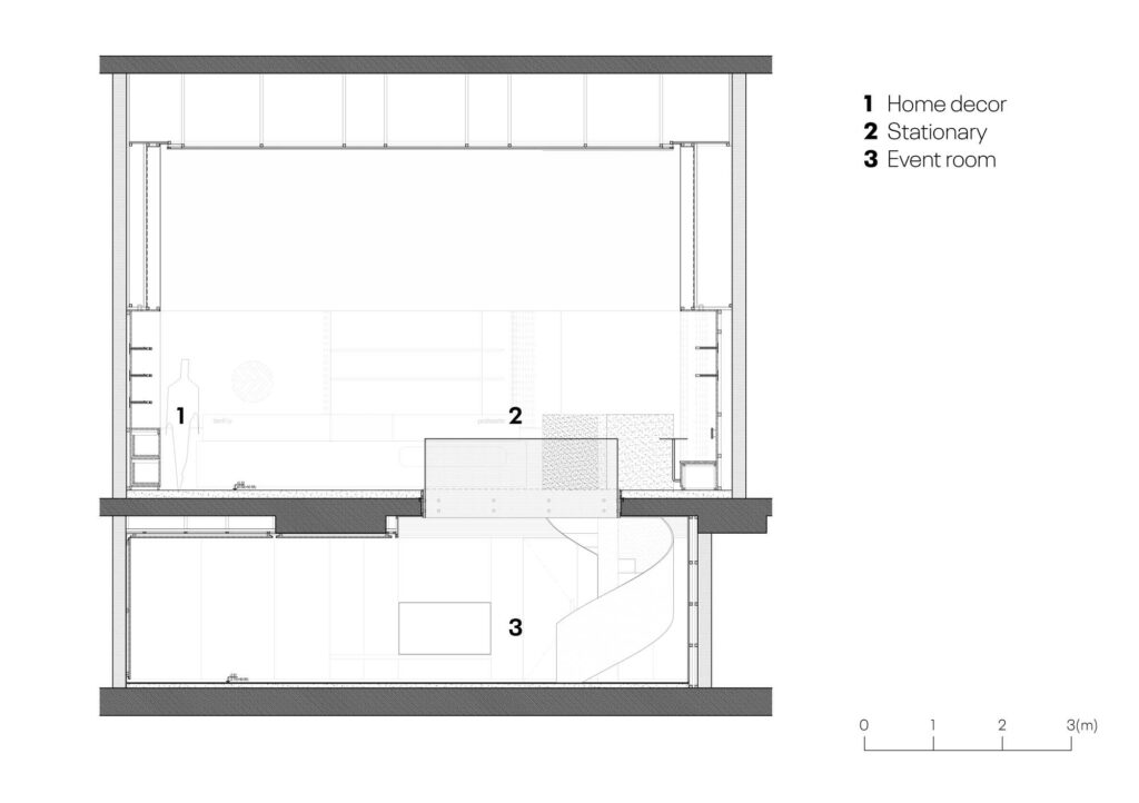
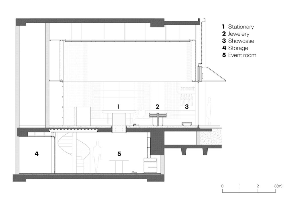
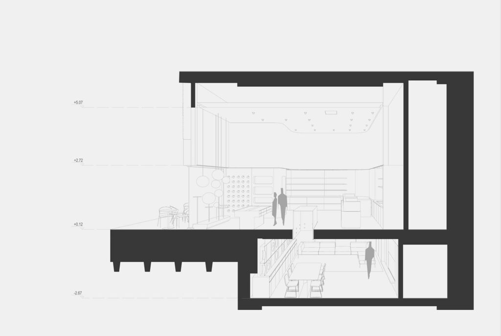
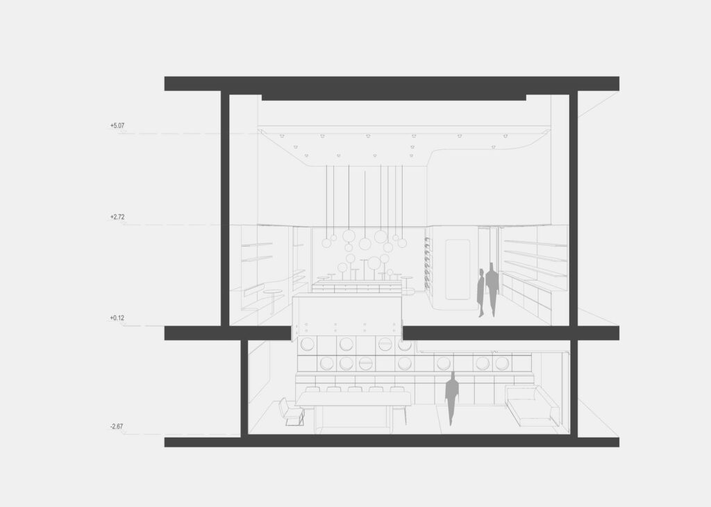
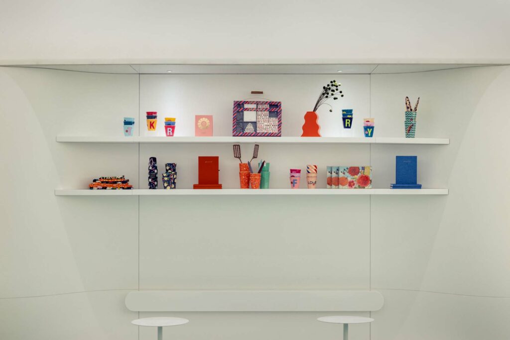
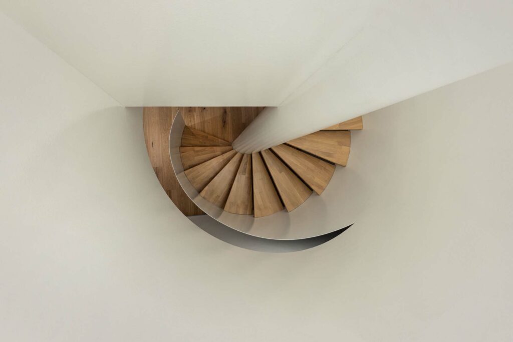
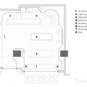
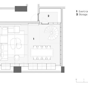
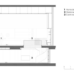
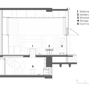
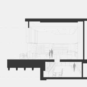
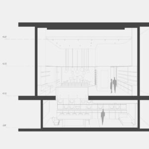
This is a concept store project located in Fisekhane, which is a restored factory campus for residential and commercial adaptive reuse in Istanbul. The brand TiedUp sells different types of materials like mugs, notebooks, clothes, plates etc. and needs a place to hold some events like birthdays, brunches, dinners etc. The first difficulty was to design a place where so many different types of objects and functions could coexist harmoniously. First step of the design was to divide functions into two main categories: sales and events. After that, we decided to use each floors of the store for one category.
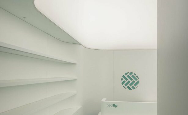
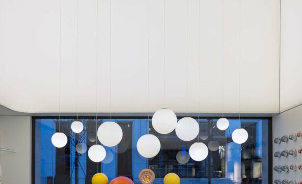
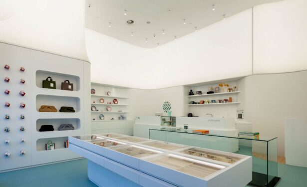
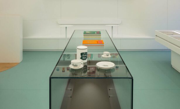
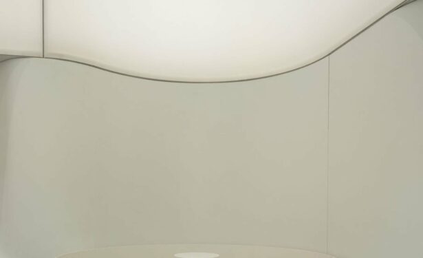
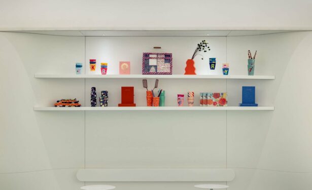
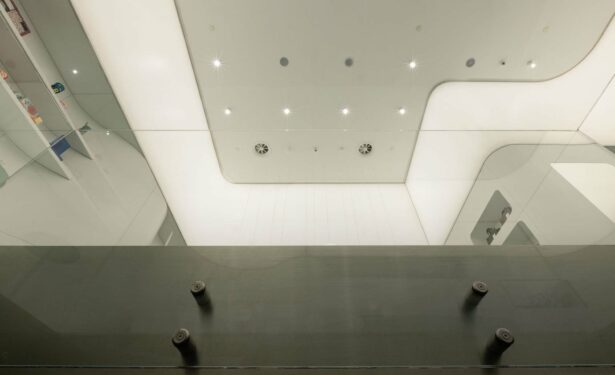
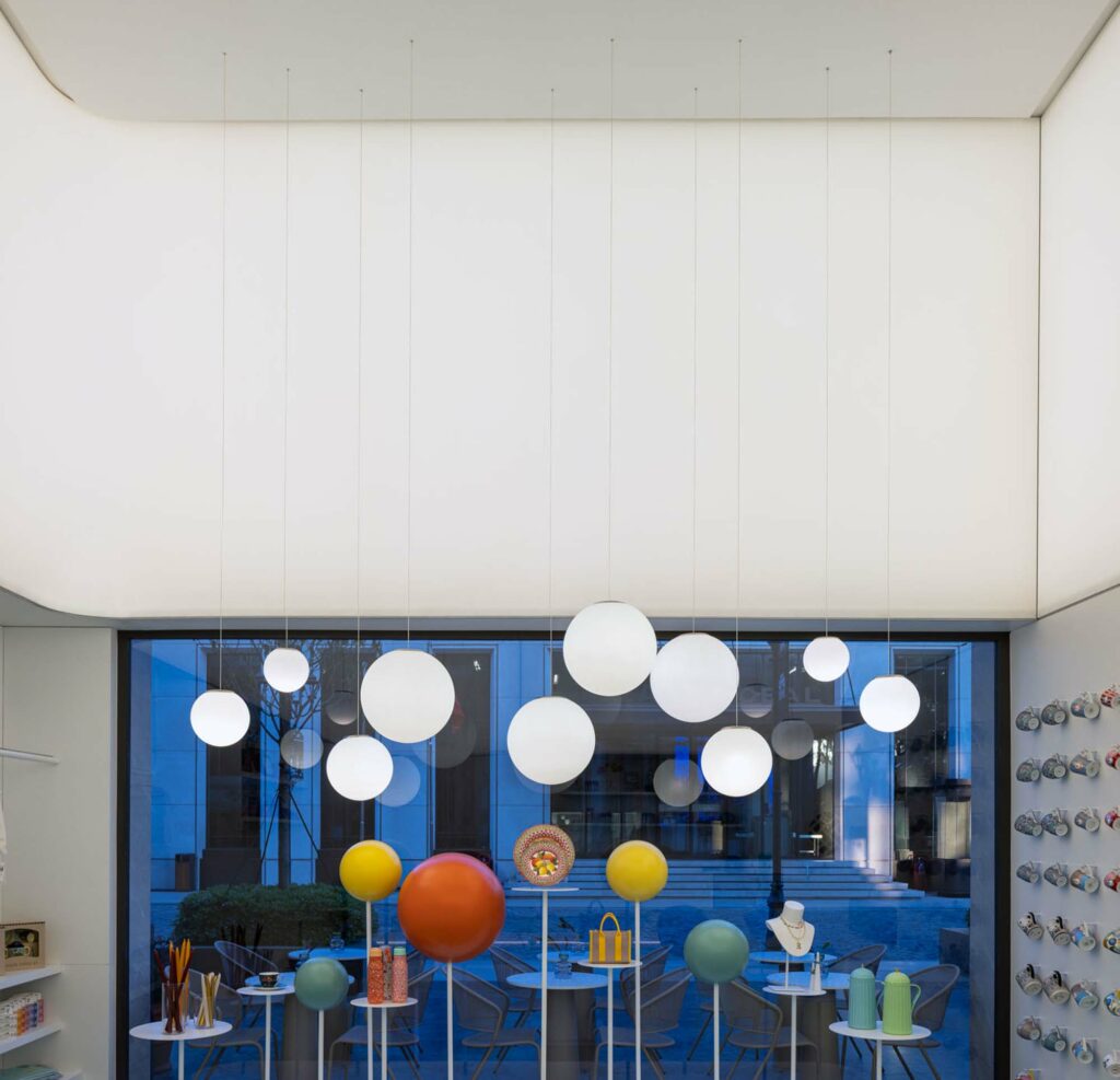
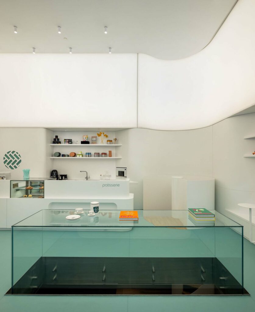
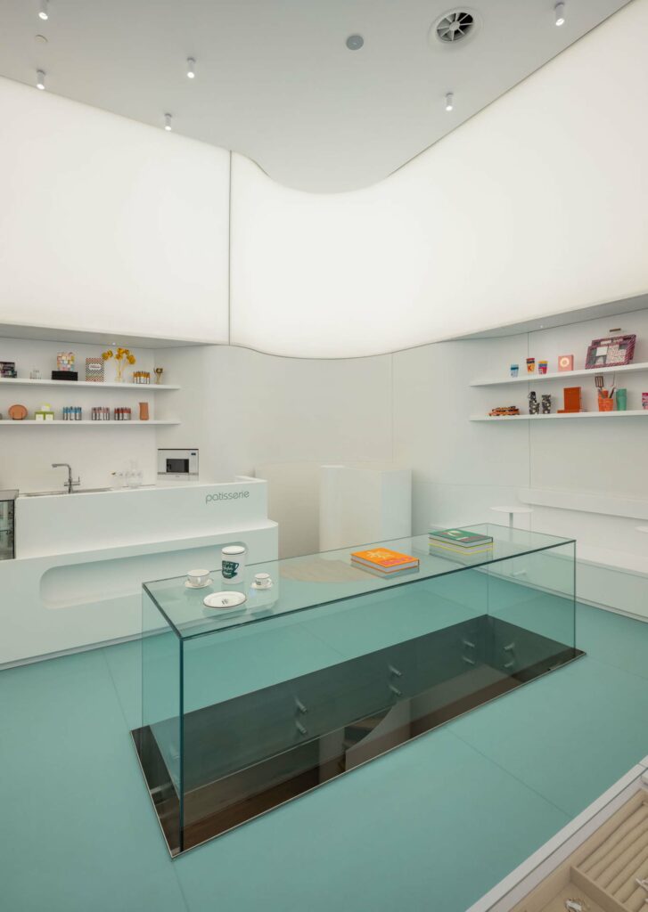
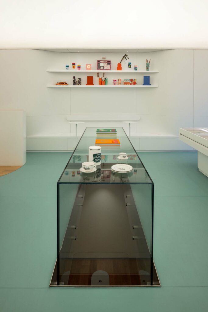
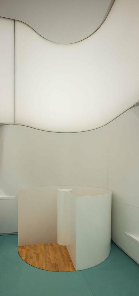
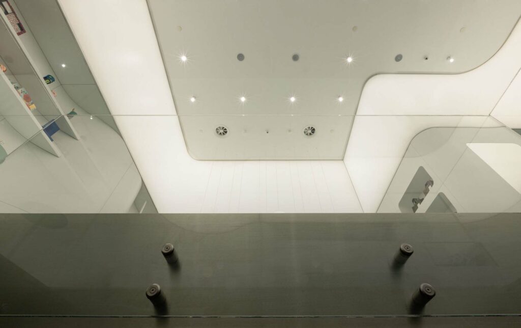
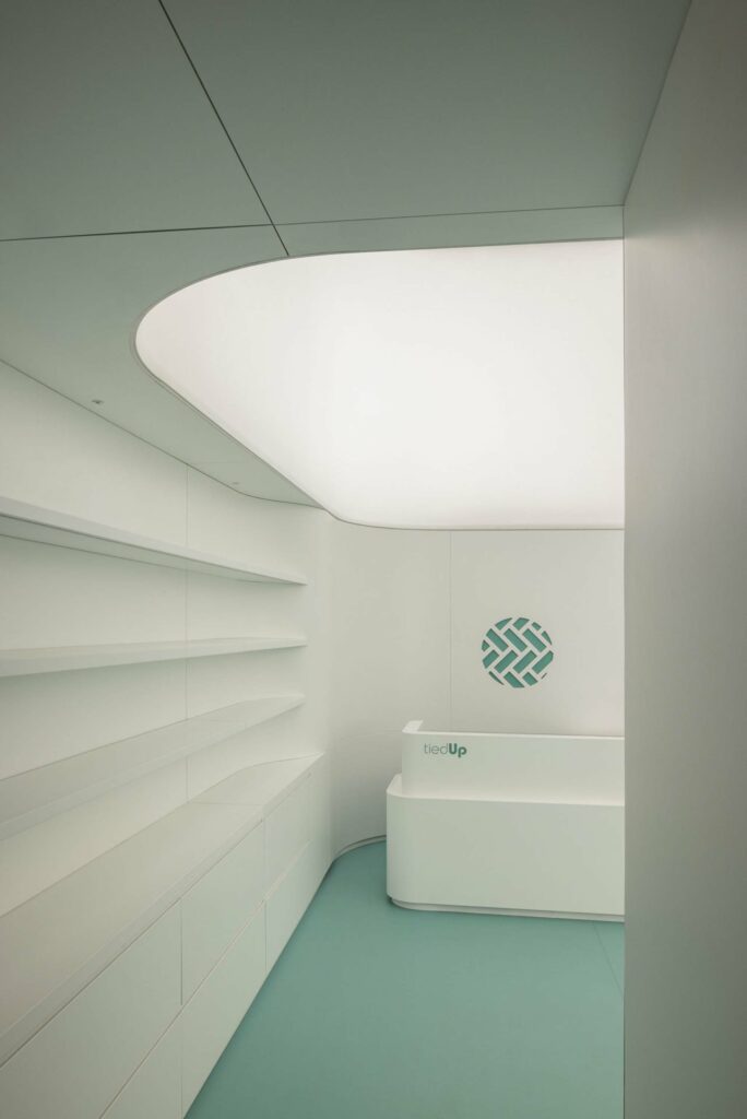
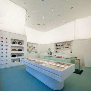
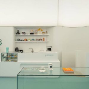
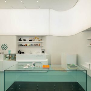
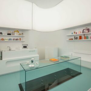
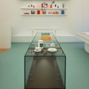
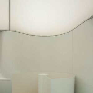
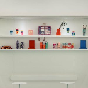
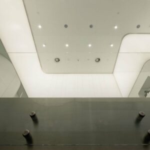
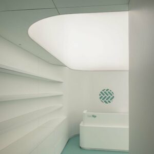
The ways of displaying the products exhibited in commercial spaces where the exhibition function is dominant include commercial concerns. Although this relationship is valid to a certain extent for art galleries or other art venues, it is never primary. Preferring to stand somewhere between the boundaries of these two different relationships, we reinterpreted today’s commercial space by considering the concept of White Cube, put forward by Irish artist and critic Brian O’Doherty. For the sales floor, the main goal of the design was to create a neutral and fluid background surfaces for the colorful objects of the brand. Vertical surfaces are constructed with white lacquer painted wooden surfaces that lean against the walls of the store, forming the display surfaces and fixed furniture -like patisserie, shelves, mug wall, seats for patisserie etc.- and self-illuminating white Barrisol surfaces on the upper level of these lacquered wooden surfaces. Floor surface is covered with mint green linoleum, which is selected to create soft contrast.
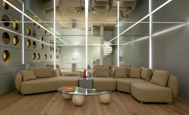
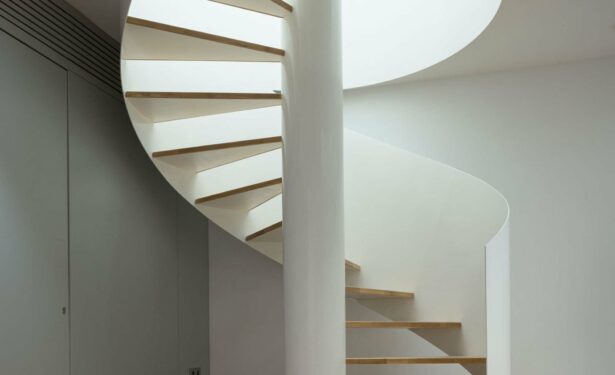
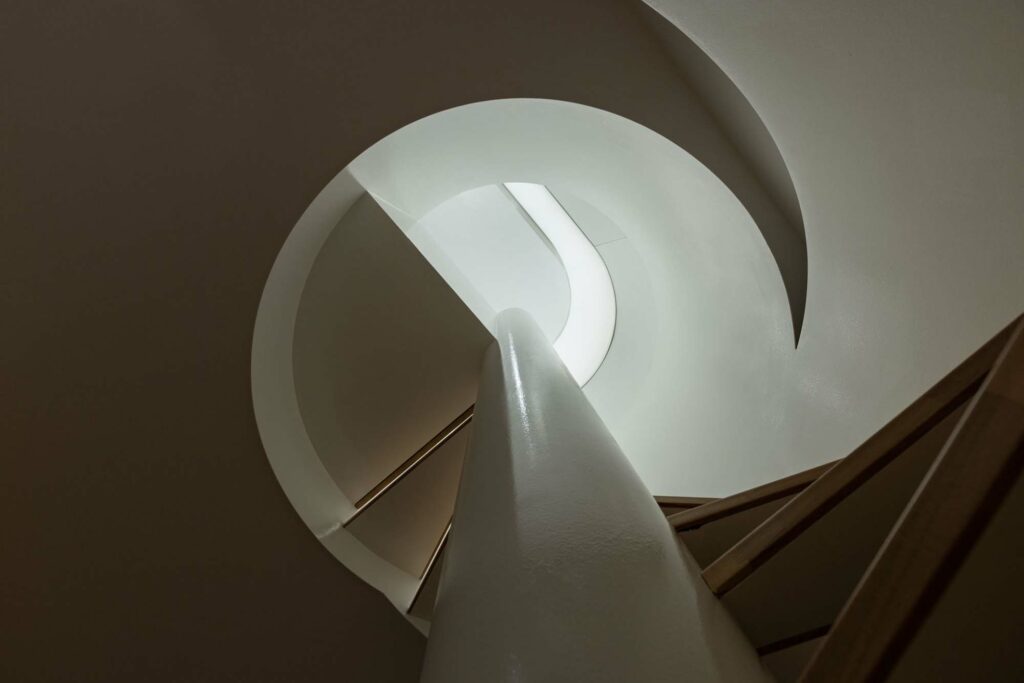
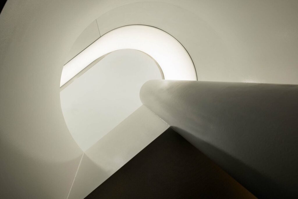
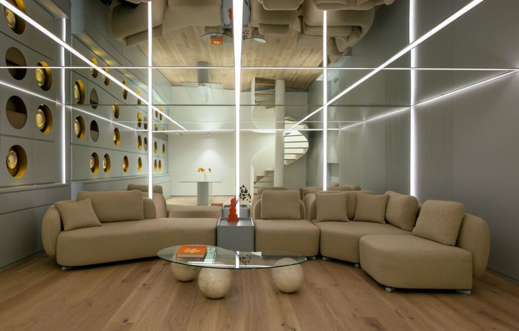
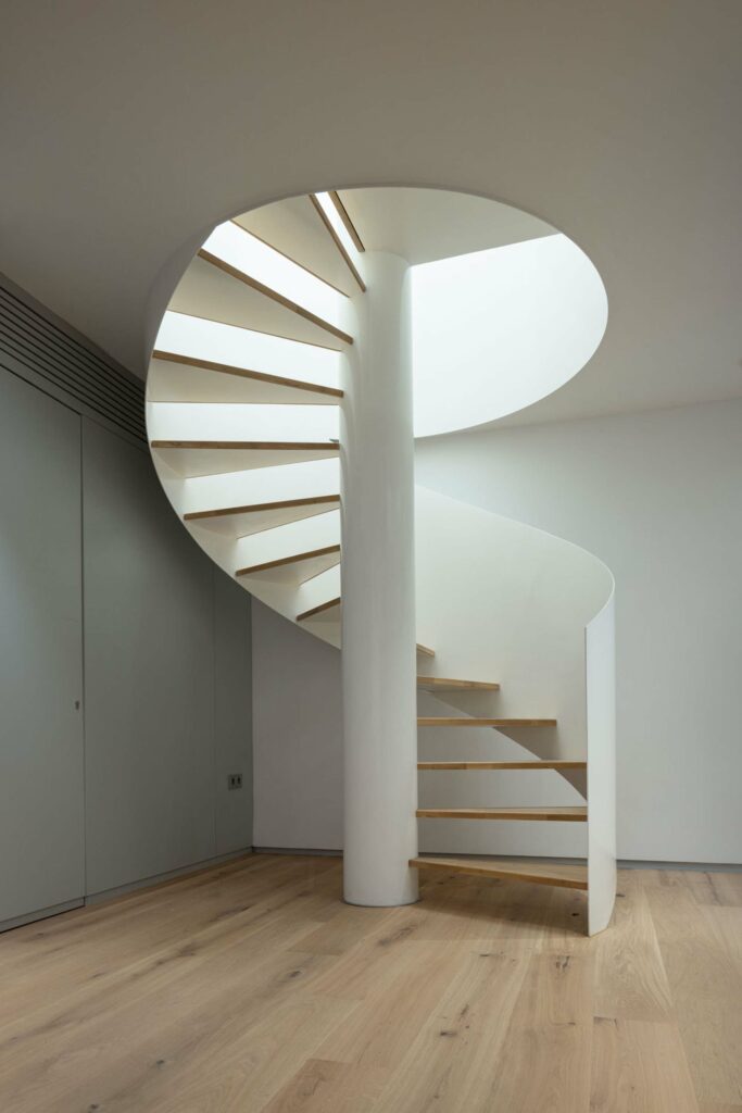
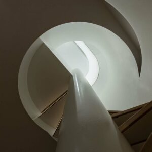
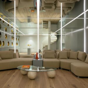
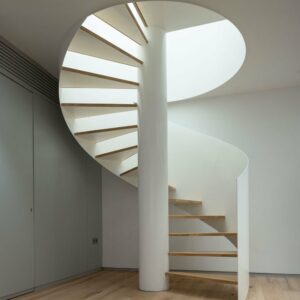
For the events floor, daylight was a necessity, so we created an opening in the ceiling and allowed the sunlight to reach this floor. We divided this volume, which has a low floor height, into two areas as eating and resting areas, and we used the ceiling of the resting area to hide the mechanical elements. By placing a large sofa, we used this area only as a sitting area, and by covering the ceiling and wall surfaces with mirrors, we enabled the people sitting to perceive a more spacious area.
Etiketler

